Zebra3 Info
-
- KVRAF
- 2623 posts since 20 Oct, 2014
Beta testers!? 
-
- KVRist
- 53 posts since 19 Dec, 2015
Any timeline available for a public beta of 2.8?
-

- u-he
- Topic Starter
- 30193 posts since 8 Aug, 2002 from Berlin
Still in final preparations of Repro V1.1 release... still a few niggles left to fix in Zebra before 2.8 beta/public appearancerosschehayeb wrote:Any timeline available for a public beta of 2.8?
-

- KVRAF
- 2110 posts since 5 Oct, 2015 from Swedish / Living in Hong Kong
Hope it will show up as a "soft" package under the xmas treeUrs wrote:Still in final preparations of Repro V1.1 release... still a few niggles left to fix in Zebra before 2.8 beta/public appearancerosschehayeb wrote:Any timeline available for a public beta of 2.8?
Win 10 -64bit, CPU i7-7700K, 32Gb, Focusrite 2i2, FL-studio 20, Studio One 4, Reason 10
-
- KVRian
- 625 posts since 19 Mar, 2004 from Copenhagen
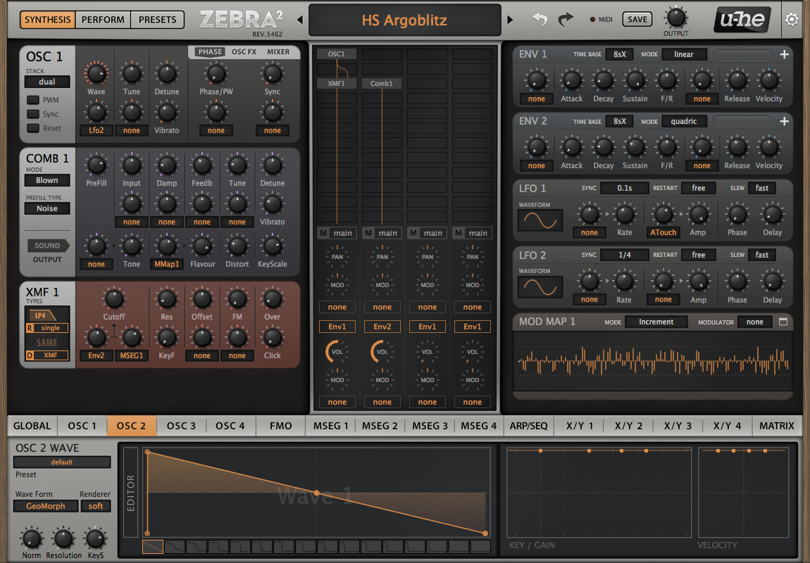
I really like this. For me the controls immediately stand out much more clearly so in fact it would be a lot less eye straining than the brown-grey GUI above. If you tone down the bright pink in the Comb 1 module I think it won't be eye fatiguing.Urs wrote: Here's a high-contrast approach I've been talking about. Needs a lot of fine tuning, many elements missing. But it shows that it's easy to do a "in your face" UI which unfortunately will quickly lead to eye fatigue:
This kind of theme will certainly sell more licenses and possibly even make Zebra easier to learn. But can't be the only choice for people who spend a lot of time creating and tweaking sounds.
-

- KVRist
- 122 posts since 14 Sep, 2017
Just a friendly reminder for 2.9 Urs that it would be great if Zebra instances could load quicker in daw please. Tx
Urs wrote:Still in final preparations of Repro V1.1 release... still a few niggles left to fix in Zebra before 2.8 beta/public appearancerosschehayeb wrote:Any timeline available for a public beta of 2.8?
-
- KVRist
- 206 posts since 23 Apr, 2006
With so many buttons, I feel like subtle bits of colour/saturation will really help with usability and clarity - in this instance, all of the orange text saying 'none' could be desaturated a fair bit, so it's obvious which parameters have a controller or modulator assigned, and which do not.nordickvr wrote:nilhartman wrote:
Seeing at a glance what is activated and what each module is doing is crucial for optimum workflow.
Also - is there any way of using some sort of visual shorthand in the design for buttons used a lot throughout the modules? too much colour would obviously look terrible, but even just a slight difference in the shade of grey (for example) would make certain knobs like resonance or tune stand out. If all of the 'tune' knobs, or all of the 'cutoff' knobs use the same visual language, I can glance and instantly know where to go in order to tweak those settings, rather than seeing a flood of identical knobs and needing to read the text.
Same for ADSR - putting those letters inside the knobs would do away with the need for the text below. Or just slightly tweaking the background behind the ADSR knobs so (again) it's clear from the quickest glance where those buttons are.
This is obviously nitpicky, but one of my biggest issues with plugins and synths is inefficient visual language in the design - and since I'm constantly on very tight deadlines it's beneficial when synths and plugins are setup in the most intuitive way.
It's worth saying that u-he synths are probably the among the best-designed synths I have, but sine tweaks like the above and inspiration from Sinevibes' Torsion and Serum would make for even better visual feedback.
-
- KVRist
- 206 posts since 23 Apr, 2006
just to quickly demonstrate - look how much clearer it is with a very subtle tweak, to see which parameters have modulation applied and which don't. EDIT - I've just seen Urs' latest mockups which weren't loading before, and he's done exactly this! D'oh!
You do not have the required permissions to view the files attached to this post.
Last edited by wilx on Thu Nov 30, 2017 12:31 pm, edited 1 time in total.
-

- KVRAF
- 24412 posts since 7 Jan, 2009 from Croatia
Zebra loads plenty fast over here...synth_punk wrote:Just a friendly reminder for 2.9 Urs that it would be great if Zebra instances could load quicker in daw please. Tx
Urs wrote:Still in final preparations of Repro V1.1 release... still a few niggles left to fix in Zebra before 2.8 beta/public appearancerosschehayeb wrote:Any timeline available for a public beta of 2.8?
-
- KVRist
- 206 posts since 23 Apr, 2006
Here's a final quick and dirty mockup - to me, it's instantly much clearer what's going on in the envelopes. I can see immediately which buttons are which, and what the envelope is doing, without having to stare at the interface for too long. If I want to tweak anything, I can instantly see which attack is slow, or snappy, and instantly see which button is affiliated with that attack, and then change it while seeing the envelope change in real time.
I'm sure some people will utterly hate this idea, but personally I would find little tweaks like this to be a massive help for usability and efficiency!
You do not have the required permissions to view the files attached to this post.
-
- KVRAF
- 24412 posts since 7 Jan, 2009 from Croatia
Those ADSR knobs look horrible, sorry.
-
- KVRist
- 206 posts since 23 Apr, 2006
Of course they do! I'm not a designer... The design could/should be much improved from that, but what I'm trying to get across is how an effectively designed GUI can communicate the maximum amount of information with the minimum amount of complexity or confusion.
-
- KVRAF
- 24412 posts since 7 Jan, 2009 from Croatia
Yeah but what you suggest for ADSR knobs is absolutely inconsistent with the rest of the interface. Why not do it for all other knobs, then, y'know?
-
- KVRist
- 206 posts since 23 Apr, 2006
Because ADSR is a special case where those four knobs form a collective group, and also influence the envelope display below (in the mockup).
Alternatively, have those knobs exactly the same as the rest, and just have the graphic ADSR display below them.
I'm not suggesting changing every knob to be a different colour or have mini graphics or letters on each one - that would be obviously be horrendous. What I'm wondering is:
'is there a way of optimising the GUI in terms of visual feedback so it's even easier and quicker at a glance to see (and change) parameters?' - regardless of the ADSR knobs/letters in that example, it's clearer to me on a quick glance what my envelopes are doing and therefore speeds up workflow. Which on tight deadlines for game/tv scores can be a lifesaver!
Last edited by wilx on Thu Nov 30, 2017 1:02 pm, edited 2 times in total.
-
- KVRist
- 206 posts since 23 Apr, 2006
accidental double post