


Melda GUI improvements

-
- KVRAF
- 6082 posts since 27 Jul, 2001 from Tarpon Springs, Florida, USA
Since Melda plugins are multi-touch capable might as well also make touching friendly.
It will be great to make the GUI to be used as a control surface.
It will be great to make the GUI to be used as a control surface.
My Studio: viewtopic.php?f=4&t=7760&p=7777146#p7777146
-

- KVRian
- 829 posts since 14 Sep, 2017
I think that both of them are ok, but really I have created my own style with MTexturedStyleEditor so is not like my preference as I don't like that much neon or the new knobs (it is good).
-
- KVRist
- 229 posts since 7 Nov, 2002
Agree on the size relationship, but imo it's enough to have color in the rings, but not the knobs. I'm finding all the different colored knobs kind of disorienting.rlared wrote: Fri Jun 21, 2019 9:30 pm I think the new one is much more comfortable to look at. I'd prefer if the knobs were a little bigger and the color ring a little smaller though, like the previous version had.
Last edited by nonstatic on Sat Jun 22, 2019 7:12 am, edited 1 time in total.
-
- KVRist
- Topic Starter
- 206 posts since 23 Apr, 2006
Big improvement for me, of course everything is subjective and some people will always prefer something else. If you slightly reduced the width of the indicator line and possibly the outer ring it would be perfect.
As mentioned above, the move from part-skeumorphic to fully 'flat' is a lot more pleasant and cohesive. Great work!
And if you then centred the module text and coloured it a slightly desaturated copy of the knobs in that module...
As mentioned above, the move from part-skeumorphic to fully 'flat' is a lot more pleasant and cohesive. Great work!
And if you then centred the module text and coloured it a slightly desaturated copy of the knobs in that module...

-
 MeldaProduction MeldaProduction https://www.kvraudio.com/forum/memberlist.php?mode=viewprofile&u=176122
 - KVRAF
- 14339 posts since 15 Mar, 2008 from Czech republic
Thanks for the feedback folks! Btw. the knobs in the beta update don't have the "locator" line, no worries about that, it's not a bug 

-
- KVRist
- Topic Starter
- 206 posts since 23 Apr, 2006
Do you mean it isn't as thick as the screenshots? Is there a still a line so you can see where it's pointing? If you just have the outer ring to rely on, I'd say that was maybe too minimalistic!
I think the idea about knobs same colour and outer ring different depending on control is a good one too. So all the knob colours in that image would be used for the outer ring, and the knobs themselves would all be one colour. Still, it looks like a great improvement already. Just needs some love for the module names!
I think the idea about knobs same colour and outer ring different depending on control is a good one too. So all the knob colours in that image would be used for the outer ring, and the knobs themselves would all be one colour. Still, it looks like a great improvement already. Just needs some love for the module names!
-

- KVRAF
- 2703 posts since 9 Jul, 2015 from UK
Here are my opinions:
1. Line should be a little thinner and not rounded at the ends.
2. The outer ring should be slightly thinner too.
3. Only the knob or ring should be coloured to make the colours pop more.
4. The knob should be coloured not the ring, as sometimes the ring is not visible (depending on the origin and current value), however the knob is always visible and the colour is important to give a quick indication as to what the knob is (green = EQ and filter etc)
5. The only thing in the GUI that is not flat now is the buttons/switches around the toolbars. They have a sort of gradient to make them look 3D. I would like to see this removed so that we have a completely flat design.
6. All controls, no matter if they are buttons sliders, small knob, big knob, etc should load the colour exactly as it has been chosen in the colour picker. Currently the colour will be modified for certain controls, for example buttons can show as de-saturated. This should be left to the device creator, they can add a more de-saturated colour if they choose. But please dont force a colour change by default.
7. An option to have all text centrally justified.
1. Line should be a little thinner and not rounded at the ends.
2. The outer ring should be slightly thinner too.
3. Only the knob or ring should be coloured to make the colours pop more.
4. The knob should be coloured not the ring, as sometimes the ring is not visible (depending on the origin and current value), however the knob is always visible and the colour is important to give a quick indication as to what the knob is (green = EQ and filter etc)
5. The only thing in the GUI that is not flat now is the buttons/switches around the toolbars. They have a sort of gradient to make them look 3D. I would like to see this removed so that we have a completely flat design.
6. All controls, no matter if they are buttons sliders, small knob, big knob, etc should load the colour exactly as it has been chosen in the colour picker. Currently the colour will be modified for certain controls, for example buttons can show as de-saturated. This should be left to the device creator, they can add a more de-saturated colour if they choose. But please dont force a colour change by default.
7. An option to have all text centrally justified.
Jason @ Melda Production
-
- KVRAF
- 10376 posts since 2 Sep, 2003 from Surrey, UK
Turn off "Enable colourization" in the main Settings window.nonstatic wrote: Sat Jun 22, 2019 7:10 amAgree on the size relationship, but imo it's enough to have color in the rings, but not the knobs. I'm finding all the different colored knobs kind of disorienting.rlared wrote: Fri Jun 21, 2019 9:30 pm I think the new one is much more comfortable to look at. I'd prefer if the knobs were a little bigger and the color ring a little smaller though, like the previous version had.
-
- KVRist
- Topic Starter
- 206 posts since 23 Apr, 2006
A suggestion:
I prefer lower-text case for everything apart from headings, but I haven't changed that since you can already select the option in preferences.
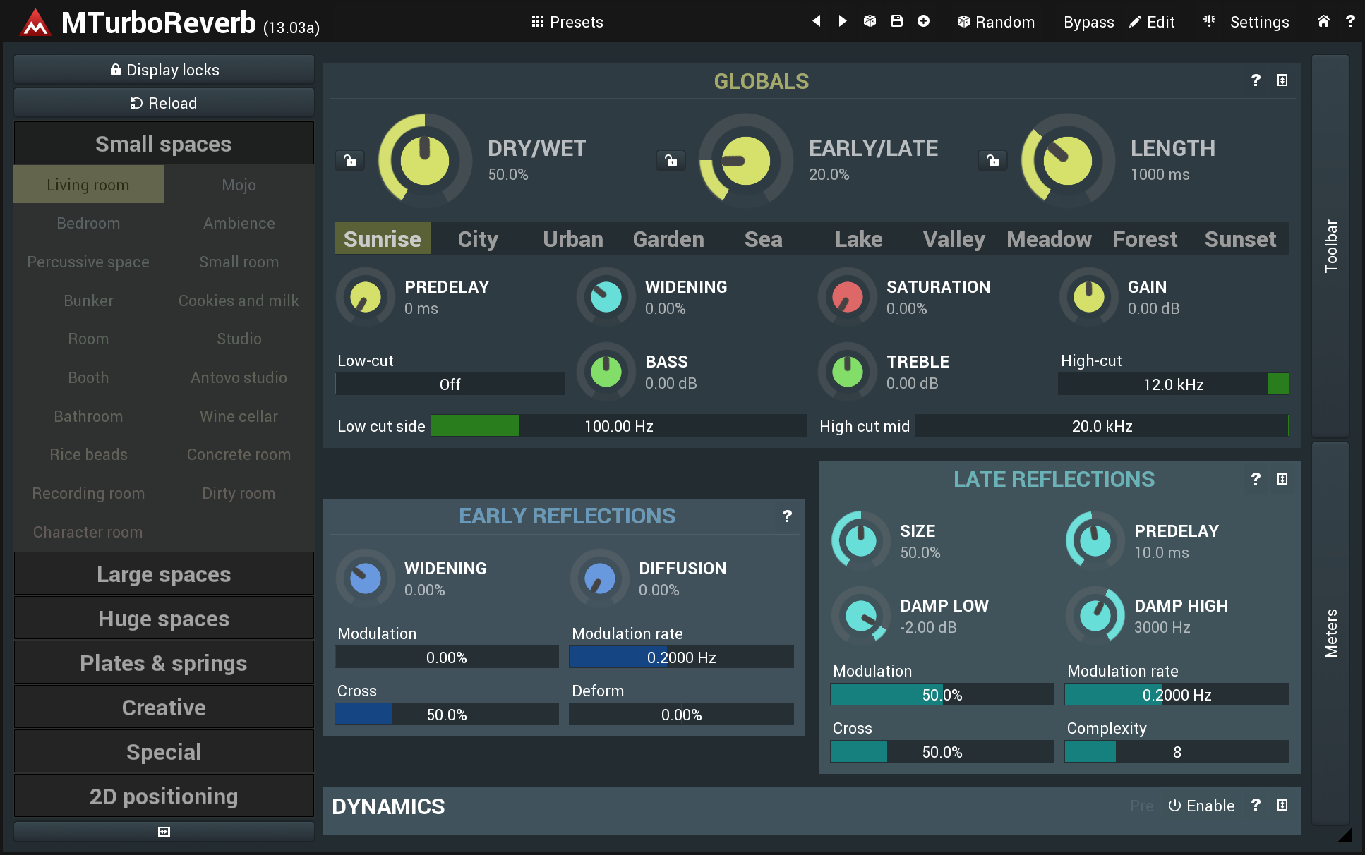
Main thing is I've centred the module text and coloured it the same as the buttons to give a bit of uniformity and cohesion. At present those module names get a bit lost in all of the white text labels. And reduced some of the bright-white contrasty text and the distracting colour on the presets.
I prefer lower-text case for everything apart from headings, but I haven't changed that since you can already select the option in preferences.
Main thing is I've centred the module text and coloured it the same as the buttons to give a bit of uniformity and cohesion. At present those module names get a bit lost in all of the white text labels. And reduced some of the bright-white contrasty text and the distracting colour on the presets.
-

- KVRian
- 938 posts since 23 May, 2010
I liked previous one (would be cool to have it as on option ) but I prefer the new look. I like where things are going with this - this new GUI feels much better.
I agree with the comments above - the knob should be bigger and outer ring thinner. Also I hope that the "locator" pointing to current value will be added in next beta, cause without it it looks weird (hard to immediately see current value even that outer ring shows that).
) but I prefer the new look. I like where things are going with this - this new GUI feels much better.I agree with the comments above - the knob should be bigger and outer ring thinner. Also I hope that the "locator" pointing to current value will be added in next beta, cause without it it looks weird (hard to immediately see current value even that outer ring shows that).
Free sample pack → spektralisk.com/free
-
- KVRAF
- 10376 posts since 2 Sep, 2003 from Surrey, UK
^^^^
Reinstall the previous version (v13.02?). Find the Neon Style file - it is in C:\ProgramData\MeldaProduction\MTexturedStyles here, named Neon.mstyle. Rename it to, say, Neon_01.mstyle.
Reinstall the beta version. Open a plug-in, select Neon_01 as its Style and "Select current Style as default". Please note that, you will need to select Neon_01 for any plug-in where you have already moved away from the default style.
Reinstall the previous version (v13.02?). Find the Neon Style file - it is in C:\ProgramData\MeldaProduction\MTexturedStyles here, named Neon.mstyle. Rename it to, say, Neon_01.mstyle.
Reinstall the beta version. Open a plug-in, select Neon_01 as its Style and "Select current Style as default". Please note that, you will need to select Neon_01 for any plug-in where you have already moved away from the default style.
-
- KVRAF
- 2067 posts since 13 May, 2004 from Germany
Is the beta with the new knobs available for everyone or just a circle of beta testers ?
-
- KVRist
- 229 posts since 7 Nov, 2002
Again, have to say I like the direction of these adjustments. Having the colored knobs isn't as distracting anymore likely because all the preset colors are more muted. Along with the other format changes, this still has the Melda 'vibe' while being easier to find your way around the UI.wilx wrote: Sat Jun 22, 2019 10:19 am A suggestion:
I prefer lower-text case for everything apart from headings, but I haven't changed that since you can already select the option in preferences.
Main thing is I've centred the module text and coloured it the same as the buttons to give a bit of uniformity and cohesion. At present those module names get a bit lost in all of the white text labels. And reduced some of the bright-white contrasty text and the distracting colour on the presets.