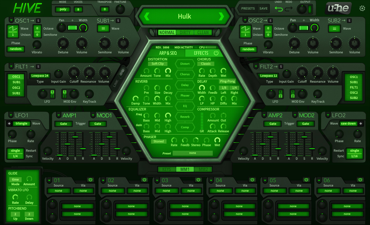
Here's my thinking after looking at this again (1-3 were suggested yesterday, #4 is new):Urs wrote: Fri Apr 12, 2019 1:55 pmLots of discussions here. We can refine this if necessary. We've planned to do some tests, but nothing set in stone.Funkybot's Evil Twin wrote: Fri Apr 12, 2019 1:37 pm 2. The Cutoff and Resonance knobs are burried in the filter section (burying the lede). I'd probably put Cutoff and Responance where the Input and Volume knobs are, and adjust some things in that bottom row.
1. Move Cutoff and Resonance where Input and Volume are currently located. This gives the most important controls the most prominence in the filter section. Hint: there's some empty space above, so you could even space them out a little more (from the row below) and maybe make them bigger if desired.
2. Move the Input knob to the far left of the bottom row in the filter section.
3. Move the Volume knob to the far right of the bottom filter row.
4. Now...on the right-side of the GUI, begin with the Cutoff and Resonance knobs on the far left for filter 2, then put the filter routing control to the right of that. So that top row would visually mirror what's happening in Filter1. Bottom row of knobs would follow the same layout as right-hand side.
I think those tweaks to the filter section would make the GUI both more symmetrical, but also more logical (most prominent knobs are displayed more prominently, input on the far left final output on the right to mirror flow).