Updated GUI is not always an improvement.

Audio Plugin Hosts and other audio software applications discussion
RELATED
PRODUCTS

Post

Recently I went back to my old DAWs. So I installed Cakewalk Sonar 4, Guitar Tracks 2, Cakewalk Project5 version 1.
I was surprised that in general I liked the look and the ''feel' of older software.
But for whatever reasons developers feel a need to often mess up a good design only because this year version has to look upgraded to the previous one and thus fixing what wasn't broken.
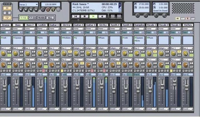
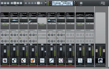
Here are some of my examples, first Cakewalk Sonar X1 and its successors (up to the current one) compared to Sonar 4 from 2004:
Image
Image

Is the top, newer version any improvement over clean and functional Sonar 4 mixer?


Then Cakewalk Guitar Tracks version 1,2,3 and 4:
Image
Image
Image
Image
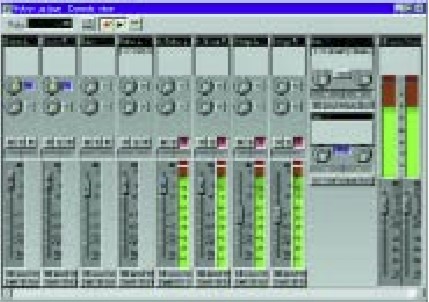
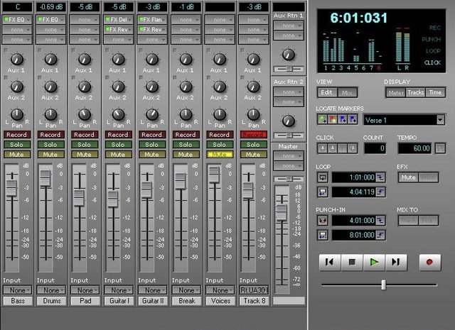
Again, my favourite mixer design is the GT2 one from 2002.

But it's not just Cakewalk. The same about Presonus Studio One, I liked the GUI in version 1 and 2 but 3 and 4 lost that appeal for me.

What are your thoughts, do the developers try to hard to invent something new rather that concentrate on small changes when most users are happy with the tool they already have.
Last edited by Monsum on Mon Jun 15, 2020 3:51 pm, edited 2 times in total.

Post

Functionality and approachability trumps everything. If those items aren't #1 in design, everything else falls flat.
Have you tried Vital?

Post

I'd agree to some degree. The "dark is Pro" deal is a not something I care for. I never loved all of Studio One's design, though I loved that it was paned instead of the stack of windows that was Cubase at the time. But the same tiny icons and text, as well as the large number of functions and tools all over the place makes honing in on the one I want difficult for me. I'm a lighter colors, less is more fan.

Rather than wishing for more features, I wish they all let you eliminate what you don't need or want so you can focus on just what you use. Logic, Cakewalk, and Reaper let you do this to a large extent, but not fully which is almost a frustrating as not being able to do it at all. For instance, you can't get rid of the icon bar in Reaper, Logic won't let you fully customize the transport display, and Cakewalk won't let you get rid of the dock below. You can theme Reaper, but you're always stuck with Windows XP dialogs.

Does anyone remember when Cubase used to let you customize the menus? I'm not sure why developers are so loathe to allow complete configuration. In some cases I think its ego (what we designed is too good to be changed), and some cases not wanting to support dumbasses who change stuff then call to ask where a feature is.

Post

Actually, let me amend. I absolutely agree with the topic title.

Post

I think it’s not so much developers who dumb down the software but management types. I don’t see it happening as much with small one or two person operations.
gadgets an gizmos..make noise~crystalawareness.bandcamp.com/ soundcloud.com/crystalawareness Restocked: 5/2026
if this post is edited -it was for punctuation, grammar, or to make it coherent (or make me seem coherent).

Post

CrystalWizard wrote: Sun Jun 07, 2020 7:09 pm I think it’s not so much developers who dumb down the software but management types. I don’t see it happening as much with small one or two person operations.
Yeah, probably. It's also a matter of who they think their target audience is.

If they think that their products are bought mainly by a bunch of kids who want to play around and make some beats, they're going to make each iteration visually attractive and different just for the sake of it.

If they think they sell their stuff to professionals, semi-professionals and mature hobbyists who would appreciate slow but study evolution of their favourite DAW, they will not bother too much about bells and whistles.
For me a good example is Ableton Live which basically looks the same as its first version.

Here are some screenshots of my Steinberg Remix (came out in 2002 or even 2001) which as far as I know was equivalent to a limited edition of Live 1.

Image

Image

Post

I run Sonar 4 Studio on my XP machine from time to time - I have nothing against that gui at all.
Cakewalk missed many updates from me going X1, X2 and then X3 I bought upgraded. Then Sonar Artist 2015 was my last one.

Now running Cakewalk by Bandlab only due to liking the dark theme, I don't use anything really that is not in SA2015.

Maybe they had this idea with ProChannel that would be difficult to do in up to Sonar 8.5.3 gui.

But it takes guts to do what Cakewalk did - and kind of like that anyway.
They are pretty much alone in the frequent update thing too.
Quite a range of fixes just about every month.
I still run 2020.01 though, waiting for some reported things to be fixed.
Excellent daw IMO.

Post

Monsum wrote: Sun Jun 14, 2020 4:14 pm
CrystalWizard wrote: Sun Jun 07, 2020 7:09 pm I think it’s not so much developers who dumb down the software but management types. I don’t see it happening as much with small one or two person operations.
Yeah, probably. It's also a matter of who they think their target audience is.

If they think that their products are bought mainly by a bunch of kids who want to play around and make some beats, they're going to make each iteration visually attractive and different just for the sake of it.

If they think they sell their stuff to professionals, semi-professionals and mature hobbyists who would appreciate slow but study evolution of their favourite DAW, they will not bother too much about bells and whistles.
For me a good example is Ableton Live which basically looks the same as its first version.

Here are some screenshots of my Steinberg Remix (came out in 2002 or even 2001) which as far as I know was equivalent to a limited edition of Live 1.

Image

Image

But in reality, professionals who are working for big company and doing it for decades are using tools which often look like real life interface.

Image

Post

Agreed. Another example that for me fell down is Geist2 vs Geist. I like that Geist2 is resizable, but it's flat as hell and totally uninspiring for me. And, it's too big (and if I resize it the various components just get too small for my vintage sight...).

- Mario

Post

I agree to a certain extent. Sometimes developers just mess with a good thing to say they did something. However that's not always true. Sometimes changes are made for the better. There are definitely certain things I don't like about S1 v4's design decision but in general I like the UX better than S1 V2. There are so man things that are just easier to do now.

I only ever used Sonar with version 4 and sparingly at that, so I can't really comment too much on it, but X and up seem more functional to me, even if the interface is a bit too busy. I'm not in general a fan of skeuomorphism so they could cut a lot of that out by concentrating more on functionality than look, but sometime skeuomorphic designs to help the user orient themselves better when using the ui.

There are times when I think older designs are better. I still think Logic 9 was far more functional UI wise and looks wise than LPX. Things were far easier to read and the layout had almost no hidden functionality.
Studio One // Bitwig // Logic Pro // Ableton // Reason // FLStudio // MPC // Force // Maschine

Post

apoclypse wrote: Mon Jun 15, 2020 3:08 pm There are times when I think older designs are better. I still think Logic 9 was far more functional UI wise and looks wise than LPX. Things were far easier to read and the layout had almost no hidden functionality.
Totally agree!

Post

But in reality, professionals who are working for big company and doing it for decades are using tools which often look like real life interface.
To each his own. Izotope, for instance, stated that it was going to design clean and functional interface for its products and not mimic any old hardware from 70s or such.
Blog ------------- YouTube channel
Tricky-Loops wrote: (...)someone like Armin van Buuren who claims to make a track in half an hour and all his songs sound somewhat boring(...)

Post

Maybe. What saves the title premise is "not always", which is true. :) Updated is not always better. But I'd suggest "way more often than not" it actually is.

Post

But in reality, professionals who are working for big company and doing it for decades are using tools which often look like real life interface.
have you got the stats for that? Fabfilter would seem to be a counterexample, same for SynchroArts Revoice

Post

Regardless of the topic, I really can't recall people being bothered by software GUI's so much back in the days. They just used the things, and got a whole lot more done than the people nowadays...

That said, Reaper is where it ends for me though. Really can't use that thing, even if it would be more easy to use. That's the prime example of a sucky GUI.

Post Reply

Return to “Hosts & Applications (Sequencers, DAWs, Audio Editors, etc.)”