
I haven't read every post, but from my memory it was one influential poster, a fellow GUI designer who I think convinced him to do so, and he did.
But indeed as he joked, some of us, including me thought it was too bright.
Of course I would have wished he switched the dark elements for lighter and the lighter elements for darker, thus making overall area darker, but he went with the decrease in contrast, and some (not me) seem to like it.
rsp
Hive 2.1 Izmo skin by Plugmon
-
- KVRian
- 919 posts since 4 Jan, 2007
I tried again and you are right, it happens on the regular hive too. This behavior is confusing IMO.
If I drag a modulation I don't want to travel the mouse pointer back to the matrix to set the amount. Maybe dragging from a mod slot should autoselect the mod slot.
If I drag a modulation I don't want to travel the mouse pointer back to the matrix to set the amount. Maybe dragging from a mod slot should autoselect the mod slot.
-
- KVRian
- 778 posts since 17 Nov, 2015 from Yuma
omg really?zvenx wrote: ↑Thu Mar 11, 2021 11:36 pmIndeed.anttimaatteri wrote: ↑Thu Mar 11, 2021 11:07 pm the skin is damn nice here in the kvr-forum previews. when i start hive 2 on my system it looks way more grey in grey and less contrasty. is there a chance to get a version with more contrast?
He was convinced here to take away some of the contrast from his earlier versions.
rsp
i consider this the equivalent state to whats called muddyness in mixes ;D.
want the old contrast then ^^.
[aˈtoːm] [aːl] [ˈa(ː)tonaːl] III + II
https://soundcloud.com/atonalatomiceel https://soundcloud.com/user-628555238
https://soundcloud.com/atonalatomiceel https://soundcloud.com/user-628555238
-
- KVRist
- 209 posts since 4 Feb, 2015
Ah, I see. Unfortunate decision, though (in my opinion).zvenx wrote: ↑Fri Mar 12, 2021 4:06 pm I haven't read every post, but from my memory it was one influential poster, a fellow GUI designer who I think convinced him to do so, and he did.
-

- KVRist
- 344 posts since 3 Mar, 2015 from Japan
drzhnn never suggested that I should lower the brightness. What he meant is opposite -- lowering brightness is not the only way to soften the impression of high contrast, which I adopted for some elements.
The big reason for modest brightness is the contrast between modulation rings.
The lighter the background is, the harder it is to tell yellow/orange mod rings.
The big reason for modest brightness is the contrast between modulation rings.
The lighter the background is, the harder it is to tell yellow/orange mod rings.

-

- KVRAF
- 13224 posts since 16 Feb, 2005 from Kingston, Jamaica
I am a bit confused.
Is lowering the brightness synonymous with decreasing contrast? I was of the view he suggested you decrease the contrast:
rsp
Is lowering the brightness synonymous with decreasing contrast? I was of the view he suggested you decrease the contrast:
I for one didn't say anything about him suggesting you lowering the brightness unless they are viewed as the same thing.1. Reducing actual contrast between elements
2. Reducing number of contrasting elements
rsp
sound sculptist
-
Funkybot's Evil Twin Funkybot's Evil Twin https://www.kvraudio.com/forum/memberlist.php?mode=viewprofile&u=116627
- KVRAF
- 11519 posts since 16 Aug, 2006
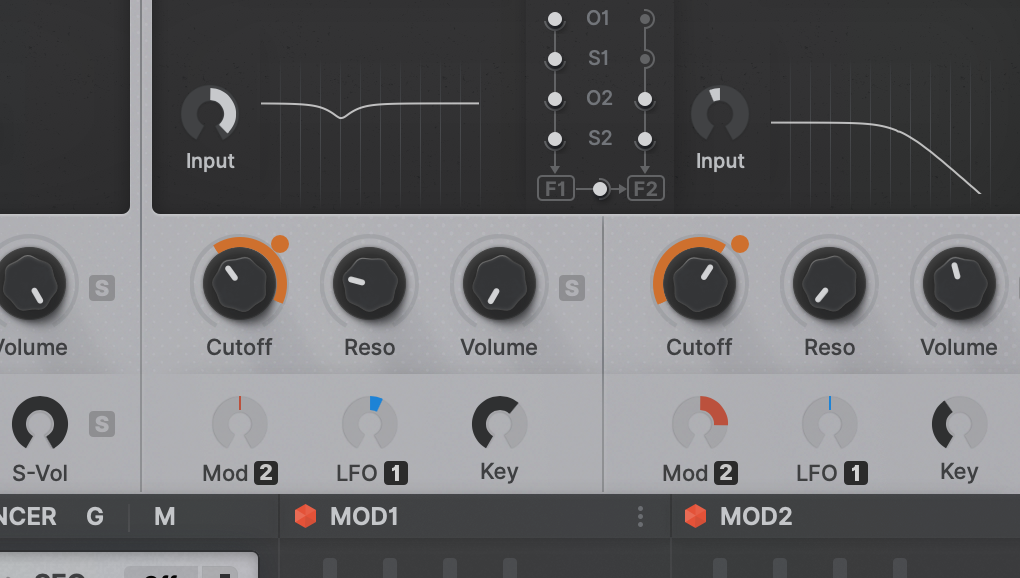
What do folks think of this Izmo mod? I basically recreated big chunks of Izmo in Affinity Desinger to facilitate recoloring elements, or just tweaked things in Photo. Changes are:
1. Replaced the paper white with the same shade of gray used in the default Hive 2 skin.
2. Darker elements are a bit darker too for more contrast
3. Changed some of the sub labels
4. Put light text inside dark windows for things like the voice mode, oscillator waveform name, XY #'s, etc.
5. Made the "FXBypass" orange when FX are enabled, and gray when disabled. Animated the switch (left off, right is on).
6. Added the default skin color to the waveform displays and logo for a splash of color
7. Added color to the FX on/off indicators to really let you know the difference between on and off
8. Vibrato indicator now is blue to match mod color
9. Centered the word VOICE in the top-left
10. As I recreated most panes, there's none of the textured noise that exists in the original theme, so it's a bit flatter/cleaner
I think the changes add just a bit of color, and result in a skin that's easier on the eyes. I just got this to a point where it looks good to me, and enough to show people what I did. I'll share if there's interest after I've had a few days to test/tweak.
-

- KVRist
- 204 posts since 7 Jul, 2004 from CrAzY-SoUnDlAbS
would be glad, because it will fit in the colors I prefer tooFunkybot's Evil Twin wrote: ↑Sun Mar 14, 2021 11:55 pm I'll share if there's interest after I've had a few days to test/tweak.
Affinity=good choice
Penta says...
https://soundcloud.com/sonical-dreams
https://soundcloud.com/sonical-dreams
-

- KVRian
- 1294 posts since 12 Nov, 2002 from Newcastle, UK
I really like the changes you've made! I took some time adjusting to Izmo and I now prefer the layout to the original GUI, your changes make it even betterFunkybot's Evil Twin wrote: ↑Sun Mar 14, 2021 11:55 pm I'll share if there's interest after I've had a few days to test/tweak.
"Micro Kid speaks digi-talk.."
-
midi_transmission midi_transmission https://www.kvraudio.com/forum/memberlist.php?mode=viewprofile&u=298730
- KVRian
- 989 posts since 13 Feb, 2013
Great work, good addition, but I prefer the original Hive. The new one is is sometimes a bit difficult to look at with these similar grey tones. A bit washed out. I like to see things more clearly.
-
- KVRAF
- 3251 posts since 30 Dec, 2014
Having tried the Hive 2 plugmon skin and not just looked at it, I find it to be on a whole, more of a nightmare to use. Stripped of simplicity, confusing, frustrating, unintuitive, aesthetically unappealing, and chaotic. Technically it's great though. The most beautiful of things, are often in their simplicity though.
KVR S1-Thread | The Intrancersonic-Design Source > Program Resource | Studio One Resource | Music Gallery | 2D / 3D Sci-fi Art | GUI Projects | Animations | Photography | Film Docs | 80's Cartoons | Games | Music Hardware |
-
- KVRist
- 173 posts since 25 Jul, 2005 from Vancouver, Canada
I am quite confused by some of the posts here, you would think it is like that time when Apple made everyone have a U2 album on their iTunes library, except this is just another skin choice to use; no one is forced to use it. Some people's feelings seem to be way too strong on the matter.
Personally, I am excited for the modifications some users will do to the Izmo skin here! Based on some other great skins for Zebra, MFM2 and Diva from users in this forum I think Hive will get a lot of attention. Maybe now I am so used to @plugmon's designs that I like it a lot as is.
Personally, I am excited for the modifications some users will do to the Izmo skin here! Based on some other great skins for Zebra, MFM2 and Diva from users in this forum I think Hive will get a lot of attention. Maybe now I am so used to @plugmon's designs that I like it a lot as is.
But then a strange fear gripped me
and I just couldn't ask....
and I just couldn't ask....
-
- KVRian
- 503 posts since 1 Jul, 2009
Izmo as an "official" skin should have a pleasing/user friendly color theme and not some fringe monochrome one, which would be OK for a 2nd variation. The layout is good the color theme is bad. I much prefer the gizmo mod.
-
- Banned
- 252 posts since 14 Oct, 2020
Looking much better! now that light grey could be the colour of original skinFunkybot's Evil Twin wrote: ↑Sun Mar 14, 2021 11:55 pm What do folks think of this Izmo mod? I basically recreated big chunks of Izmo in Affinity Desinger to facilitate recoloring elements, or just tweaked things in Photo. Changes are:
1. Replaced the paper white with the same shade of gray used in the default Hive 2 skin.
2. Darker elements are a bit darker too for more contrast
3. Changed some of the sub labels
4. Put light text inside dark windows for things like the voice mode, oscillator waveform name, XY #'s, etc.
5. Made the "FXBypass" orange when FX are enabled, and gray when disabled. Animated the switch (left off, right is on).
6. Added the default skin color to the waveform displays and logo for a splash of color
7. Added color to the FX on/off indicators to really let you know the difference between on and off
8. Vibrato indicator now is blue to match mod color
9. Centered the word VOICE in the top-left
10. As I recreated most panes, there's none of the textured noise that exists in the original theme, so it's a bit flatter/cleaner
I think the changes add just a bit of color, and result in a skin that's easier on the eyes. I just got this to a point where it looks good to me, and enough to show people what I did. I'll share if there's interest after I've had a few days to test/tweak.


