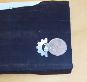
I wanted to practice using something relatively (for a newbie) complex so that I could learn as much as possible. I figured the "T" logo was just as good as anything.
First step-- used the colour scheme selector to provide myself with a white background and a black logo in the project window, and took a screen shot. Then I resized it a few times (not knowing what size I'd need) and printed them out.
Next step-- I chose the largest size possible that would fit onto the 'scrap' mother of pearl that I had available. The end result was that the entire logo is about the size of a quarter.
Third step-- I cut out and glued the "T" and the "Sprocket" onto two different hunks of MOP, then individually clamped them into a small bench-mounted vise and used the Dremel tool to cut them to shape. Then I cleaned up the edges with hand tools
Fourth step-- put tape on the ebony, then glued the T logo into place (eyeballing the two pieces, so it might not be absolutely perfect) and then used an Xacto to score into the ebony around the MOP.
Fifth step-- remove the logo, leaving just the 'outside' part of the tape affixed to the ebony. Used my initial score lines to continue scoring into the wood. Ebony is mother effing hard wood.
Sixth-- removed the tape and filled the score lines in with white chalk so that I'd have a visual cue.
Seventh-- used the Dremel tool again to 'hog out' as much of the ebony as I could
Eighth-- used hand tools to gouge out right up to the edges. This took a lot of work because even when I thought I was at the right spot, I wasn't. I had to keep test-fitting the MOP and cutting out weee weee bits of ebony until she finally fit.
Ninth-- used Krazy Glue to glue the logo into the cavity
Tenth-- mixed some ebony shavings and Krazy Glue together to fill in any gaps left by imperfect routing
Eleventh-- used an orbital sander to level it all out
Twelfth-- put some varnish over top just to darken up the wood. I didn't buff to a mirror shine because it's just a practice piece.
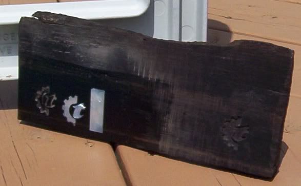
You can see my first attempt on the right, my second attempt to the left of the actual inlay, and then the final "T" inlay. The rectangle was also practice because I'm going to inlay my fretboard with block inlays (a la Les Paul) and I wanted to reassure myself that it's much easier to do a block.
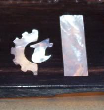
The "T" logo and the block together. The block has a bit of a chip out of it, but it's just a practice piece anyhow. The funny thing is, the first attempt was horrible but the pictures turned out well. The third attempt turned out well but the pictures make it look like crap. Ah well.
 You'll just have to trust me that it looks pretty good in person!
Me? Fanboy? Whatchatalkingabout....
Greg