KVR - 50 Shades of Blue

Any problems with the site? How can we improve KVR?
Post Reply New Topic
RELATED
PRODUCTS

Post

In the future I will write hundreds of CSS sheets to "overload" the CSS of all bad looking homepages.

I won't be bored any more...for the rest of my life I'll just write better CSS sheets for all websites that I don't like!

Sorry, if I won't have time for making music anymore...

:tantrum:

Post

George wrote:
aMUSEd wrote: Yeah I found the Stylish extension - it's available for Safari too incidentally - but couldn't find any scripts that work for KVR and wouldn't know how to write one. What theme did you use?
Try http://pastebin.com/raw.php?i=MQeDfhdq

I could do one or two more in the future.
Thanks - can't get it to work. I edited the css, adding the above and making the url point to http://www.kvraudio.com but when I click on the Stylish button it still says "no styles for this page"

Post

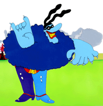
I figured out where Ben got his new color scheme from.

Welcome to Blue Meanie KVR!

Image

Post

Move along. Nothing to see here.
This is the same method MJ used when he was working on Anthony Marinelli's Thriller.

Post

Edit: I didn't want to be mean. :hihi:

I will say that the colors clash too much. It needs contrast. A light on dark color scheme would be better than this light on light.

Also, this color blue doesn't mix well with the grayish/midnight blues of the posts.
Last edited by HaganeSteel on Fri Aug 09, 2013 12:08 am, edited 1 time in total.

Post

Frantz wrote:I figured out where Ben got his new color scheme from.

Welcome to Blue Meanie KVR!

Image
Not quite sure. He might have watched too much "Captain Blaubär" ("Blaubär" = "Blue Bear")...

Image

Post

For information on risks and side effects read the CSS and ask your designer:

Image

Post

KVR looks ugly now. And at my resolution 1920 x 1080 the left half of the window is news/forum, the right side just ugly blue.

Also, selecting text with mouse-over presents the user with yellow..

Some more scripts running too.

Why do you make KVR look worse?

Post

About the new feature currently in Beta, I like that I can keep track of the plugins I use and the ones I want directly on KVR. Also this tool will help me know what Plugins have updates available.

It would be nice if we could add our own plugins as well to our lists via customization (I can only add Halion 4, not 3 because 3 is no longer in the KVR database). There's only Lounge lizard 4, not 3. So if you want to add a plugin to your list you may have select one you actually don't own (I haven't upgraded to Halion 4). There's also only the PLAY version of EWQLSO gold, not the Kompakt version. Other than that, cool stuff.
Play it by ear

Post

Tricky-Loops wrote:He might have watched too much "Captain Blaubär" ("Blaubär" = "Blue Bear")...
Blue Bear would be a major improvement over the current design.

To be clear, here is the complete derivation of the Blue Meanie KVR color palette:

Image

:D

Post

Frantz wrote:.

To be clear, here is the complete derivation of the Blue Meanie KVR color palette:

Image

:D
excellent. :hihi:

Post

My initial impression was 'ooh, pretty'
but my lasting impression is 'cool except for the profile icons (looks gimicky and 'social-networking-ey'), and the faded-blue background makes reading forum pages much less easy on the eyes/brain. '

I think if you changed the background to a flat colour again Ben, that would sort out the site more than anything else.
Cheers-
M@

Post

The old style was way better, more professional and easy on the eyes.
Press the undo button Ben, please! :cry:

Post

WiKID!!! Nice going on the site. I'm so happy this place has kept going and growing. It's simply fantastic. I for one LOVE the changes, all the new personalization... everything. It's all great!!! :tu:

Post

I can only assume that there was a snotload of "internet blue" going cheap after Musicradar sank.

Oh, my eyes / change for the sake of change / sack the focus group who thought this was a good idea, etc.
"are we there yet?"

Post Reply

Return to “Site Stuff”