


That's why CSS has the ridiculously useful max-width property. Which, for whatever reason, is rarely used in web sites.mystran wrote:edit: oh and short-lines are much faster to read.. ideally you can read the whole line with a single "look" (I don't know what it's called in English) and just scan top to bottom.. if it's too wide, that won't work anymore, which will seriously hurt the reading speed for most people
KVR - 50 Shades of Blue
-

- KVRAF
- 8472 posts since 18 Apr, 2004

-
AdmiralQuality AdmiralQuality https://www.kvraudio.com/forum/memberlist.php?mode=viewprofile&u=83902
- Banned
- 6657 posts since 10 Oct, 2005 from Toronto, Canada
Max width: 2 inchesfarlukar wrote:That's why CSS has the ridiculously useful max-width property. Which, for whatever reason, is rarely used in web sites.mystran wrote:edit: oh and short-lines are much faster to read.. ideally you can read the whole line with a single "look" (I don't know what it's called in English) and just scan top to bottom.. if it's too wide, that won't work anymore, which will seriously hurt the reading speed for most people
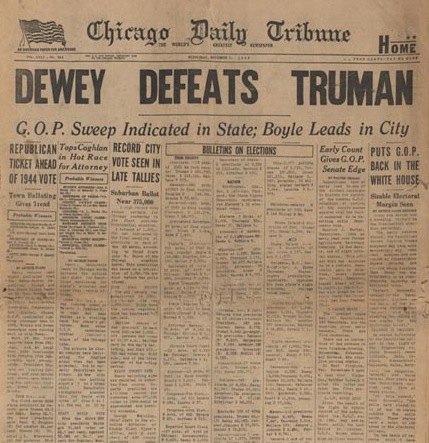
Point: People don't like reading in Panavision.

-
- KVRist
- 366 posts since 7 Apr, 2011
I gave it a few days before making comments. Now that I am used to the new interface, I have to say that I don't like it. Aside from the color scheme that looks like I choose it (no visual art skills whatsoever), the new interface is harder to navigate. Maybe I need to go in and set up myKVR to get back the bigger buttons and links for latest topics, but I would rather make music than spend hours learning to configure my own website. Ironically though, I don't seem to mind spending a few minutes complaining about it. Oh well.
-
- KVRAF
- 4056 posts since 8 Jan, 2005 from Hamilton, New Zealand
I have to thank this thread for putting me onto the 'stylish' plugin. Not only does KVR look better now, but I used the 'Facebook App' style with facebook and that's immeasurably improved too.
I make music: progressive-acoustic | electronica/game-soundtrack work | progressive alt-metal
Win 10/11 Simplifier | Also, Specialized C++ containers
Win 10/11 Simplifier | Also, Specialized C++ containers
-
- Pick Me Pick me!
- 10251 posts since 12 Mar, 2002 from a state of confusion
metamorphosis wrote:I have to thank this thread for putting me onto the 'stylish' plugin. Not only does KVR look better now, but I used the 'Facebook App' style with facebook and that's immeasurably improved too.
Yes.. this is a useful plugin indeed.
-

- Banned
- 10196 posts since 12 Mar, 2012 from the Bavarian Alps to my feet and the globe around my head
In my life some things came out of the BLUE, too (not only the new KVR design)...thecontrolcentre wrote:Kriminal wrote:Story of my life...thecontrolcentre wrote:It's never looked great. Long as it "works" I don't mind.Kriminal wrote:'works' fine here too...at least same as it was....just looks like i redesigned it ...ie its a fuckin mess.thecontrolcentre wrote:Seems to work fine on my android mobile.

-
- KVRian
- 730 posts since 13 Apr, 2002 from Terra Australis
In magazines and websites you can always tell who has the power behind the scenes by how the ads are placed. In this redesign it's obvious that the emphasis is on ad placement.
Other embellishments are laughably incompetent - such as the breadcrumbs area: a huge slab of highly prominent dead space. Having four navigation areas is also worthy of a what-not-to-do masterclass.
All up it's probably on par with the last botched redesign. Anyone remember all those huge and redundant icons which were eventually deleted?
Other embellishments are laughably incompetent - such as the breadcrumbs area: a huge slab of highly prominent dead space. Having four navigation areas is also worthy of a what-not-to-do masterclass.
All up it's probably on par with the last botched redesign. Anyone remember all those huge and redundant icons which were eventually deleted?
-
- KVRAF
- 2973 posts since 10 Sep, 2003 from Karlskoga, Stockholm, Sweden
I really like the new videotab!
-

- KVRAF
- 5440 posts since 4 Aug, 2006 from Helsinki
I agree.mystran wrote:Cramped or not, curiously this new one requires much more accurate mouse precision, which means it's significantly harder to navigate quickly using a track-pad on a laptop.Compyfox wrote:Okay, after some tweaks (by the crew it seems), it's definitely Windows 8.
Now I kind of want the old cramped design back.
Oh and the white-text on light-blue is kinda eye-hurting (high saturation, low contrast). The darker shades of the previous iteration where definitely easier to look at.
I liked both the functionality and the design of the old site better.
Example: if I like to see the latest posts, now I need two clicks in stead of one (Forum dropdown - latest. And the present "All" menu is really messy. H.
-

- KVRAF
- 7413 posts since 8 Feb, 2003 from London, UK
Surely if you resize your windows you expect the content to reflow? Using a fixed width prevents this, which is what some people are complaining about. Stylish lets you overcome this with a rule (i.e. replace the fixes width with a percentage width).mystran wrote:I don't really agree.. my browser on desktop is usually about half-screen wide, and even on laptop it's rarely full-screen. It's very hard to multi-task with full-screen windows, much easier when you can fit things side-by-side.contrast wrote:A forum that doesn't expand to fill widescreen monitors in an age where everyone is using widescreen monitors is not a good idea.
edit: oh and short-lines are much faster to read.. ideally you can read the whole line with a single "look" (I don't know what it's called in English) and just scan top to bottom.. if it's too wide, that won't work anymore, which will seriously hurt the reading speed for most people (though it's probably most obvious with people that read fast in the first place).
-
- KVRAF
- 3227 posts since 4 Jan, 2005
I used this to downsize a photo for an Avatar http://www.shrinkpictures.com/create-avatar/ BAZINGA !!!!!
-

- Mr KVR
- 1591 posts since 23 Oct, 2000 from UK
- KVR Audio
User avatars can now be blocked at http://www.kvraudio.com/mykvr.php?m=prefs
The forum wide options should now work properly.
The forum wide options should now work properly.

-
- KVRAF
- 5646 posts since 18 Jul, 2002
Nicer color scheme indeed.