nilhartman wrote:Can't find the most recent 2.8 screenshot Urs posted some times ago... looked damn elegant and easy/fast to operate, can't wait for that update.

We been eager since then...nilhartman wrote:Can't find the most recent 2.8 screenshot Urs posted some times ago... looked damn elegant and easy/fast to operate, can't wait for that update.

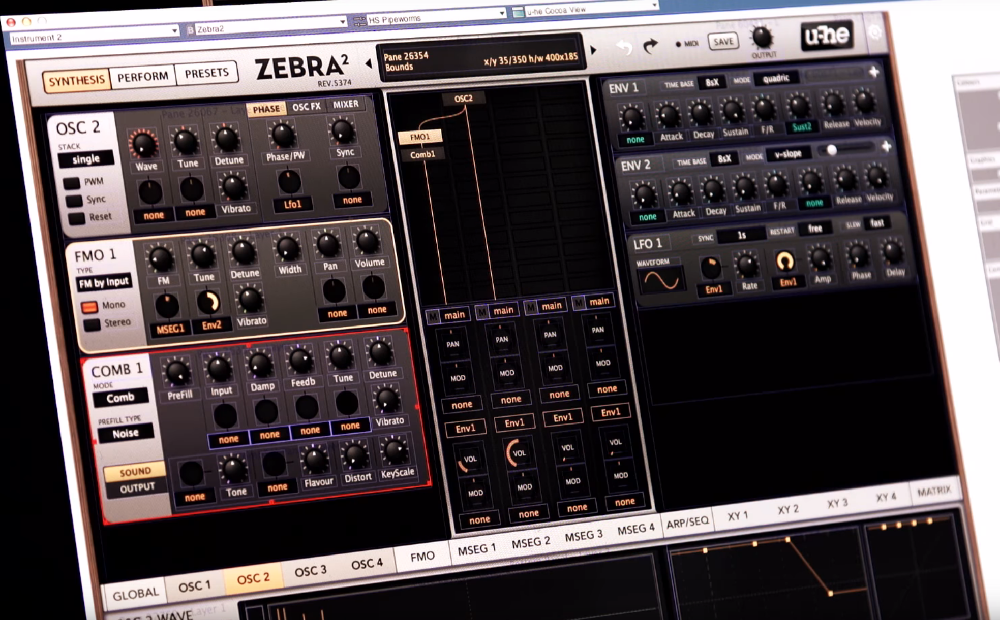
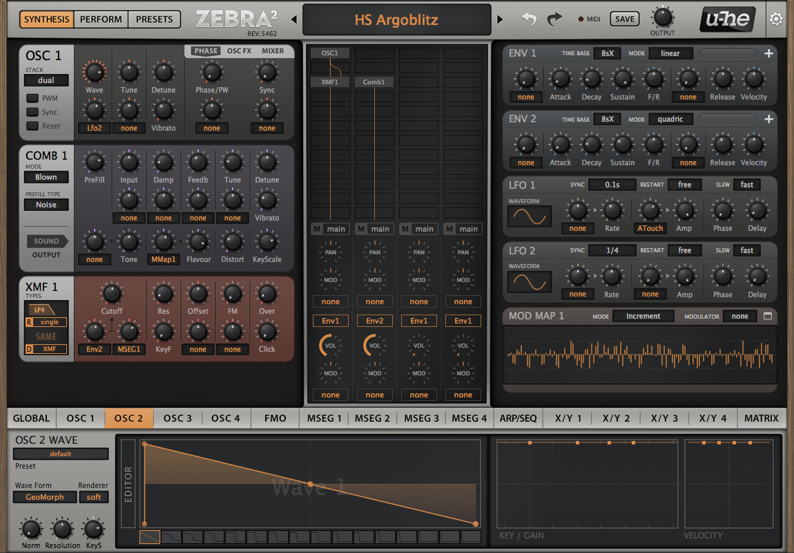
Nice! The line instead of the arrow on the knobs is distinctly clearer... I like that the white background for the Osc tabs is gone... and the shading on the Osc graphs looks good. Glad to see the numbering on the Osc waves, plus you got rid of the shorter divider lines between groups of tabs which seems like an improvement.Urs wrote:We been eager since then...nilhartman wrote:Can't find the most recent 2.8 screenshot Urs posted some times ago... looked damn elegant and easy/fast to operate, can't wait for that update.
It is perfect! You have an excellent own style of interface design, do not imitate anyone, as suggested above.Urs wrote:We been eager since then...nilhartman wrote:Can't find the most recent 2.8 screenshot Urs posted some times ago... looked damn elegant and easy/fast to operate, can't wait for that update.

Word.mrj1nx wrote:Totally agreed, not worried about UI for any of u-he's future products. Z 2.8 looks really great and in general I think u-he's is one of the leaders in UI.
The gradient is... pretty. I was hoping for a maybe a lavender type of colour, but Basti, our designer, felt like he had to stop me there.Sound Author wrote:I like how the little notches around the knobs is a bit subtler now. And as pdxindy pointed out, the line instead of the arrow makes the knobs pop a little more. I do think the gradient in the envelope editors is a bit extreme though. But I could get used to it.
Something the forum could do with.Urs wrote:stronger knob indicator

Submit: News, Plugins, Hosts & Apps | Advertise @ KVR | Developer Account | About KVR / Contact Us | Privacy Statement
© KVR Audio, Inc. 2000-2026