
Viper|1.2.2 update with bugfixes and new skin
-
- KVRian
- Topic Starter
- 1238 posts since 29 Sep, 2004
I have one nasty bug left, and then I need to make the factory bank 3, so not long now.
http://www.adamszabo.com/ - Synths, soundsets and music
-
 Touch The Universe Touch The Universe https://www.kvraudio.com/forum/memberlist.php?mode=viewprofile&u=190615
 - KVRAF
- 5845 posts since 2 Oct, 2008
Don't post anymore until it is finished so it will be released on your 604th post!
100 High Quality Soundsets: Omnisphere 2, Dune 3, Tone 2 Synths, Pigments, Uhe Synths, Halion, Spire, and others.
TTU Youtube
TTU Youtube
-
Echoes in the Attic Echoes in the Attic https://www.kvraudio.com/forum/memberlist.php?mode=viewprofile&u=180417
- KVRAF
- 12040 posts since 12 May, 2008
After I heard that a 64 bit version was being developed I decided to test this (I can do so in Bitwig even though I stay away from 32but plugins). I must say the sound is very good and really is the first time that I've heard that Virus kind of quality in software. Spire is close but I find it generally a bit thinner than the virus. Viber seems to have a fuller sound and get that good kind of dirty.
I do have a couple comments:
-It's really cool that pretty much every parameter is exposed to the host through automation IDs, it means that it can mostly be controlled by hardware like Novation Automap, nektar controllers, Push, Maschine, Komplete Kontrol etc. The one little exception is the wavetable menu. You can change the osc type with the autoation ID, but not the selected wavetable. When I tweak a preset, the first thing I'll ften do is go through other waveforms and it's really nice to be able to sit at a controller keyboard and turn a knob to try different waveforms. Several other synths allow this, such as some tone2 synths and Spire, where the menu selection is an automatable control. Even if you don't want to assign the full range to the control, in case the menu might grow, you simply have to assign a full range that is well beyond how many items would populate the list and have that be the full range. So for example if the menu has 100 items, maybe you make the waveform selector parameter 200 values and only the first 100 are populated. It still allows control over the values from automation. And for example novation allows you to set the full range and range you want to control separately. So with the above example, I'd set full range = 200, but the control covers values 1-100. Spire has a rather extreme version of this where the full range of a menu is 100 or something when there are only real values in the first 6 or so slots.
Secondly, I really like the GUI, I think it looks great. But something I've noticed is that it's actually a lot harder to work on a GUI that does not show certain combinations of pages at the same time. For example there is no way to have an oscillator and filter seen at teh same time. Or modulations and filter or an osc. This makes for more switching than is really fun because you are constantly going back and forth between pages. Spire for example handles a massive amount of controls pretty well. The oscs are tabbed, but you always see the filters, and there is a separate tabbed area for modulation that you see at teh same time as the filters and one of the oscs. This allow working on a few different aspects that work together (like changing the filter cutoff at the same time as adjusting an envlope or other modulation etc.), which is really useful. I would strongly consider trying to take this approach and have a couple areas that can be seen and adjusted at the same time.
Cheers
-
 VELLTONE MUSIC VELLTONE MUSIC https://www.kvraudio.com/forum/memberlist.php?mode=viewprofile&u=404834
 - KVRAF
- 2441 posts since 19 Sep, 2017 from The Future
Definitely most interesting and intuitive synth after Sylenth1 i have tried 
I'd recommend to all developers to leave save function and to remove import cuz i made some really cool stuff with the demo and was not able to save and share them
I'd recommend to all developers to leave save function and to remove import cuz i made some really cool stuff with the demo and was not able to save and share them
-
- KVRAF
- 5664 posts since 7 Feb, 2013
Viper's GUI exactly copies the layout of Virus Control plugin with an added bonus - you have these little tabs on the left which you can't tweak but you can see what's going on in each of the big tabs. Thus you can overview the whole patch when you are tweaking each of the tabs.Echoes in the Attic wrote: Secondly, I really like the GUI, I think it looks great. But something I've noticed is that it's actually a lot harder to work on a GUI that does not show certain combinations of pages at the same time. For example there is no way to have an oscillator and filter seen at teh same time. Or modulations and filter or an osc. This makes for more switching than is really fun because you are constantly going back and forth between pages. Spire for example handles a massive amount of controls pretty well. The oscs are tabbed, but you always see the filters, and there is a separate tabbed area for modulation that you see at teh same time as the filters and one of the oscs. This allow working on a few different aspects that work together (like changing the filter cutoff at the same time as adjusting an envlope or other modulation etc.), which is really useful. I would strongly consider trying to take this approach and have a couple areas that can be seen and adjusted at the same time.
Cheers
I see your point, but on the other hand for someone who is used to programming Virus TI with the plugin the transition to Viper is very smooth. Actually I think that the Virus Control GUI is very logical in terms of the process of building a sound from the ground up, like you are moving from shaping the bare oscillators to adding the filters and shaping the envelopes, then you assign the LFOs etc. Some things may seem redundant, like the preassigned modulations and the extra slots in the LFO section (we have the matrix for that, don't we? couldn't they ditch these to make the LFO section smaller and put it where the filters/envelopes are?) but actually they are very handy and moreover I'd say that they suggest certain patch structure and basically make Virus what it is.
I agree that Viper sounds much closer to Virus than Spire or any other synth. I'm one of the most annoying Virus fanboys out there, but Viper basically replaces Virus as a VA for me (there is also the wavetable area, but Serum and Rapid loaded with Virus TI wavetables can do the job)
You may think you can fly ... but you better not try
-
Echoes in the Attic Echoes in the Attic https://www.kvraudio.com/forum/memberlist.php?mode=viewprofile&u=180417
- KVRAF
- 12040 posts since 12 May, 2008
That's nice that it's an easy transition from a virus editor to this but I'm not sure that is more important than overall usability and people coming from other synths besides the virus. I'm just finding it too much back and forth. I didn't really think of it until now but pretty much every synth I use that has tabs usually allows certain important parameters to seen at once, at the very least osc settings and filter settings and usually modulation is possible to see at the same time as a parameter being modulated which is very important. Without that, you spend half your time clicking back and forth between pages when working on a single element of the sound. And as nice as it is to see the settings on the left tab, that doesn't really help this situation. When I first saw it I thought, oh brilliant, you can edit a few important parameters of other pages over on the left. Nope, just an image of the parameter value, not editable. I hate to say, and like I said I like the look of the GUI, but I don't think the layout would quite work for me.recursive one wrote: Viper's GUI exactly copies the layout of Virus Control plugin with an added bonus - you have these little tabs on the left which you can't tweak but you can see what's going on in each of the big tabs. Thus you can overview the whole patch when you are tweaking each of the tabs.
I see your point, but on the other hand for someone who is used to programming Virus TI with the plugin the transition to Viper is very smooth. Actually I think that the Virus Control GUI is very logical in terms of the process of building a sound from the ground up, like you are moving from shaping the bare oscillators to adding the filters and shaping the envelopes, then you assign the LFOs etc.
-
- KVRAF
- 5664 posts since 7 Feb, 2013
Ha, yes! When I saw the first GUI screenshots I also thought "I will be able to tweak these little tabs as I'm working with a big one, how cool!" But it wasn't quite a bummer anyway, I'm really used to Virus Control GUI. Actually when I bought Virus TI I already had some experience with programming Spire, Sylenth and Dune2 and it didn't take much time to get used to Virus Control layout. Spire, Serum and Virus (now Viper) are the synths which I use basically every day, I make new patches and modify existing ones all the time and I can't say that any of them provides better overall programming experience that the others, they all have their pros and cons (e.g. I like seeing all oscillators at once but Spire shows only one of them).Echoes in the Attic wrote:That's nice that it's an easy transition from a virus editor to this but I'm not sure that is more important than overall usability and people coming from other synths besides the virus. I'm just finding it too much back and forth. I didn't really think of it until now but pretty much every synth I use that has tabs usually allows certain important parameters to seen at once, at the very least osc settings and filter settings and usually modulation is possible to see at the same time as a parameter being modulated which is very important. Without that, you spend half your time clicking back and forth between pages when working on a single element of the sound. And as nice as it is to see the settings on the left tab, that doesn't really help this situation. When I first saw it I thought, oh brilliant, you can edit a few important parameters of other pages over on the left. Nope, just an image of the parameter value, not editable. I hate to say, and like I said I like the look of the GUI, but I don't think the layout would quite work for me.recursive one wrote: Viper's GUI exactly copies the layout of Virus Control plugin with an added bonus - you have these little tabs on the left which you can't tweak but you can see what's going on in each of the big tabs. Thus you can overview the whole patch when you are tweaking each of the tabs.
I see your point, but on the other hand for someone who is used to programming Virus TI with the plugin the transition to Viper is very smooth. Actually I think that the Virus Control GUI is very logical in terms of the process of building a sound from the ground up, like you are moving from shaping the bare oscillators to adding the filters and shaping the envelopes, then you assign the LFOs etc.
Anyway I see your point. E.g., I'm not very comortable with programming Discovery Pro, it's quite simple synth compared to Virus/Viper/Spire etc but some things (e.g. the way to assign velocity to different targets) just don't make sense to me. I guess it was directly copied from Nordlead which I never had. But I doubt Adam will redo the GUI from the ground up and I think it makes more sense to concentrate on other things (64 bit before everything, then probably some wavetable thing).
You may think you can fly ... but you better not try
-

- Banned
- 10729 posts since 17 Nov, 2015
Havent forgotten, still working on it.Distorted Horizon wrote:AwesomeAnX wrote:Sure, i'll try and upload next week.Distorted Horizon wrote:Interested to share those?AnX wrote:Thats excellent. I have made a ton of these, sampled from my own gear. Bring on the 64bit so i can give it a whirl
I put some links up a few pages back to some other free ones.
-
- KVRAF
- 35676 posts since 11 Apr, 2010 from Germany
Me too, TBH. I don't quite see the point of displaying all those parameters when you can't change them. And I do get the point about the many pages as well.recursive one wrote: Ha, yes! When I saw the first GUI screenshots I also thought "I will be able to tweak these little tabs as I'm working with a big one, how cool!"
-
- KVRian
- 1185 posts since 27 Apr, 2016
Virus users are very well aware of the quirks of Virus Control and we Virus users suffer it because of the sound, which in my humble opinion is by far superior to any soft synth that exists. If you can get close to virus sound with Viper you are blessed.
Adapt and benefit from the sound. let's not forget what synths are actually about.
Adapt and benefit from the sound. let's not forget what synths are actually about.
-
- KVRian
- 1185 posts since 27 Apr, 2016
If I am understanding it right from what I see.. are they not there to show you what tab those controls are on ? That is more than actual virus GUI. And it can be useful maybe even inspiring to see what you have available for tweaking. Even if you cannot tweak them it reminds you of the depth of synthesis under your control.... mwa ha ha ha.chk071 wrote:Me too, TBH. I don't quite see the point of displaying all those parameters when you can't change them. And I do get the point about the many pages as well.recursive one wrote: Ha, yes! When I saw the first GUI screenshots I also thought "I will be able to tweak these little tabs as I'm working with a big one, how cool!"
-
- KVRAF
- 5664 posts since 7 Feb, 2013
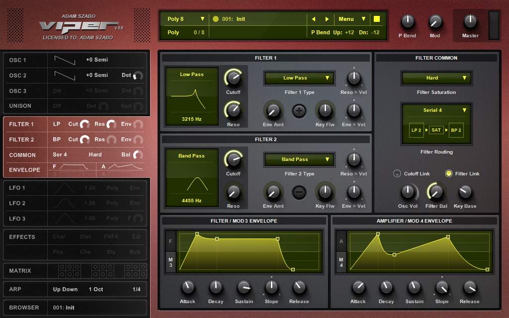
The small tabs show an overview of the patchSynthman2000 wrote:If I am understanding it right from what I see.. are they not there to show you what tab those controls are on ? That is more than actual virus GUI. And it can be useful maybe even inspiring to see what you have available for tweaking. Even if you cannot tweak them it reminds you of the depth of synthesis under your control.... mwa ha ha ha.chk071 wrote:Me too, TBH. I don't quite see the point of displaying all those parameters when you can't change them. And I do get the point about the many pages as well.recursive one wrote: Ha, yes! When I saw the first GUI screenshots I also thought "I will be able to tweak these little tabs as I'm working with a big one, how cool!"
Like in this screenshot you see that the small filter tab shows the type of the filters, the type of the saturation, the filter configuration, the amount of cutoff, resonance, filter balance and envelope->filter assignment (roughly), the envelope shapes (roughly) - basically the positions/values of the most important controls available on the respective page are seen. You can't tweak them though.
You may think you can fly ... but you better not try
-
- KVRian
- Topic Starter
- 1238 posts since 29 Sep, 2004
Hmm, I didnt want to post until the 64 bit is finished so that it could be my 604th post, but oh well, ill do it when the 128 bit comes out for my 1208 post 
Anyway I appreciate all ideas and comments but you have to look at it from a design/programmers point of view. When I looked at the Virus GUI, I was investigating if there is anything I could do a different way. Look at the Virus control:

There are a lot of tabs at the top, but convey absolutely zero information. Can you tell from this screenshot what filters they use? How many oscillators are enabled? Which effects are turned on? Nope nothing, you have to go to each page to see whats going on. I wanted some easy way to see the most common parameters, and since Viper is a VST you dont need multi outs (since you can load up as many instances as you want, however you can only have ONE Virus control thats why it needs multi outs), I didnt need the left most part, it was just a waste of space. Then I thought it would be the perfect place to put some bigger tabs that show information for free.

Now its a nice idea to make the controls in the tabs changeable, but it will turn into a logistics nightmare. Just think about this, I have to create clickable mouse areas (green squares) for the knobs. But then if I allow knobs to be tweaked people will complain they want to choose filters and all other stuff, so then I have to create more mouse areas (blue squares). I would be forced to do this because it makes zero logical sense to allow only a few parameters to be tweaked, how would I explain that to a user? They would have to understand the whole thing right away. Ok so now that all those parameters are editable how would it work? If you are in the Osc section but want to change the cutoff without going to to filter section, then when you click on the little cutoff, should the tab switch to the filter section or stay? If it says then if you want to go to the filter you have to click around the controls and that would be a pain in the behind. Plus what if someone wants to go to the filter section, but clicked on the cutoff and changed it by accident? then I will get complaints about that. Then people want options for making it behave differently. As you can see it will become a nightmare quickly, plus I can go on and on with all the issues, but I have to get back to the 64 bit. I hope you guys see its too much trouble for something small. The easiest way to solve is to have them as big tabs that convey information and problem solved. I cant make everybody happy.
Anyway I appreciate all ideas and comments but you have to look at it from a design/programmers point of view. When I looked at the Virus GUI, I was investigating if there is anything I could do a different way. Look at the Virus control:
There are a lot of tabs at the top, but convey absolutely zero information. Can you tell from this screenshot what filters they use? How many oscillators are enabled? Which effects are turned on? Nope nothing, you have to go to each page to see whats going on. I wanted some easy way to see the most common parameters, and since Viper is a VST you dont need multi outs (since you can load up as many instances as you want, however you can only have ONE Virus control thats why it needs multi outs), I didnt need the left most part, it was just a waste of space. Then I thought it would be the perfect place to put some bigger tabs that show information for free.
Now its a nice idea to make the controls in the tabs changeable, but it will turn into a logistics nightmare. Just think about this, I have to create clickable mouse areas (green squares) for the knobs. But then if I allow knobs to be tweaked people will complain they want to choose filters and all other stuff, so then I have to create more mouse areas (blue squares). I would be forced to do this because it makes zero logical sense to allow only a few parameters to be tweaked, how would I explain that to a user? They would have to understand the whole thing right away. Ok so now that all those parameters are editable how would it work? If you are in the Osc section but want to change the cutoff without going to to filter section, then when you click on the little cutoff, should the tab switch to the filter section or stay? If it says then if you want to go to the filter you have to click around the controls and that would be a pain in the behind. Plus what if someone wants to go to the filter section, but clicked on the cutoff and changed it by accident? then I will get complaints about that. Then people want options for making it behave differently. As you can see it will become a nightmare quickly, plus I can go on and on with all the issues, but I have to get back to the 64 bit. I hope you guys see its too much trouble for something small. The easiest way to solve is to have them as big tabs that convey information and problem solved. I cant make everybody happy.
http://www.adamszabo.com/ - Synths, soundsets and music
-
Touch The Universe Touch The Universe https://www.kvraudio.com/forum/memberlist.php?mode=viewprofile&u=190615
- KVRAF
- 5845 posts since 2 Oct, 2008
With all the activity, I had a feeling it would draw you out, lol
64bit and 604 would have been an added coincidence 604 can look like GOA, so it is a sort of special number (not really).
Carry on ...
64bit and 604 would have been an added coincidence
Carry on ...
100 High Quality Soundsets: Omnisphere 2, Dune 3, Tone 2 Synths, Pigments, Uhe Synths, Halion, Spire, and others.
TTU Youtube
TTU Youtube