VintageVerb NOW mode in black/white is very unpleasant on the eye (add a new color scheme for 'now' please)

RELATED
PRODUCTS

Post

Love the look in 70/80 mode. But I notice that I really avoid the NOW mode because of the black and white color scheme.

I know that you can switch black/white and white/black.

So it would be really really great when a third easier on the eye and more pleasant to watch (like the 70/80) scheme could be implemented for the 'now' mode.

And it would be great when this could happen in the near future, because I really notice that I avoid the 'now' mode because of the visual representation. :-D


I attached a very quick example idea I thought about, the colors are only rough and the distribution from left to right is not not balanced well so far. And I'm not sure with the oranges, because is already used in 70 mode this way. Maybe you have a better idea for a NOW color scheme. I just want to show how some simple colors can make the whole thing a lot more pleasant.
You do not have the required permissions to view the files attached to this post.

Post

+1

Post

Too much - prefer the starkness of NOW

Post

Well, I am probably one of very few people who suffers from 'ghosting' or whatever the correct medical term is in english (I have no idea). So for me the inverted version makes no difference for me because it's the actually strong contrast that is the problem, and it is real problem for me. I basicly don't use the NOW mode for this reason.

Since I assume I'm in a real minority I have not bothered to 'complain', but since the topic showed up I might just throw in my 2 cents for the sake of it.

Post

Kr3eM wrote: Sun Nov 04, 2018 9:18 pm Well, I am probably one of very few people who suffers from 'ghosting' or whatever the correct medical term is in english (I have no idea). So for me the inverted version makes no difference for me because it's the actually strong contrast that is the problem, and it is real problem for me. I basicly don't use the NOW mode for this reason.

Since I assume I'm in a real minority I have not bothered to 'complain', but since the topic showed up I might just throw in my 2 cents for the sake of it.
When it helps people who suffer from any eye impairment I would say Sean please do it :hug:
It refuses description, allowing only the vague approach of adjectives: dark, light, raw, angelic. Who or what is making these noises? Where are they coming from and what do they point to? What kind of entity can leave such a troubling sonic remnant?

Post

I think "NOW" isn't 'really' meant to be used :hihi: ..that's why the obnoxious contrast. ;)
I always use 70s or 80s cause the color/contrast is easier on the eyes

Post

3ee wrote: Mon Nov 05, 2018 7:19 am I think "NOW" isn't 'really' meant to be used :hihi:
That is what I figured... and followed that advice :lol:

Post

I quite like the NOW colour scheme, I think it was already changed once to be less "harsh", no? I guess it could be nicer on the eyes if it was more greyscale and less simple B&W.

Post

The contrast is lower in the Lightness mode. I also don't have brightness set to stun on my monitors, which helps.

However, given the relative simplicity of the graphics, it might be worth implementing a similar system to 2C's where the user can tune the brightness, saturation and hue of the graphics.

Post

Cheap TN panels with the brightness turned up could be the problem here. Even IPS panels won't look nice with the brightness up.
Calibrate the screen. Most screens perform better with brightness down around 25-35% brightness for a start.

I guess it might be nice to be able to tune the colours to taste as you can in Synth1.

Post

Rob James G wrote: Thu Nov 08, 2018 6:49 pm Cheap TN panels with the brightness turned up could be the problem here. Even IPS panels won't look nice with the brightness up.
Calibrate the screen. Most screens perform better with brightness down around 25-35% brightness for a start.

I guess it might be nice to be able to tune the colours to taste as you can in Synth1.
Personally I do not feel the need or even would like to drop my medical history and make that a public discussion. I do however want to make it perfectly clear that for me the panel is not the issue.

As I suffer from being oversensitive to light and whatnot, I can assure you that I do not run my setup with high brightness and/or hard contrast. I've got IPS panels which are calibrated very well, learned the hard way with graphic design to print in the 90's.

Also I can not simply adjust the screen to lessen the problem due to everything else on screen will end up saturated as f*ck and basically turn into mush. However, I do understand your why you post this, in my 25+ years working with computers I have hardly encountered any decent calibrated panels, be it my friends or just random setups...so yes it is a very common issue.

Post

How do you "calibrate a monitor correctly"? Don't you need expensive tech to be able to do it properly?

Post

Hermetech Mastering wrote: Mon Nov 12, 2018 9:08 am How do you "calibrate a monitor correctly"? Don't you need expensive tech to be able to do it properly?
Well if you going for proper representation of colours, specially for print, then the answer is most likely yes, though it's not that expensive these days, at least not what it was like 15+ years ago. However with few steps you can more or less get your monitor calibrated for optimal image display.


Adjust Brightness and Contrast
You should be able to see all 11 zones, use your monitors contrast and brightness controls to make any necessary adjustments.
Image

Set White Point
24 shades of gray from pure white to solid black.
The pure white block at the far left should merge with the pure white bar along the top, while the second block of very light gray should display a bit darker than pure white. The solid black block at the far right should merge with the solid black bar along the bottom, while the block just to the left should display a bit lighter than solid black.

Image


In the 2x2 table below, are for colors.
One should be absolute black. Nothing on your monitor should be darker than the black square. Same goes for the white square. Nothing should be lighter than it. The gray boxes and the white box should have no tints of other colors in them. No pink or blue.

Image


Next, if your monitor permits this, start with a white point value of 6500K (degrees Kelvin).
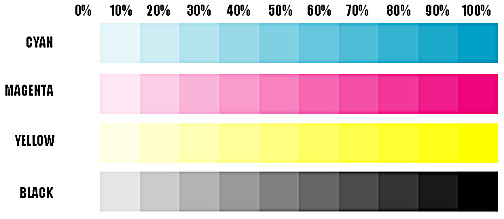
Under the 0% column, there should be NO color, just plain bright white. Under the 100% column, the colors should be recognizable, with a full rich representation. If they appear washed out, your monitor is probably set too bright.

Adjust your gamma curve up or down until the 10% shade difference between the 90% bars and the 100% bars can just be seen. If you adjust it too dark, you will not be able to see a difference between 90% and 100%. As you lighten them up, the moment you start to see the difference between the 90% bars and the 100% bards, STOP.

The cyan bar will always appear correct first, but keep going until you start to see the 90% tint in the magenta and black bars as well. The yellow bar may never come in correctly, but don't worry about it. The magenta and black bars are the most important.

Image


Once your white point is set and your tint bars look correct your monitor is calibrated for optimal image display...though the actual quality of the hardware is another subject.


Although I have seen and tried other more complex and fancy guides over the years, this have produced the best results and has been a easy guide to give to friends, it does the job well and don't overwhelm people. Most people have seen these kind of pictures before and probably done some variant of the steps, but in my experience people tend to either skip it or not take the time to do it properly but rather overdo it in the end, you know like when beginners try to master their own tracks, I'm pretty sure you know what I mean by that.


Disclaimer, pictures and most of the text are from a really old guide I found many, many years ago and the source url is long gone.

Post

Sean already tweaked the shade of white in Now mode but I do suspect that it wasn't enough, one solution could be to invert he colors, black to the background and white for the labels, at least it will be less shiny,
dedication to flying

Post

Hermetech Mastering wrote: Mon Nov 12, 2018 9:08 am How do you "calibrate a monitor correctly"? Don't you need expensive tech to be able to do it properly?
this helps quite a bit..
http://www.lagom.nl/lcd-test/

Locked

Return to “Valhalla DSP”