Melda 13 look

Official support for: meldaproduction.com
Post Reply New Topic
RELATED
PRODUCTS

Post

enCiphered wrote: Sat May 11, 2019 10:19 am Is there a way to get back to the original design (v12) as default? I can´t find it in the settings tab
Currently not or only with hacks. But have a look here and vote. Melda is at least thinking about bringing it back. I feel the same, V12 Titanium was working great for me. viewtopic.php?f=138&t=524841

I think the direction with darker/less saturated colors works good with NEON theme, it's not my most favorite colors but I find Darkstars theme absolutly usable at least judging from the pictures. https://i.imgur.com/MRxyawq.png

Post

Just chipping in, I like the new look a lot!

Post

It is not a hack. It is archaeology. ;)
-- install v12,
-- find the Titanium style (it is in C:\ProgramData\MeldaProduction\MTexturedStyles\ here),
-- rename it to Titanium_v12,
-- install v13,
-- open any plug-in, select the Titanium_v12 Style,
-- repeat for each plug-in, as desired.

You could click "Select current style as default" too.
Select current style as default button stores the current style as the default for all MeldaProduction software. This is then used for the other plugins that are currently using the default style; that is, those plugins for which you have NOT selected a specific style. Please note that if you have already selected a specific style for a particular plugin, then it won't be changed until you use the Default style button.
DarkStar, ... Interesting, if true
Inspired by ...

Post

Couldn´t have said it better, thank you!
_________________________________
midi_transmission wrote: Wed May 08, 2019 12:31 pm No problems with the feature changes made to the interface, but I have big problems with the changes in the look. I use the MLoudnessAnalyzer a lot for example and version 13 made it from loving it to disliking it.

Please make it possible to use the same dark look as in 12 with 'titanium' also in version 13.

The bright grey backgrounds for meters and curves and some other backgrounds are really holding me back to use 13. You can't change this element via settings. It's a huge pita for me to be honest. So big that I think I will stay with version 12 forever otherwise.

'Titanium' theme was a great and very balanced dark theme in version 12. I would love to have the same look in version 12. The version 12 'Titanium' theme is so much nicer and easier to look at (also the mild yellow botton color is a lot nicer).

I re-installed both demo versions for MdistortionMB quickly to show the difference. It's just an example, it's not only about this specific plugin, most plugins have now large bright areas.

Maybe a toggle for dark/bright mode in the stye configuration at least?

Otherwise I love you plugins melda.
Its over for Bitwig--CUBASE WON !!!!!!!!!!!!!!!!!!!!!!!!!!!!!!!!!

Post

I always just see very dark color palettes in this forum... but since a few days I enjoy this very light color palette... the palette is attached, it´s called snowblind. maybe someone would like to enjoy this aswell...
You do not have the required permissions to view the files attached to this post.
Everyone knows more than I do...

Post

Here is the palette...
You do not have the required permissions to view the files attached to this post.
Everyone knows more than I do...

Post

Hi Vojtech,
I am a bit red-green blindish and I want to ask if you could choose a more light color of Instrument names (in Plugins like MTurboReverb and MTurboDelay and so on) which are located at the bottom of the left side in easy screen. The Names on the bottom are colored red and I can´t read them when they are displayed on the dark background of the standard GUI. Would be really great.

I like the new standard GUI design very much and I would also love to see exactely this design but with a touch lighter background. It´s very dark and I think a bit lighter version would be far more pleasing to the eye. Do you think that´s manageable? I would bow to you :) :hug:

Post

Hey, well, this is a bit complex, but you are right that the red is perhaps a bit hard to read. Maybe I'll make it go just to orange.
Vojtech
MeldaProduction MSoundFactory MDrummer MCompleteBundle The best plugins in the world :D

Post

MeldaProduction wrote: Thu May 30, 2019 10:27 am Hey, well, this is a bit complex, but you are right that the red is perhaps a bit hard to read. Maybe I'll make it go just to orange.
:party: :hug:

Post

operator wrote: Mon May 13, 2019 8:07 pm Here is the palette...
Yes it's great. How to get it running?

Post

nichttuntun wrote: Thu May 30, 2019 10:40 am
operator wrote: Mon May 13, 2019 8:07 pm Here is the palette...
Yes it's great. How to get it running?
I think you just need to import it under settings/style/open colorsettings presets/click import.
Everyone knows more than I do...

Post

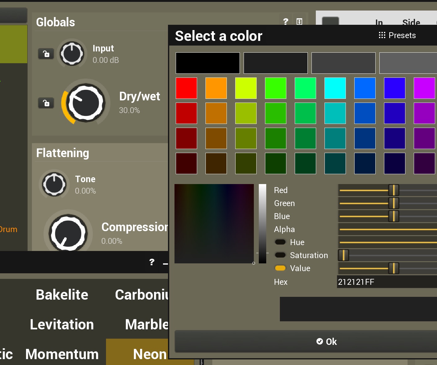
How do I make the text black? I'm trying to make the GUI easier on the eyes with more muted colours and black text on an off-white background, but changing the text colour from white to black doesn't work. Am I missing something?

Image

Post

Ah, ok - I see there's some sort of contrast threshold where you can't choose certain colours to avoid clashes. Good idea, but maybe a little aggressively weighted at the moment...

Post

Thank you.

Post

Oh, btw thanks for morphing the two bars in MADEQ into one - I like that much better. :tu:

Not sure about the new knobs though... They are just coloured dots and you wanted to animate movement so I think a little more detail should be added. Wait, ok they do look quite cool so maybe we'll have to get used to them first.
Soarer wrote: Tue Mar 19, 2019 11:00 am Vojtech please consider doing something to the two bars (Bands and Automatic Equalizer) in the bottom of MAutoDynamicEq. I never use those and it would be great to just have a bigger display of the plugin without these. I think they should be turned into one bar that is thinner. They do take up quite a lot of screen space.

Post Reply

Return to “MeldaProduction”