Hive 2.0 - Recrafted GUI By The Intrancer

Official support for: u-he.com
RELATED
PRODUCTS

Post

Below is a sneek peek at one image of a what is pretty much a complete redesigned GUI of Hive 2, which has been a daily project that has taken over 2 weeks..... Over 90% of all the graphic elements have been changed in some way, (there's well over 500 individual graphic elements). All sections of the GUI, tabs and screens have been changed, whilst a couple of things have remained as they are from Hive 2 thus far. The only thing I've retained are the pitch and mod wheels which are the only elements I've used from my previous redesign of Hive. Delving into the scripting, moving elements about to match the graphics. It wasn't just aesthetic changes, some were more practical, moving numbers away from overlaps of the waveforms, (little tweeks here and there...)...

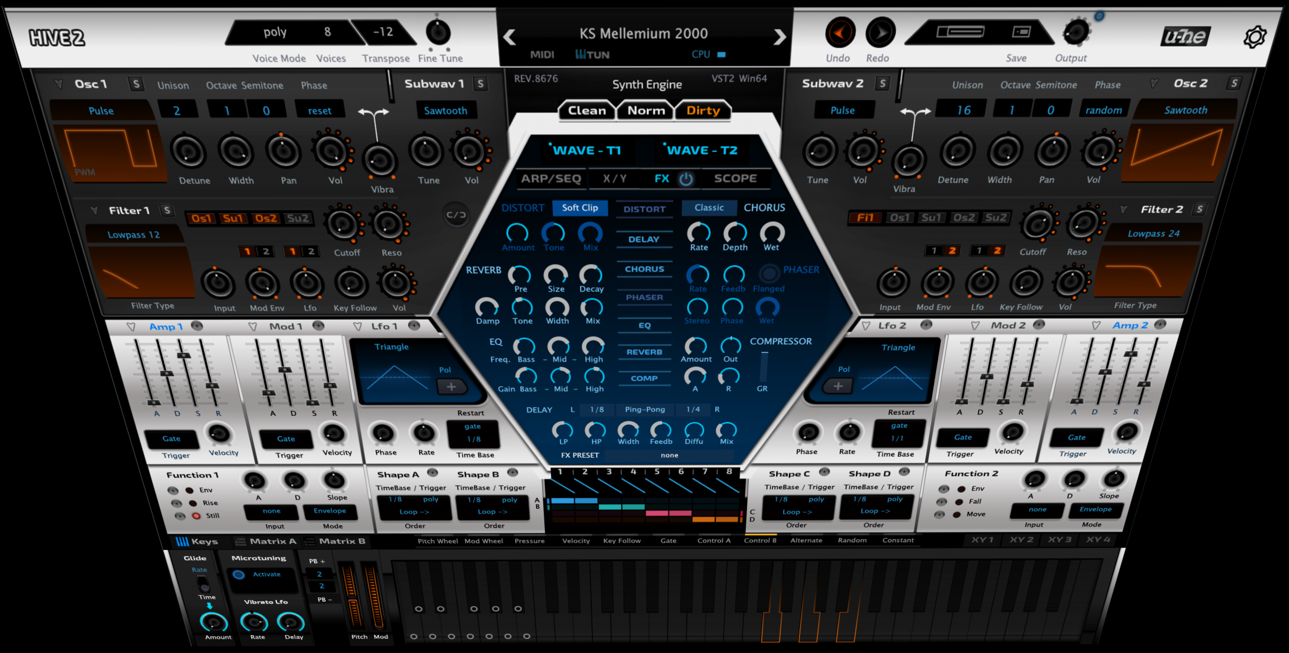
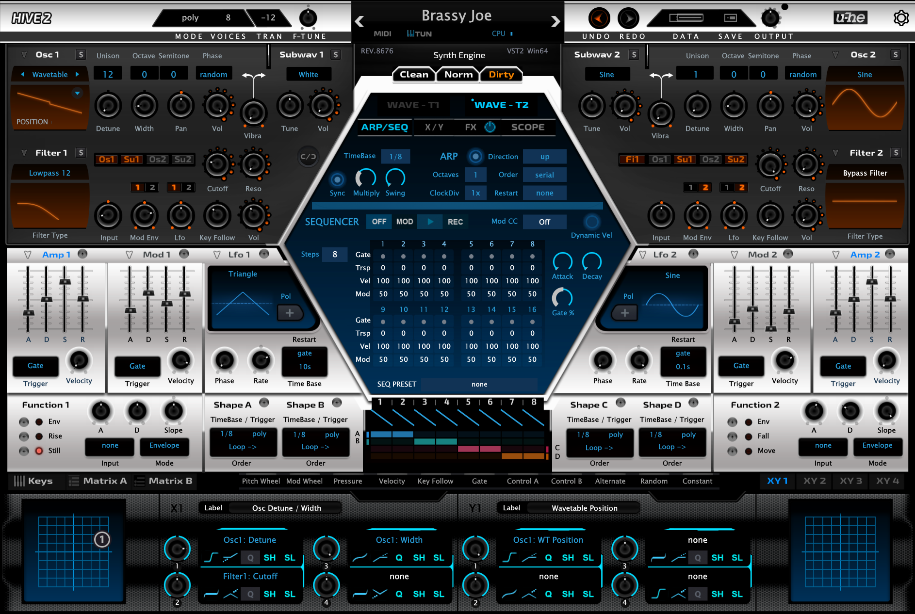
Hive 2 has been a much more tedious reskinning project than previous one's, the scripts have changed, things have been removed that were there previously.

The other screens of Hive will be shown at the end of another animation project I'm working on I think...

For me, Hive 2 launched with a GUI for my tastes that was a bit too flat and bland and I wasn't keen on the colour palette. So I've gone for the more futuristic vibe I like, with a minimal but vibrant colour pallet, combining a range of different design themes that mix seamlessly into one.

This is also the first publicaly shown redesign of Hive 2, other than those shown during the development by the Hive team, as far as I'm aware of.

Note: That this is just a screenshot of a fully functional GUI.


Click for full the size image

Image
KVR S1-Thread | The Intrancersonic-Design Source > Program Resource | Studio One Resource | Music Gallery | 2D / 3D Sci-fi Art | GUI Projects | Animations | Photography | Film Docs | 80's Cartoons | Games | Music Hardware |

Post

This is not what I call a complete redesign. It's just a new skin.

Post

I prefer the original.

Post

its a recolour with new knobs, and looks awful

Post

This must have been a ton of work.

Some nice elements in there! I like the dark sections with creative knobs redesign.
The balance in coloring still needs work for me.
Contrast between the light and dark sections is to big.
Also bright red, cyan, blue highlights.... I would tone it down quite a lot and introduce more balance in the coloring.

Hint: red has the worst readibility of all colors.

Edit: colors looked differently on my smartphone. Orangey-brown was more like a red color.
Looks nicer on my desktop but would still tone down the contrast.
Last edited by Stefken on Fri Jun 14, 2019 9:49 am, edited 1 time in total.

Post

I like this. I think the changes will remind that there are so many different
capabilities in the new Hive. The original V2 is gorgeous, and can almost
lull the senses with it's beauty. I think your revision would tend to keep me awake
when too stubborn to admit it was time sleep. :hyper:
Cheers

Post

"the intrancer" strikes again :D
I don't know what to write here that won't be censored, as I can only speak in profanity.

Post

AnX wrote: Fri Jun 14, 2019 4:59 am its a recolour with new knobs, and looks awful
I wouldn't go as far as to say it looks awful, sure I don't think it brings anything new to the table which is perhaps a testament to how good the new Hive 2 skin really is.

Post

Stefken wrote: Fri Jun 14, 2019 6:54 am This must have been a ton of work.

Some nice elements in there! I like the dark sections with creative knobs redesign.
The balance in coloring still needs work for me.
Contrast between the light and dark sections is to big.
Also bright red, cyan, blue highlights.... I would tone it down quite a lot and introduce more balance in the coloring.

Hint: red has the worst readibility of all colors.

Edit: colors looked differently on my smartphone. Orangey-brown was more like a red color.
Looks nicer on my desktop but would still tone down the contrast.

Yeah... it's a lot of work if you want to do it properly, and for the most part, you're essentially redrawing a large bulk of the elements by hand all over again, or re-rendering stuff, and digging in to scripting side which is pretty much unavoidable. Many elements are tied to using the same colour, so if you change something, it may change another part that you didn't want changed, and then their the other side of finding and deciphering what piece of text relates to what part of the GUI. Previously I've spanned out revised gui updates of Hive over a few years, but this time I wanted to condense that into doing everything at once. If you think something gonna take you a week, it typically takes at least two in practice I find, but then when you think you're done, you're not cause you've to polish and repair minor marks afterwards.

In Photoshop I try and be careful when it comes to contrast and illumination of elements. making things clear without them being glaring ect.. The top bar is one thing I did change as the shine was too bright in practice, Something you don't notice whilst in isolation in photoshop, so that was changed with a dark strip which also added more contrast to the text, which is atm using true type fonts rather than bitmap.

I was going to show the other parts of the GUI as part of something else, but I might as well add some images here anyway, to show how it's developed.

Large Image

Image
KVR S1-Thread | The Intrancersonic-Design Source > Program Resource | Studio One Resource | Music Gallery | 2D / 3D Sci-fi Art | GUI Projects | Animations | Photography | Film Docs | 80's Cartoons | Games | Music Hardware |

Post

It's from an alternate universe where Fxpansion designed Hive.

Post

THE INTRANCER wrote: Sun Jun 16, 2019 1:42 am
Stefken wrote: Fri Jun 14, 2019 6:54 am This must have been a ton of work.

Some nice elements in there! I like the dark sections with creative knobs redesign.
The balance in coloring still needs work for me.
Contrast between the light and dark sections is to big.
Also bright red, cyan, blue highlights.... I would tone it down quite a lot and introduce more balance in the coloring.

Hint: red has the worst readibility of all colors.

Edit: colors looked differently on my smartphone. Orangey-brown was more like a red color.
Looks nicer on my desktop but would still tone down the contrast.

Yeah... it's a lot of work if you want to do it properly, and for the most part, you're essentially redrawing a large bulk of the elements by hand all over again, or re-rendering stuff, and digging in to scripting side which is pretty much unavoidable. Many elements are tied to using the same colour, so if you change something, it may change another part that you didn't want changed, and then their the other side of finding and deciphering what piece of text relates to what part of the GUI. Previously I've spanned out revised gui updates of Hive over a few years, but this time I wanted to condense that into doing everything at once. If you think something gonna take you a week, it typically takes at least two in practice I find, but then when you think you're done, you're not cause you've to polish and repair minor marks afterwards.

In Photoshop I try and be careful when it comes to contrast and illumination of elements. making things clear without them being glaring ect.. The top bar is one thing I did change as the shine was too bright in practice, Something you don't notice whilst in isolation in photoshop, so that was changed with a dark strip which also added more contrast to the text, which is atm using true type fonts rather than bitmap.

I was going to show the other parts of the GUI as part of something else, but I might as well add some images here anyway, to show how it's developed.
Hey, I'd love to see some images to see how it's developed. Even more so, some script examples like for example how you change colors in the filter graphs and the hexagon section.

You're obviously going for a contrasty look but I would tone it down in the bright middle section and ease down on the many gradients. For example, the gradients in the dividers make it harder to scan the UI, so I would just drop them. And also in the bright middle section in general I would ease down on the gradients where the light 'seems to come from all places at once'.
If I'm correct this can al be done in the main background image, so you would only have to change 1 image.

Post

I admire the work, effort and skill in crafting the skin, but I just don’t think it works for me. I much prefer the native UI.

Post

It brings too much focus on the envelope section, "hiding" the oscillators section. Eg. it creates unbalance.

Post

mevla wrote: Sun Jun 16, 2019 1:52 pm It brings too much focus on the envelope section, "hiding" the oscillators section. Eg. it creates unbalance.
you'd think that creating balance and directing workflow with colors would be obvious to anyone passingly familiar with how UI design is actually done, but if you've seen other "works" of "The Intrancer", you'd see that he doesn't actually know how to design a proper, functional UI.
I don't know what to write here that won't be censored, as I can only speak in profanity.

Post

Burillo wrote: Sun Jun 16, 2019 1:56 pmyou'd think that creating balance and directing workflow with colors would be obvious to anyone passingly familiar with how UI design is actually done, but if you've seen other "works" of "The Intrancer", you'd see that he doesn't actually know how to design a proper, functional UI.
What in the world has he ever done to you? x.x

Post Reply

Return to “u-he”