with

You post looks weird.Yorrrrrr wrote: Wed Jun 26, 2019 10:28 pm All in one place, and its color coded and easy to read, no need to drag.
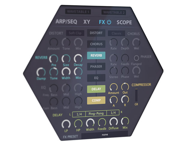
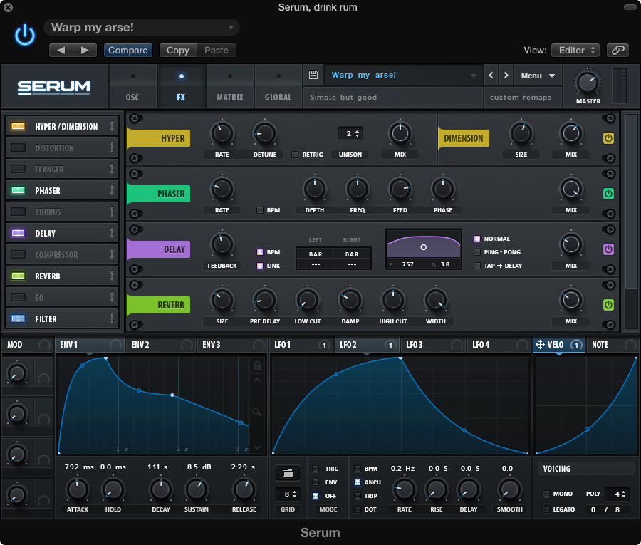
But in Serum they actually couldn't fit it in, so you need to use a scroll bar in order to see everything.david.beholder wrote: Wed Jun 26, 2019 10:23 pm Note on Hive 2: Effects section looks like designer tried to squeeze crazy amount of data into tiny hexagon.
That's only when more than 4 effects are used, correct?omiroad wrote: Thu Jun 27, 2019 12:34 amBut in Serum they actually couldn't fit it in, so you need to use a scroll bar in order to see everything.david.beholder wrote: Wed Jun 26, 2019 10:23 pm Note on Hive 2: Effects section looks like designer tried to squeeze crazy amount of data into tiny hexagon.
Right, while Hive always shows you all 7. Trade offs, trade offs...david.beholder wrote: Thu Jun 27, 2019 12:41 amThat's only when more than 4 effects are used, correct?omiroad wrote: Thu Jun 27, 2019 12:34 amBut in Serum they actually couldn't fit it in, so you need to use a scroll bar in order to see everything.david.beholder wrote: Wed Jun 26, 2019 10:23 pm Note on Hive 2: Effects section looks like designer tried to squeeze crazy amount of data into tiny hexagon.
Great ;(Probably my feature request, but I can’t take credit ; )). It’s simply fantastic ergonomics for those of us who patch from scratch often to have access all modules on a single interface. This is a HUGE strength for Hive in my book. Can I ask why You “feel” that you require (more) space than what Hive offers in order to dial-in simple effects settings? I mean its no exact science with efx units built into synthesizers. They are there for the icing on the cake and require no precision really. Even the EQ is not actually meant to be a huge multi-band unit for precise cut/boost. It’s there for ears to use to get a “fitting” timbre from the resulting patch. So I don’t understand the neccessity to have things so spread-out across tge width of the UI. One should know that this synthesizer is designed top-to-bottom by people who have patched synthesizers for MANY years, and esp with U-he Hive, have Efficiency constantly in mind.david.beholder wrote: Wed Jun 26, 2019 10:23 pm Note on Hive 2: Effects section looks like designer tried to squeeze crazy amount of data into tiny hexagon.
I suggest you check out the Plugmon Eclipse skin/theme for Hive if you haven't already. All effects are visible + cleanly ordered and separated. Improved my workflow a lot!david.beholder wrote: Wed Jun 26, 2019 10:23 pm Note on Hive 2: Effects section looks like designer tried to squeeze crazy amount of data into tiny hexagon. Compare
...

Hah. You should have seen Hive 1.xdavid.beholder wrote: Wed Jun 26, 2019 10:23 pm Note on Hive 2: Effects section looks like designer tried to squeeze crazy amount of data into tiny hexagon
Was a simple list-based mod matrix that you could house in the hexagon explored? I'm actually quite a fan of a simple list that you can sort on source and target.Urs wrote: Thu Jun 27, 2019 9:27 amHah. You should have seen Hive 1.xdavid.beholder wrote: Wed Jun 26, 2019 10:23 pm Note on Hive 2: Effects section looks like designer tried to squeeze crazy amount of data into tiny hexagon
The reason we added "on target depth control" for the ModMatrix was so we could move the sequencer and/or the effects section into the bottom tab (such that, you can see either ModMatrix or any of the other areas, requiring a different paradigm than drag&drop from the Matrix).
But after experimenting with all options, we decided that the colour contrast and the newly added active/inactive visualisation made the hexagon the better choice.
Oh no thanksUrs wrote: Thu Jun 27, 2019 9:27 amHah. You should have seen Hive 1.xdavid.beholder wrote: Wed Jun 26, 2019 10:23 pm Note on Hive 2: Effects section looks like designer tried to squeeze crazy amount of data into tiny hexagon
But you don't want to have tab like say serum?The reason we added "on target depth control" for the ModMatrix was so we could move the sequencer and/or the effects section into the bottom tab (such that, you can see either ModMatrix or any of the other areas, requiring a different paradigm than drag&drop from the Matrix).
But after experimenting with all options, we decided that the colour contrast and the newly added active/inactive visualisation made the hexagon the better choice.
Clearly not. Having tabs doesn't fit in with Hive's ethos of being an immediate synth with efficient workflow. Having to tab between the main synth and FX pages would kill the workflow, just like it does in Serum. Tabs are a massive weakness in a synth imo, the more there are, the more tedious they are to program. That Hive manages to show (almost) all of the main synth parameters, the FX and (half) the mod matrix, all in one page, without about being a total mess is something to applaud, not seek to change imo.
Submit: News, Plugins, Hosts & Apps | Advertise @ KVR | Developer Account | About KVR / Contact Us | Privacy Statement
© KVR Audio, Inc. 2000-2026
