Another thought.
I guess it's not the design of the switch itself? I mean, people see what's "on" and what's "off", right? Like, "on" is when the switch is set to the state with the visible white dot.
I guess the problem here is that "off" is associated with 24dB while "on" is associated with 12dB. I assume that, what the OP is talking about is, he expected the "on" setting to be the setting of higher quantity, and thus 24dB instead of 12dB.
If that is correct, no change in visual design of the UI element will come to ease. The inherent problem is the perception of domain. The domain we intended it to be is "no modification" vs "modification applied". We show that 24dB is the common case whereas 12dB is the exception, and thus the on state of the switch represents the exception.
Therefore, in the next iteration of Diva's UI I will propose to change the label to "12dB mod" or something.
Diva Ladder 12db and 24db filters reversed?
-

- u-he
- 30215 posts since 8 Aug, 2002 from Berlin
-

- KVRist
- 396 posts since 3 Mar, 2015 from Japan
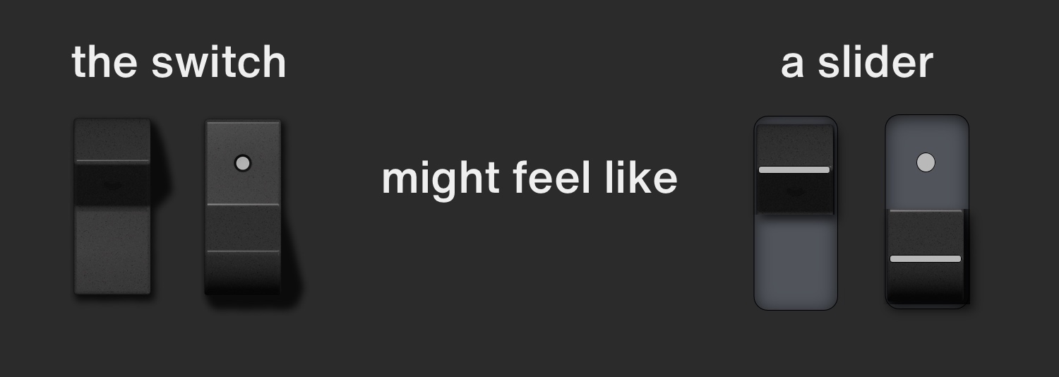
My two cents: the problem is that the switch could look like a slider (when your eyes are tired  ).
).
I bet this is what Echoes in the Attic saw.
True there're proper shadows and shades which indicate that this is a switch, but the disappearance of white dot makes your brain misunderstand that the dot is covered over by something -- a slider cap. (You will be able to experience this feeling by flipping the switch verrrry fast repeatedly. A Gestaltzerfall will happen!)
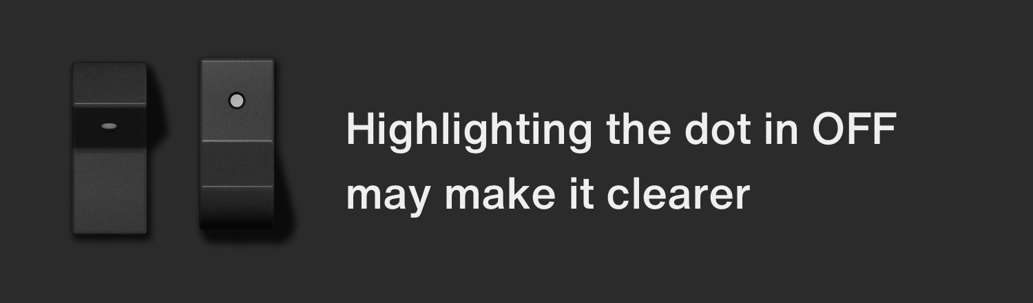
Just highlighting a dot even in off state will make it clearer that it is a switch.
In this case the white dot is not a lamp but a statically painted ink, which also fit for the vintage hardware concept. I adopt this in my own skin!
Or if it should stay as a lamp (dark when off, light when on), some lamp-ish effect will help users perceive which side is on.
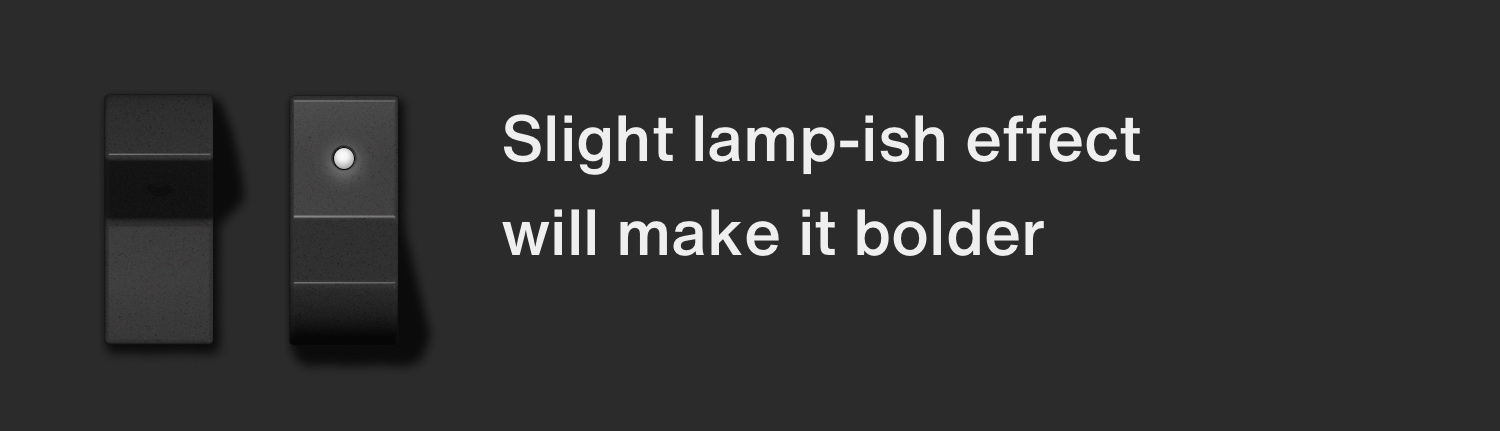
Switches in "Digital" OSC has this kind of lighting effect, so it's consistent to add this to this switch as well. Anyway, too small matter to bother you sir! We can easily get used to it.
I bet this is what Echoes in the Attic saw.
True there're proper shadows and shades which indicate that this is a switch, but the disappearance of white dot makes your brain misunderstand that the dot is covered over by something -- a slider cap. (You will be able to experience this feeling by flipping the switch verrrry fast repeatedly. A Gestaltzerfall will happen!)
Just highlighting a dot even in off state will make it clearer that it is a switch.
In this case the white dot is not a lamp but a statically painted ink, which also fit for the vintage hardware concept. I adopt this in my own skin!
Or if it should stay as a lamp (dark when off, light when on), some lamp-ish effect will help users perceive which side is on.
Switches in "Digital" OSC has this kind of lighting effect, so it's consistent to add this to this switch as well. Anyway, too small matter to bother you sir! We can easily get used to it.
Last edited by plugmon on Sat Nov 02, 2019 12:41 am, edited 1 time in total.

-
Echoes in the Attic Echoes in the Attic https://www.kvraudio.com/forum/memberlist.php?mode=viewprofile&u=180417
- KVRAF
- Topic Starter
- 12049 posts since 12 May, 2008
Oh that's what it's meant to be?! OK I get it. I thought the switch flipped down or up like a lightswitch. I didn't realize that it actually was meant to represent a switch that was pressed (upwards). I understand the design now. Yeah that's confusing if you aren't really familiar with the hardware switch. I didn't understand what the thing was doing until you showed where the dot would be when in 24db mode.plugmon wrote: Fri Nov 01, 2019 2:19 pm My two cents: the problem is that the switch could look like a slider (when your eyes are tired
I bet this is what Echoes in the Attic saw.
True there're proper shadows and shades which indicate that this is a switch, but the disappearance of white dot makes your brain misunderstand that the dot is covered over by something -- a slider cap. (You will be able to experience this feeling by flipping the switch verrrry fast repeatedly. A Gestaltzerfall will happen!)
Just highlighting a dot even in off state will make it clearer that it is a switch.
In this case the white dot is not a lamp but a statically painted ink, which also fit for the vintage hardware concept. I adapt this in my own skin!
Or if it should stay as a lamp (dark when off, light when on), some lamp-ish effect will help users perceive which side is on.
Switches in "Digital" OSC has this kind of lighting effect, so it's consistent to add this to this switch as well. Anyway, too small matter to bother you sir! We can easily get used to it.
-

- KVRAF
- 24447 posts since 7 Jan, 2009 from Croatia
Indeed I think the disappearance of the dot is the only issue here. If the dot were there even in off state, just dimmer like plugmon showed, there'd be no problems in understanding the functionality, I think.
-
Echoes in the Attic Echoes in the Attic https://www.kvraudio.com/forum/memberlist.php?mode=viewprofile&u=180417
- KVRAF
- Topic Starter
- 12049 posts since 12 May, 2008
And now that I think about it, I've used those types of switches on hardware plenty of times, I just didn't realize that's what these are. Maybe it was the dot appearing, which I thought was hidden in the other mode.
-
- u-he
- 30215 posts since 8 Aug, 2002 from Berlin
-
 david.beholder david.beholder https://www.kvraudio.com/forum/memberlist.php?mode=viewprofile&u=159839
 - KVRAF
- 1914 posts since 13 Sep, 2007
3 and 4
You do not have the required permissions to view the files attached to this post.
Murderous duck!
-
david.beholder david.beholder https://www.kvraudio.com/forum/memberlist.php?mode=viewprofile&u=159839
- KVRAF
- 1914 posts since 13 Sep, 2007
@plugmon and @urs - I think lamp on rocker wouldn't work because it's still not clear.
Slider looks very clear and lamp is making it confusing.
Slider looks very clear and lamp is making it confusing.
Last edited by david.beholder on Fri Nov 01, 2019 10:34 pm, edited 1 time in total.
Murderous duck!
-
- KVRAF
- 24447 posts since 7 Jan, 2009 from Croatia
I like plugmon's solution better than either of those 2.
-
Funkybot's Evil Twin Funkybot's Evil Twin https://www.kvraudio.com/forum/memberlist.php?mode=viewprofile&u=116627
- KVRAF
- 12493 posts since 16 Aug, 2006
Agree. The lamp looks nice and gets across the point. The arrow is clear but kind of ugly at the same time. Seems like mountains out of molehills honestly.
-
david.beholder david.beholder https://www.kvraudio.com/forum/memberlist.php?mode=viewprofile&u=159839
- KVRAF
- 1914 posts since 13 Sep, 2007
Criticizing quick mock up for being ugly.
What a great idea
What a great idea
Murderous duck!
-
Funkybot's Evil Twin Funkybot's Evil Twin https://www.kvraudio.com/forum/memberlist.php?mode=viewprofile&u=116627
- KVRAF
- 12493 posts since 16 Aug, 2006
I didn't say it to be offensive (I actually initially was going to describe it as clunky then edited for the worse apparently), it's just not a convention that you'd see in a piece of hardware and therefore doesn't fit in with the Diva concept. I've never seen a single push-button toggle with an arrow on it. Lighting up the dot on the toggle seems like a nice compromise. But honestly, now that you get what type of switch it is, combined with the fact it's a decade+ old synth and there aren't a lot of complaints about this, is it really necessary that anything change? I'm all for improving things, and Plugmon's approach does that, but it would be about as low a priority change for me as imaginable TBH. The kind of thing that I would just tweak on my own if it really bugged me.
Is that the only vertical Moog switch in Diva (not at my music PC)? If it's a single .png that's not shared with anything else, I'd be happy to take a stab at what you mocked up and post an edited .png with the arrow that you could use.
Is that the only vertical Moog switch in Diva (not at my music PC)? If it's a single .png that's not shared with anything else, I'd be happy to take a stab at what you mocked up and post an edited .png with the arrow that you could use.
-
Funkybot's Evil Twin Funkybot's Evil Twin https://www.kvraudio.com/forum/memberlist.php?mode=viewprofile&u=116627
- KVRAF
- 12493 posts since 16 Aug, 2006
Here's a quick and dirty version where the dot always appears next to the selected option. So if you're on the 12db option or pink noise, the dot is at the top. If 24db or white noise, the dot is at the bottom. Doesn't necessarily fit in 100% with hardware since printed dots don't move, but once you get it, it should be easy enough to follow.
You do not have the required permissions to view the files attached to this post.
-
Echoes in the Attic Echoes in the Attic https://www.kvraudio.com/forum/memberlist.php?mode=viewprofile&u=180417
- KVRAF
- Topic Starter
- 12049 posts since 12 May, 2008
That makes even less sense because the dot jumps to a different part of the physical switch. Much better to actually understand the physical mechanism it is meaning to represent. I think the solution was already presented. Have the dot in the dark angled part, which shows how the switch actual works.Funkybot's Evil Twin wrote: Fri Nov 01, 2019 11:57 pm Here's a quick and dirty version where the dot always appears next to the selected option. So if you're on the 12db option or pink noise, the dot is at the top. If 24db or white noise, the dot is at the bottom. Doesn't necessarily fit in 100% with hardware since printed dots don't move, but once you get it, it should be easy enough to follow.
-
Funkybot's Evil Twin Funkybot's Evil Twin https://www.kvraudio.com/forum/memberlist.php?mode=viewprofile&u=116627
- KVRAF
- 12493 posts since 16 Aug, 2006
The dot in the dark angled part is confusing when the switch is in the down position. Like, I've got the 24db filter selected but there's just a black, flat, empty surface indicating that? But there's a dot on the 12db version? That doesn't make logical sense to me. Probably the inconsistency of dot versus no dot. My version couldn't exist in the physical world, granted, the dot moves, but the dot highlights which is selected while still looking like the other rockers. If you don't overthink it, the dot is just an indicator of what current option is selected. That was my rationale anyway. I don't feel too strongly about this. I actually use the AIKO skin.