Massive X 1.4 update!

VST, AU, AAX, CLAP, etc. Plugin Virtual Instruments Discussion
Post Reply New Topic
RELATED
PRODUCTS
Massive X Quarantine - Massive X Presets

Post

The main problem with the GUI is that there are so many different sections and there's no clear separation between them. No contrast between elements. It's just straining to look at. They really took a step back in GUI design from Massive to X. It still looks like an alpha version.

Image

Image
You are currently reading my signature.

Post

djanthonyw wrote: Mon Jun 01, 2020 10:17 pm They really took a step back in GUI design from Massive to X. It still looks like an alpha version.
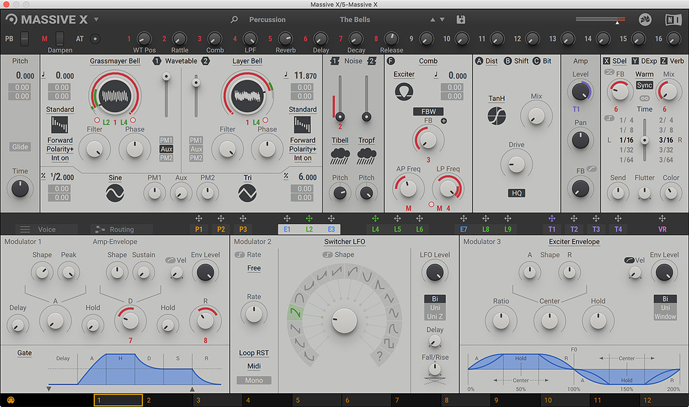
Sort of agree with you. But I think NI released an update where you can chose differenet skins. It helps a bit. But its still a peculiar GUI compared to Serum or Pigments.
🌐 Spotify 🔵 Soundcloud 🌀 Soundclick

Gear & Setup: Windows 10, Dual Xeon, 32GB RAM, Cubase 10.5/9.5, NI Komplete Audio 6, NI Maschine, NI Jam, NI Kontakt

Post

djanthonyw wrote: Mon Jun 01, 2020 10:17 pm The main problem with the GUI is that there are so many different sections and there's no clear separation between them. No contrast between elements. It's just straining to look at. They really took a step back in GUI design from Massive to X. It still looks like an alpha version.

Image

Image
And I disagree with you. I never liked the old Massive GUI. It was ugly, with to many graphic elements on it, and a bad workflow. All these poins were improved in MX. And about separation between sections, I think it's a matter of getting used to. Nowadays I think that's very well done, clean and intuitive. I really think it's a very well thought out GUI.

Post

I really like the new gui compared to the old one. I find it logically layed out and very easy to work with.

Post

Both GUI's are fine IMO.

Post

The GUI is a complete mess.
It's pretty clear to be me that - this being somewhat om a semi-modular synth- that they were inspired by the hardware modular world where you often combine modules from different brands resulting in a complete mess.

But this is one synth; not a set of hardware modules that are thrown together.
No sense making it into a complete mess then. Bad choice.

As mentioned separation issues, contrast issues but also knob handling issues, (computer) mouse handling issues, bad use of real estate, illogical topology, gestalt rules of perception completely neglected, almost no regard for colorblind guidelines, the list just goes on and on...

Post

I think it's a subjective experience. I really liked the default interface since day 1 and now the flat minimal versions are even better in my opinion. This is my favorite :

https://www.synthanatomy.com/wp-content ... -light.png

I find this one particularly pleasing to look at and to work with, the colors stand out more. But overall I find MX interface pretty functional and logical to me. My experience working with MX is pretty similar to the one I have with Serum (a synth that gets a lot of praise for its GUI and fast workflow) and I work fast with both.

In comparison, I find Hive 2's interface less intuitive and slower to work with, even though it looks good. It's one of my favorite synth but to make a patch in it requires more efforts. Pigments is even worse for me… And yet many people have the opposite experience.

🤷🏻‍♂️

Post

And I disagree with you. I never liked the old Massive GUI. It was ugly, with to many graphic elements on it, and a bad workflow. All these poins were improved in MX.
+1

Massive X has similiar layout to Serum, which is praised for its workflow.

Oscillators on top, modulation sources at the bottom. One of parts is paged. Extra macro knobs + drag & drop markers for easy access.
Blog ------------- YouTube channel
Tricky-Loops wrote: (...)someone like Armin van Buuren who claims to make a track in half an hour and all his songs sound somewhat boring(...)

Post

I like the interface

Post

what do u pweeple use massive x for?

Post

DJ Warmonger wrote: Tue Jun 02, 2020 12:48 pm
And I disagree with you. I never liked the old Massive GUI. It was ugly, with to many graphic elements on it, and a bad workflow. All these poins were improved in MX.
+1

Massive X has similiar layout to Serum, which is praised for its workflow.

Oscillators on top, modulation sources at the bottom.
That's pretty much like saying a ferrari and a fiat are very similar because they both have a steering wheel, 4 wheels and controls at the driver's position.

Serum for one has a lot of visual feedback. MX has few. They are very different. But yes, they are both synths. And rock and house both use drums.
That makes them only similar on a VERY superficial level.

Post

I also see GUI as well done. It's easy to read, no useless 'eye candy' graphics but also it's not total win3.11 look. Something between. I like it more than synths that look like Winamp Visualisation window ;)
Thanks to simplified GUI my senses can focus on hearing and are not occupied by "cool graphics and visualisations".
I know that it's a personal experience and I would vote for keeping it the way it is. The only exception would be a shortened access to additional Performance settings but I don't have any better idea of how to improve it.

Also after using dark GUI recently I came back to white one as I found it easier for eyes.

Post

It seems i am in a minority but i have no trouble with the GUI and i am picky about GUI´s normally. But maybe it is because i never use it more than 1 hour or so.
The old Massive is a pain for me compared to Massive X GUI.

Post

zvenx wrote: Sun May 24, 2020 1:47 pm What would you consider a game changing update?
  • Another OSC (maybe easier to giver us 2 and just add a tab on the dual OSC)
  • Dual Filters
  • Performer interface changes to make less fiddly, massive og was simpler to use, though obviously less powerful
  • Better use of space on the modulators, the LFO's are huge - I think they could fit 6 panels for LFO/Envelope in the same space
  • An optional simpler Unison mode
All that said, I think this is a great synth as it is. Personally I like the GUI. Sounds really really good!

Post

Sinisterbr wrote: Tue Jun 02, 2020 12:54 am And I disagree with you. I never liked the old Massive GUI. It was ugly, with to many graphic elements on it, and a bad workflow.
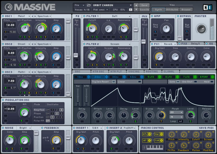
Maybe to you. I think that the original Massive has one of the best synth interfaces. Super poweful Very routable, easy to see the routing, tons of stuff on one screen.

Maybe occasionally I would have liked to be able to send more inputs to a control - but this is a limitation of Massive X routing as well.

I really like Massive X - but I would also have been happy with a Massive 2.0 with just new OSCs, Filters and FX.

Post Reply

Return to “Instruments”