
Massive X 1.6.1 update (September 2025)!

-

- KVRAF
- 18525 posts since 26 Jun, 2006 from San Francisco Bay Area
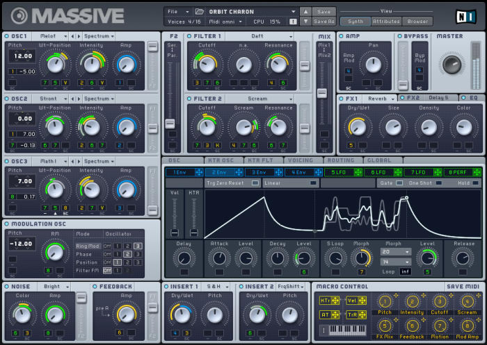
Massive wasn’t great either, IMO, but at least they labeled sections so you knew what was what at a glance. I hate the trend of “let’s make a super clean UI by removing useful information!” Is that number a display or something I can change? You’ll have to click to find out!djanthonyw wrote: Mon Jun 01, 2020 10:17 pm The main problem with the GUI is that there are so many different sections and there's no clear separation between them. No contrast between elements. It's just straining to look at. They really took a step back in GUI design from Massive to X. It still looks like an alpha version.
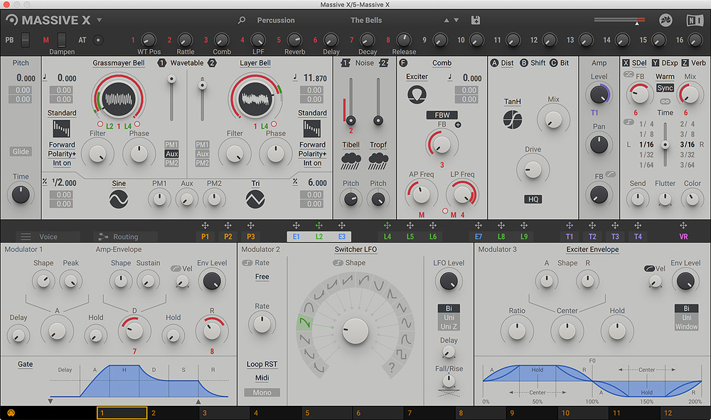
I wish they would have taken a chapter from their own playbook and sort of stole the “Blocks” look and concept.
It’s still clean, but each part is very clearly delineated from every other part and slight changes in look can elude to the function and even the character of different parts, like Blocks points to a Moog look when they’re modeled after it. They could even have duplicated the “Blocks Wired” concept that could be turned on or off so you could see how things were connected without having to go to a separate screen. It also has lots of odd choices, like the modulation macros being separated from the other modulation types. Things like the entire envelope section could be two knobs for velocity and level and the rest could be done by moving points on an interactive envelope display, saving a ton of space.
Zerocrossing Media
4th Law of Robotics: When turning evil, display a red indicator light. ~[ ●_● ]~
4th Law of Robotics: When turning evil, display a red indicator light. ~[ ●_● ]~
-

- KVRAF
- 27005 posts since 3 Feb, 2005 from in the wilds
The Massive X GUI is visually pleasing if considered as art... but as a functional GUI it's not well designed. Definitely form over function. As previously mentioned, the LFO's are one example of that. The whole circle thing is complicated and takes up a lot of space and at the same time is not very capable or flexible. It's like someone thought it was cool looking.Stefken wrote: Tue Jun 02, 2020 10:05 am The GUI is a complete mess.
It's pretty clear to be me that - this being somewhat om a semi-modular synth- that they were inspired by the hardware modular world where you often combine modules from different brands resulting in a complete mess.
But this is one synth; not a set of hardware modules that are thrown together.
No sense making it into a complete mess then. Bad choice.
As mentioned separation issues, contrast issues but also knob handling issues, (computer) mouse handling issues, bad use of real estate, illogical topology, gestalt rules of perception completely neglected, almost no regard for colorblind guidelines, the list just goes on and on...
MX requires more mouse clicking than any synth I have. Everywhere are little menus. For example on a default Osc there is Forward, Polarity+ and Int On... all 3 of them are 2 option menus instead of toggle switches. So they each require 2 clicks instead of one. LFO sync on off is also a menu. and so on.
And everything is mouse clicks... no mousewheel support so you cannot hover over one of those 2 option menus and switch, no support for arrow keys in menus or the preset or wavetable browsers.
-

- KVRAF
- 4589 posts since 7 Jun, 2012 from Warsaw
The LFO takes just as much space as an envelope, as they are interchangeable and use same panel for display. How many times do I need to point that out?The whole circle thing is complicated and takes up a lot of space and at the same time is not very capable or flexible.
How is Massive X different here than original Massive?Massive wasn’t great either, IMO, but at least they labeled sections so you knew what was what at a glance. I hate the trend of “let’s make a super clean UI by removing useful information!” Is that number a display or something I can change? You’ll have to click to find out!
I can't help but think you guys try to find a hole in a whole.
Or maybe you're eyes are getting old
Blog ------------- YouTube channel
Tricky-Loops wrote: (...)someone like Armin van Buuren who claims to make a track in half an hour and all his songs sound somewhat boring(...)
Tricky-Loops wrote: (...)someone like Armin van Buuren who claims to make a track in half an hour and all his songs sound somewhat boring(...)
-

- KVRAF
- 24456 posts since 7 Jan, 2009 from Croatia
Consider how much more space things would require if there WEREN'T for all those menus. As for the two option menus, I assume it's all the same widget (for a particular position on the GUI) dynamically populated with options based on which mode you're in, so changing it to a toggle just for a few modes isn't feasible.
I do agree that mousewheeling over the menus should work, though. Reaper uses that pretty much everywhere and it's a very good workflow booster.
I do agree that mousewheeling over the menus should work, though. Reaper uses that pretty much everywhere and it's a very good workflow booster.
-
- KVRist
- 42 posts since 11 Jun, 2007
Finally picked this up and had a good play.
Great synth as usual from NI, but I think they need to look again at their design/UI dept.
Starting to see the same pattern with so many of their recent synths.
Rounds, Form, Razor.
All truly brilliant synths, but tough to learn and with esoteric non-conforming UI decisions.
Soon as you've not spent any time with any of them, coming back a week or so later is like staring at cuniform without a rossetta stone.
MassiveX feels like it belongs in that family.
-
- KVRAF
- 1863 posts since 11 Apr, 2008
Yep, these could be updated and would save time. I'm MX defender but even for me it's badly implemented.pdxindy wrote: Wed Jun 03, 2020 4:50 am
MX requires more mouse clicking than any synth I have. Everywhere are little menus. For example on a default Osc there is Forward, Polarity+ and Int On... all 3 of them are 2 option menus instead of toggle switches. So they each require 2 clicks instead of one. LFO sync on off is also a menu. and so on.
And everything is mouse clicks... no mousewheel support so you cannot hover over one of those 2 option menus and switch, no support for arrow keys in menus or the preset or wavetable browsers.
Maybe floating window over the hovered section/option with detailed info
about functionality would be also a good idea for those complaining that MX is too hard to learn.
-

- KVRist
- 395 posts since 6 May, 2020
Massive X still labels everything in a similar fashion as Massive, but I will definitely agree that it is harder to make out at first, as the accent colours are missing. But after using Massive and Massive X, it hasn't been that difficult after a bit. I even feel that Massive X is segmented in a bit of a more convenient way, at least personally. And the labels are not as noticeable, but once you know where they are, it gets definitely easier.zerocrossing wrote: Tue Jun 02, 2020 9:50 pm Massive wasn’t great either, IMO, but at least they labeled sections so you knew what was what at a glance. I hate the trend of “let’s make a super clean UI by removing useful information!” Is that number a display or something I can change? You’ll have to click to find out!
Take care 
-
- KVRAF
- 2418 posts since 9 Nov, 2016
-
- KVRAF
- 2418 posts since 9 Nov, 2016
That's quite clear but that in itself is quite a wastefull way of doing things.DJ Warmonger wrote: Wed Jun 03, 2020 5:56 am The LFO takes just as much space as an envelope, as they are interchangeable and use same panel for display.
If you look at Zebra or Voltage modular for example, 'blocks' don't have to be of equal size and that lfo could be implemented with a lot less space. Hell, in that space you could even implement two lfo's with custom shapes and real time graphs but that is another topic.
Actually, it doesn't. In a text, the graphical properties of headings support the hierarchical structure.consordini wrote: Wed Jun 03, 2020 9:22 amMassive X still labels everything in a similar fashion as Massivezerocrossing wrote: Tue Jun 02, 2020 9:50 pm Massive wasn’t great either, IMO, but at least they labeled sections so you knew what was what at a glance. I hate the trend of “let’s make a super clean UI by removing useful information!” Is that number a display or something I can change? You’ll have to click to find out!
Heading1 is typically a big fontface, H2 is smaller etc.
In an UI you also use 'headings', labels, separation etc to support your structure but that structure is badly implemented in the graphics.
It does use a logical signal flow from left to right ( but then again, you can add extra osc's after the filter block).
And let's not forgot how old the original Massive is. It was a good implementation at the time but if you're doing worse than an implementation from a decade ago, something is wrong.
Doesn't even work in that capacity for me. It looks more like a science project.pdxindy wrote: Wed Jun 03, 2020 4:50 am The Massive X GUI is visually pleasing if considered as art...
-
- KVRist
- 395 posts since 6 May, 2020
I think that's a valid stance to have. The focus has definitely shifted more towards a minimalistic "modern" design, which often can remove clarity. If a more advanced skin option would be introduced, I guess this hurdle could be avoided.Stefken wrote: Wed Jun 03, 2020 11:39 am And let's not forgot how old the original Massive is. It was a good implementation at the time but if you're doing worse than an implementation from a decade ago, something is wrong.
Take care
-
Echoes in the Attic Echoes in the Attic https://www.kvraudio.com/forum/memberlist.php?mode=viewprofile&u=180417
- KVRAF
- 12066 posts since 12 May, 2008
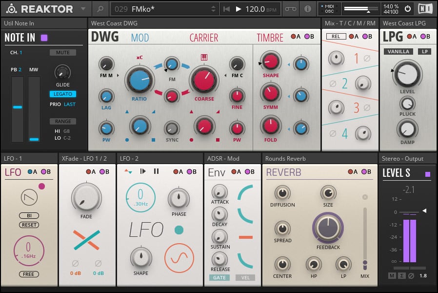
Original Massive was a cool GUI. Massive X looks like a Reaktor ensemble using default controls. Not inviting at all.
-

- KVRAF
- 37539 posts since 14 Sep, 2002 from In teh net
Obviously NI should have rebranded this plugin Marmite X 