Tokyo Ghost Skin for Bazille

Official support for: u-he.com
Post Reply New Topic
RELATED
PRODUCTS

Post

I don't have TG, i tried it and didn't click with it.

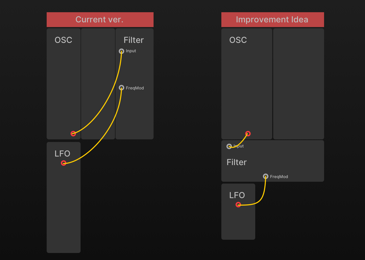
Asymmetric design is an interesting idea - it might make someone go for different patch choices and shuffle up their thinking.
I do think multiplexers, LFOs and processors belong together tho.

also, i'd appreciate a dark mode :) it's simply too bright for me.
Also, if there's space, Sliders instead of knobs on the envelopes. I don't use Gearporn because the knobs annoy me, i feel like i'm lost in the interface.

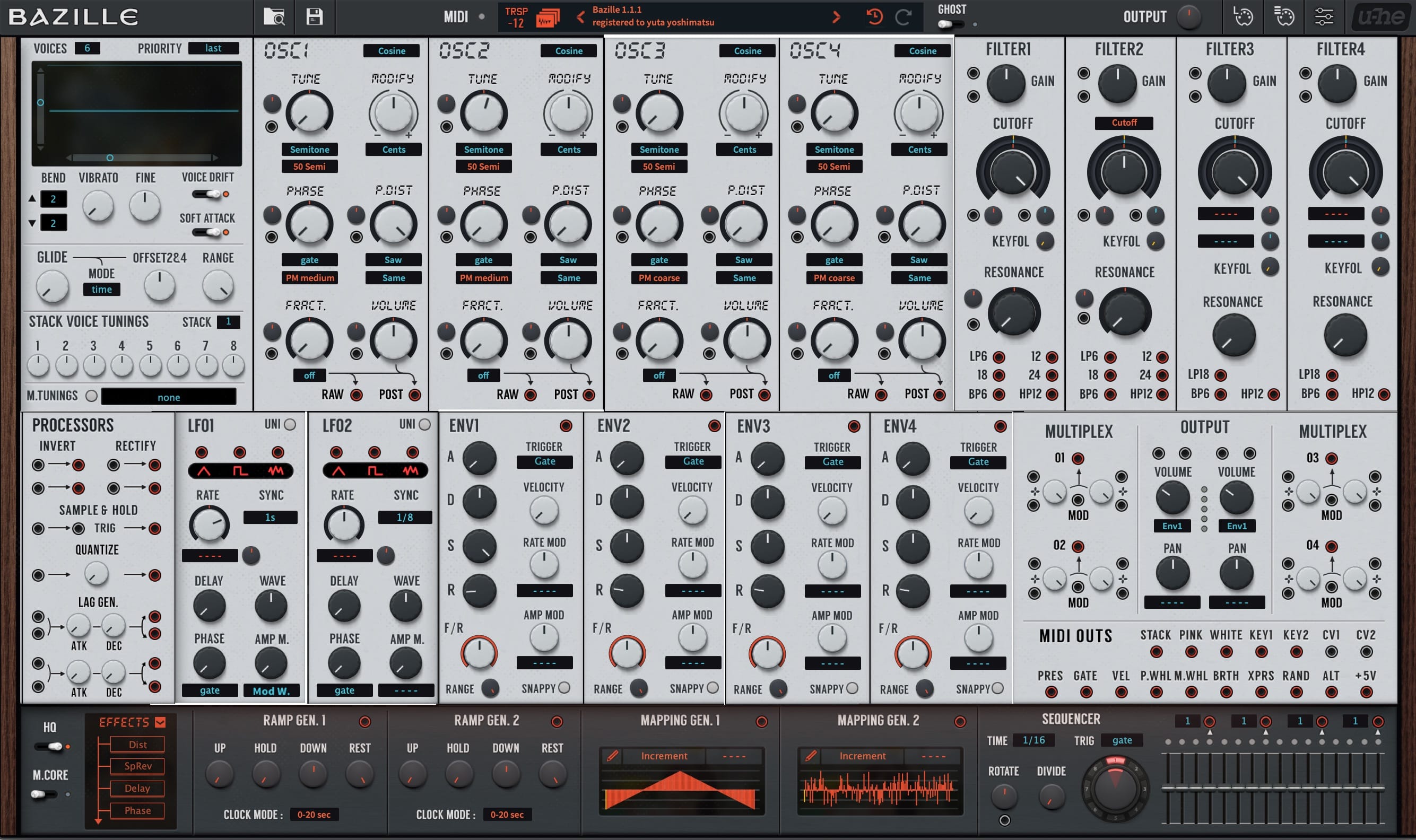
I use Bazille a lot (the most next to Hive) and i also use Softube Modular, but i don't have any hardware.
Having a skin where you could drag/drop and swap module layout around would be cool :D
Image

Post

plugmon wrote: Wed Dec 02, 2020 3:32 pm Bazille is going to be updated soon and I'm eager to update Tokyo Ghost too, something like a major update like...

-More generic font choice, less use of red colors for highlighting mod rings --like monolith skin for ACE.
-A bit larger GUI size, to make mod-depth knobs bigger.
-Small icon display for OSC waveforms

And now I'm really wondering what's the best layout for Bazille. How about asymmetric design?

Image

In Bazille the layout matter much because the labour of connecting cables changes heavily depending on the layout.
The problem is, I'm not a modular man at all and quite not sure on this point. I'd like to hear the voices of heavy users! :pray:

Please post your thoughts! Any idea, even complaint, is welcome.
That would be perfect ... if Bazille had a different mod system without cables :) I dont have a problem with the current mirrored layout :tu:

If it's not to much work, why not make 2 versions? But first ... where is that dark skin you've promised 1 year ago ... i'm still waiting :tantrum: :wink: (i prefer dark skins on all of my tools, if possible)

Post

i don't think he meant completely without cables?
Image

Post

audiot wrote: Wed Dec 02, 2020 4:25 pm If it's not to much work, why not make 2 versions? But first ... where is that dark skin you promised 1 year ago ... i'm still waiting :tantrum: :wink: (i prefer dark skins on all of my tools, if possible)
Wowwow... plan is a plan and there are a lot of plans stacked _:(´ཀ`」 ∠):
The main reason why the dark version hasn't come yet is that I'm not fully content with the current version. So polishing this light skin definitely is a step closer to the release of the dark version 8)
ImageMONA, the new skin for DIVA is released! | Follow me on Twitter.

Post

Ploki wrote: Wed Dec 02, 2020 4:53 pm i don't think he meant completely without cables?
I reckon what audiot is saying is that , say on the GUI I proposed as the screenshot connecting LFO and Filter requires very long dragging, and in symmetric design that misery can be avoided because you have LFO both left and right.

So maybe asymmetric layout is not for a large modular synth like Bazille?
ImageMONA, the new skin for DIVA is released! | Follow me on Twitter.

Post

Aah yeah i see.
yeah i have to agree
Image

Post

I strongly feel there must be a room for improving cable economy.
For example, OSC tend to be signaled to Filter, yet currently OSC output is bottom of module, while Filter input top. This not only takes your time, but also visually disturbing.

How about putting Filter between OSC & LFO? It seems rational.

Image

The layout of TG is very much influenced by Eurorack, but after all Bazille is not rack and I now think the layout can be more flexible, like the original skin.
ImageMONA, the new skin for DIVA is released! | Follow me on Twitter.

Post

plugmon wrote: Wed Dec 02, 2020 5:34 pm I strongly feel there must be a room for improving cable economy.
For example, OSC tend to be signaled to Filter, yet currently OSC output is bottom of module, while Filter input top. This not only takes your time, but also visually disturbing.

How about putting Filter between OSC & LFO? It seems rational.
I often send 2 oscillators to a multiple before going to the filter. I avoid to send 2 osc's each to a filter input cause I want to save the second filter input in case.

Hmmm... complex situation to visualize in the mind :)

Post

pdxindy wrote: Wed Dec 02, 2020 6:05 pm
plugmon wrote: Wed Dec 02, 2020 5:34 pm I strongly feel there must be a room for improving cable economy.
For example, OSC tend to be signaled to Filter, yet currently OSC output is bottom of module, while Filter input top. This not only takes your time, but also visually disturbing.

How about putting Filter between OSC & LFO? It seems rational.
I often send 2 oscillators to a multiple before going to the filter. I avoid to send 2 osc's each to a filter input cause I want to save the second filter input in case.

Hmmm... complex situation to visualize in the mind :)
Ah, mtltiple is another module difficult to place since many kinds of signal are routed in...
ImageMONA, the new skin for DIVA is released! | Follow me on Twitter.

Post

plugmon wrote: Wed Dec 02, 2020 6:34 pm
pdxindy wrote: Wed Dec 02, 2020 6:05 pm
plugmon wrote: Wed Dec 02, 2020 5:34 pm I strongly feel there must be a room for improving cable economy.
For example, OSC tend to be signaled to Filter, yet currently OSC output is bottom of module, while Filter input top. This not only takes your time, but also visually disturbing.

How about putting Filter between OSC & LFO? It seems rational.
I often send 2 oscillators to a multiple before going to the filter. I avoid to send 2 osc's each to a filter input cause I want to save the second filter input in case.

Hmmm... complex situation to visualize in the mind :)
Ah, mtltiple is another module difficult to place since many kinds of signal are routed in...
Yeah... I'm pondering this now... :borg:

Post

The only thing that i could imagine would be horizontal envelopes! Because an envelope describes the behaviour on a timeline and timelines are usually displayed in a horizontal. That's why most synths have horizontal envelopes and the majority of users is used to that style. It's just easier to capture what the envelope is doing, on a quick look.

Here's a quick scratch. With the current style it might look weird, because it doesnt fit to that eurorack module style. But yeah ... usability before look, i'd say :D
bazille mod.jpg
You do not have the required permissions to view the files attached to this post.

Post

audiot wrote: Wed Dec 02, 2020 6:55 pm The only thing that i could imagine would be horizontal envelopes! Because an envelope describes the behaviour on a timeline and timelines are usually displayed in a horizontal. That's why most synths have horizontal envelopes and the majority of users is used to that style. It's just easier to capture what the envelope is doing, on a quick look.

Here's a quick scratch. With the current style it might look weird, because it doesnt fit to that eurorack module style. But yeah ... usability before look, i'd say :D

bazille mod.jpg
an image helps a lot, thanks!
Yeah vertical envelopes are another thing I inherited from Eurorack, which I personally don't like.
Breaking rack structure may well bring better ideas(*⁰▿⁰*)

(Seems like we're getting closer back to the original skin... :lol: )
ImageMONA, the new skin for DIVA is released! | Follow me on Twitter.

Post

Yeah, something more similar to Monolith skin would be terrific!

By the way, while we're mentioning Monolith (sorry for off-topic), I have a suggestion for it! Modulation sources shown in dropdown menus each have their own color based on type. Don't you think it would then also make sense that icons below the mod source output ports match the same colors? I think it'd be cool :)

Post

It was TG that made me revisit Bazille. Since then, I have been using Bazille more than ever. And the very reason is TG:
+ clean and appealing design (I could also say attractive and beautiful to look at)
+ improved workflow (as compared to the original skins)

Therefore I say: Please do not change the overall structure of the skin!
And if you do change some fonts, knobs, colours (but not the general layout), please also offer the current one as an additional variant. Not every change means progress or improvement.
Of course, this is highly subjective.

Post

EvilDragon wrote: Thu Dec 03, 2020 9:00 am Yeah, something more similar to Monolith skin would be terrific!

By the way, while we're mentioning Monolith (sorry for off-topic), I have a suggestion for it! Modulation sources shown in dropdown menus each have their own color based on type. Don't you think it would then also make sense that icons below the mod source output ports match the same colors? I think it'd be cool :)
After years of using too much colors, now my trend is modest use of colors.
Actually in development stage I once had LFO shape icons blue, VCO/Filter type icons purple -- their respective colors.

Image

It's kinda consistent but after a while I found it a bit confusing because the distinction between modulation things and the others becomes unclear. So my current principle is to keep the usage of colors minimum, and labels don't deserve a color.

That said, To add alternative images that you can replace with as option would be an easy work :)
ImageMONA, the new skin for DIVA is released! | Follow me on Twitter.

Post Reply

Return to “u-he”