Hey Yuta. Amazing work on the skin (as always).
I think brightness is definitely not an issue, but I would like to see a bit more contrast, as drzhnn pointed out. The interface looks a bit washed out.
Perhaps at first glance I do feel the lack of colour. but once you get used to the workflow you wouldn't benefit from them as much as, let's say, coloured modules in your neumann skin. I would go for coloured waveforms and similar elements, even the selectable (on) ones such as voice mode (legato and so on), waveshape.
If space allows it, I would avoid too many abbreviations.
I would also try a dark-light-dark variation, with the same first row template as your early revision you just posted, because recalling the honeycomb shape was a nice touch.
Alternating light and dark in such way (basically like the first version, but inverted) would still retain the same separation of elements, and would have less light spots (even though the light areas are still darker than this page). I also prefer the previous waveshape selection, because it makes the interface look less cluttered.
I see that the q character still renders thin, just like in the neumann skin (which you worked around by making it upper case), but maybe the folks at u-he can help out this time around.
Hive 2.1 Izmo skin by Plugmon
-
- KVRist
- 115 posts since 6 Nov, 2014
-

- KVRist
- 396 posts since 3 Mar, 2015 from Japan
Minute yet specific indication is very much appreciated  Some ideas for improvements:
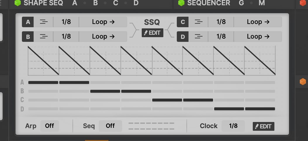
・Bolder button for big sequencer / shape sequencer editor opener
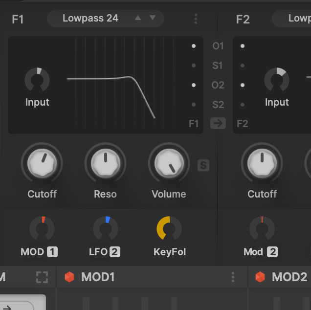
・Labels for cutoff mods
・Other minor things I should tackle
- Label for "Unison"
- Label for "Engine" (if enough space)
- Make Osc/SubOsc separation clear and remove S from "Stun/SVol"
- Less abbreviation. Mod Matrix definitely has width for more letters (A1→Amp1, M1→Mod1, L1→LFO1)
- Per element dark/light reconsideration
・Bolder button for big sequencer / shape sequencer editor opener
・Labels for cutoff mods
・Other minor things I should tackle
- Label for "Unison"
- Label for "Engine" (if enough space)
- Make Osc/SubOsc separation clear and remove S from "Stun/SVol"
- Less abbreviation. Mod Matrix definitely has width for more letters (A1→Amp1, M1→Mod1, L1→LFO1)
- Per element dark/light reconsideration

-

- KVRAF
- 3500 posts since 25 Apr, 2011
-

- KVRAF
- 19887 posts since 16 Sep, 2001 from Las Vegas,USA
Without looking at Hive's GUI for reference which of these knobs is set to -120 and which one is set to +48.50 ?
You do not have the required permissions to view the files attached to this post.
None are so hopelessly enslaved as those who falsely believe they are free. Johann Wolfgang von Goethe
-

- KVRAF
- 2267 posts since 25 Jun, 2008 from Montreal, Canada
OMG I can't stand white text on dark background! When I look at something else like a wall I can still see the text burned on my retina.Ploki wrote: Mon Jan 25, 2021 8:53 am most of the pages i browse get flipped into "dark mode" following OS setting.
My notes where i write the most is white on black
-
- KVRAF
- 3500 posts since 25 Apr, 2011
-

- KVRAF
- 14499 posts since 16 Feb, 2005 from Planet Earth, Somewhere
I just noticed that too.
Finally!!
rsp
sound sculptist
-
- KVRAF
- 3500 posts since 25 Apr, 2011

-
- KVRist
- 396 posts since 3 Mar, 2015 from Japan
-
- KVRAF
- 14499 posts since 16 Feb, 2005 from Planet Earth, Somewhere
Where is that dislike button when I need it for the smart ass .
lol
I kid, BUT it depends on the icon.
If it is a well known one. well..
rsp
lol
I kid, BUT it depends on the icon.
If it is a well known one. well..
rsp
sound sculptist
-

- KVRian
- 643 posts since 28 Oct, 2010
I'm guessing most people will be dark UI users that suddenly see something a bit too bright which will obviously be supper annoying.plugmon wrote: Mon Jan 25, 2021 1:27 amAs to "too bright" issue, I'd like to know if it's
"I do use light skins in other synth, but this one is too bright." or "I usually use dark skins, so this one is too bright."
We see this all the time in other UI areas (web dev, apps, etc).
I've been using dark UIs for a over a decade and recently went back to light UIs. It's not as cool-looking, but there's much less eye strain and I've been able to go back to old glasses. IMO the ideal solution is to provide both light and dark and let users decide, or have a UI that is neither too bright nor too dark.
-
- KVRAF
- 19887 posts since 16 Sep, 2001 from Las Vegas,USA
They must know proper UI creation then.plugmon wrote: Mon Jan 25, 2021 3:53 pm Now I see clearly why they removed that button. They need to make space for putting labels 'cause icons without labels need steep learning curve
None are so hopelessly enslaved as those who falsely believe they are free. Johann Wolfgang von Goethe