I think it's a good idea to include alternative themes
Hive 2.1 Izmo skin by Plugmon
-
- KVRian
- 671 posts since 8 Jan, 2005 from Germany
Wow!  Looks like a modified version of the Eclipse skin. The controls look better and the overall look is more balanced, but the greyish color scheme in Eclipse works better for me. I think Izmo needs some fine tuning with brightness/contrast. But apart from that:
I think it's a good idea to include alternative themes Zebra and Bazille are the only ones that come with different themes (as far as i can remember). And it's a good idea to hire plugmon for that job
I think it's a good idea to include alternative themes
-
- KVRist
- 283 posts since 4 Feb, 2015
plugmon wrote: Tue Jan 26, 2021 11:17 am
Putting light/dark discussion aside, I'm curious about the opinions for "waveform selector".
With this selector --
Pros : It takes just 1 click to select waveforms.
Cons : For main OSC, having 2 menus to select waveforms, one of which is hidden in WT mode, is rather perplexing. Displaying many icons, it may look cluttered.
Without this selector --
Pros : Looks simple. Works simple.
Cons : You need 2 clicks every time you switch waveforms.
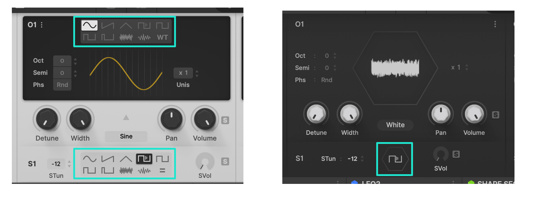
Out of these two, definitely the first option - with this selector!
But why don't you stick with your original draft (see below)? Or is that the same? I am confused.
BTW: Please do not use any hexagons in your skin. Does not look good at all (talking about these two little hexagons for the OSCs).
You do not have the required permissions to view the files attached to this post.
-

- KVRAF
- 3499 posts since 25 Apr, 2011
You are showing the display when a "wavetable" is selected. He's showing the way "a normal" OSC would look like. In the Hive2.1 BETA, this is how it ise-musician wrote: Tue Jan 26, 2021 5:57 pmplugmon wrote: Tue Jan 26, 2021 11:17 am
Putting light/dark discussion aside, I'm curious about the opinions for "waveform selector".
With this selector --
Pros : It takes just 1 click to select waveforms.
Cons : For main OSC, having 2 menus to select waveforms, one of which is hidden in WT mode, is rather perplexing. Displaying many icons, it may look cluttered.
Without this selector --
Pros : Looks simple. Works simple.
Cons : You need 2 clicks every time you switch waveforms.
Out of these two, definitely the first option - with this selector!
But why don't you stick with your original draft (see below)? Or is that the same? I am confused.
Izmo OSC WT.png
BTW: Please do not use any hexagons in your skin. Does not look good at all (talking about these two little hexagons for the OSCs).
-
- KVRist
- 75 posts since 2 Jan, 2021
OMG YESSSS
どうもありがとうございました
even in this early beta stage, so much thought has obviously gone into this more-than-a-skin
(and well done to everyone in the thread before me for broadly useful critique)
so so much more than a puny changing of the colors or assets - a whole bunch of neat ideas that really change the UX of the synth
for instance:
- L/R delay time column setting - like it
- maximizing the scope view - love it
- the "MixControl" with filter flow diagram - looooove it
- piano roll visualisation in the sequencer - i may have died and gone to heaven
much much much much prefer having both filters side-by-side instead of either side of the hexagon - operator routing especially is much easier to glance at without having to make your eyes split to look at both sides of the hexagon at once
even tiny things that are real "attention to detail", such as the icons for the type of source for the function generators - so much easier to glance and see what is selected instead of having to focus and read "ShapeSeq A"
and editing the sequencer steps in-place, in a single continuous strip without popping-up each - yes yes yes yes yes
* a couple of tiny "bugs?":
- double-click on the FX icon changes selection to the modulation icon, but none of the other icons do anything on double-click (the selection is unchanged)
- left-clicking on the mode in phaser toggles between flanged/stoned, but the same does not work for modes in distort or chorus - you have to use the right-click context menu there, which caused me a little confusion for a bit
- the non-bold "q" is really funny - it happens everywhere i've found a "q" in the UI (i found 3 "q"s, can anyone find more?)
* a couple of things i'm not so keen on:
- the compressor gain reduction meter (5 horizontal dots) seems less intuitive than the original-skin one (vertical downwards column), but perhaps there were additional design-related considerations?
- the main meter in the MixControl jumps around so much on arp patches that it creates a flickering/strobing effect
* 100% will not be going back to the original skin
thanks plugmon and uHe - an amazing thing to include for us all in a .x update
(platform: Win10/Ableton/VST2 64bit)
-
- KVRist
- 75 posts since 2 Jan, 2021
oh, and for the "too light"/"needs contrast" question:
this is NOT intended as a brag, but as someone who does professional color-critical work, on a monthly-hardware-calibrated, IPS, 100% sRGB, delta E < 2, etc. etc. etc. setup: it is pretty good, i've been using the skin for a good while now - no eye strain, and i would be the first to be grumpy if it had
BUT! to use an audio analogy:
just like some speaker systems artificially boost low+high end to be more "instantly pleasing", so do many many monitors boost contrast, saturation (and sometimes gamma), etc.
SO: for the average monitor (regardless of the pro-monitor situation), the levels/large-block areas might need tweaks, by the sounds of it
-
- KVRist
- 283 posts since 4 Feb, 2015
Ah, okay, I see. Thanks for your explanation!exmatproton wrote: Tue Jan 26, 2021 6:27 pm You are showing the display when a "wavetable" is selected. He's showing the way "a normal" OSC would look like. In the Hive2.1 BETA, this is how it is
-

- KVRist
- 396 posts since 3 Mar, 2015 from Japan
Basically FX types are switchable with vertical drags like oct/semi parameter in OSC section. There're arrows indicating this, but due to the color rendering issue I mentioned before, currently it's barely visibleoctaveup wrote: Wed Jan 27, 2021 12:03 am - left-clicking on the mode in phaser toggles between flanged/stoned, but the same does not work for modes in distort or chorus - you have to use the right-click context menu there, which caused me a little confusion for a bit
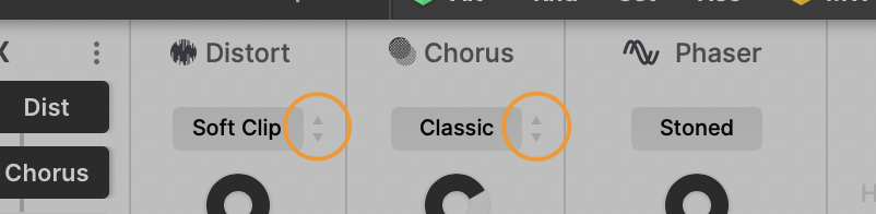
Phaser is exceptional -- click to switch between modes, since there're only 2 modes.
But here's again a battle of consistency vs efficiency. Different actions for the same kind of parameters will be perplexing, but in switching easiness it excels.

-
- KVRist
- 75 posts since 2 Jan, 2021
^ i never manage either of them, so at least 1 out of 2 is already good going
would putting a different "toggle" icon to the right of the phaser selection box work?
(in an equivalent location to the up/down arrows in the distortion/chorus, but a different icon to show that it's a toggle instead of a click+drag?)
edit: obviously a different icon, because this example one is rubbish, but here's what i mean:
You do not have the required permissions to view the files attached to this post.
Last edited by octaveup on Wed Jan 27, 2021 7:42 am, edited 1 time in total.
-
- KVRer
- 17 posts since 8 Nov, 2018
Interesting. We must be on the same wavelength because I did something similar.Funkybot's Evil Twin wrote: Thu Jan 21, 2021 5:12 pm I made the same suggestion, but purple on black is not great for contrast IMO. I created my own personal Eclipse Mod (won't be sharing for obvious reasons) but it looks like this:

It's still a work in progress. I'm having issues with fonts. For some reason, Hive is reacting to script changes for font size and color attributes but insists on rendering the text using an ugly, non anti-aliased generic bitmapped font instead. Your screenshot doesn't seem to have this issue, nor does my installation of Diva. I've tried specifying a Mac system font or a font I add to the Hive font folder in the script file to no avail.
You do not have the required permissions to view the files attached to this post.
-
- KVRer
- 17 posts since 8 Nov, 2018
I'm having the same generic blocky font issues with the Beta using Izmo as with any other skin in Hive 2.01. Anyone have any idea how to fix it? It doesn't happen with my install of Diva.
You do not have the required permissions to view the files attached to this post.
-
- KVRist
- 75 posts since 2 Jan, 2021
just call it "future retro" and charge morekarlfranz wrote: Wed Jan 27, 2021 7:16 am insists on rendering the text using an ugly, non anti-aliased generic bitmapped font instead
-
- KVRAF
- 3499 posts since 25 Apr, 2011
Yeah, no. Other content is pretty much working just fine. I am not recalibrating my "avarage" monitors again for 1 plugin ...octaveup wrote: Wed Jan 27, 2021 12:14 am
SO: for the average monitor (regardless of the pro-monitor situation), the levels/large-block areas might need tweaks, by the sounds of it
-
- KVRist
- 75 posts since 2 Jan, 2021
^ 100% agreeexmatproton wrote: Wed Jan 27, 2021 8:45 am I am not recalibrating my "avarage" monitors again for 1 plugin ...
only "average" as in "most frequent", not "average" as in "bad" or "cheap" (no offense intended, and i hope none taken)
i'm sure retina monitors are more expensive than mine
just like audio monitors: specialist accuracy-focused monitors are essential for the creative process, but there are many many more car speaker systems out there, so we have to take those into account during mixing/mastering (and cars are more expensive than (most) speakers, even if they're useless for mixing on
-
- KVRAF
- 3499 posts since 25 Apr, 2011
No..i mean. I like dark elements on my screen at night.octaveup wrote: Wed Jan 27, 2021 2:25 pm^ 100% agreeexmatproton wrote: Wed Jan 27, 2021 8:45 am I am not recalibrating my "avarage" monitors again for 1 plugin ...
only "average" as in "most frequent", not "average" as in "bad" or "cheap" (no offense intended, and i hope none taken)
i'm sure retina monitors are more expensive than mine
just like audio monitors: specialist accuracy-focused monitors are essential for the creative process, but there are many many more car speaker systems out there, so we have to take those into account during mixing/mastering (and cars are more expensive than (most) speakers, even if they're useless for mixing on
Plugmon asked for feedback and since i like dark elements with low contrast i vented that it is too bright for my taste. It is not about cheap/avarage monitors. It is about if that theme ticks all the boxes for 'certain' users. For some it does, for me it doesn't. It is just too bright. No matter what settings on my screens
-
- KVRist
- 182 posts since 25 Jul, 2005 from Vancouver, Canada
I am loving this so far, it really cleans up Hive that had become somewhat quite cluttered...
... I also love that it looks like the ACE Monolith skin, maybe Bazille Tokyo Ghost needs some tweaks! LOL
... I also love that it looks like the ACE Monolith skin, maybe Bazille Tokyo Ghost needs some tweaks! LOL
But then a strange fear gripped me
and I just couldn't ask....
and I just couldn't ask....