Hive 2.1 Izmo skin by Plugmon

Official support for: u-he.com
Post Reply New Topic
RELATED
PRODUCTS

Post

Taking drzhnn's advice, I'm reducing dark elements popping out of light backgrounds.

Image

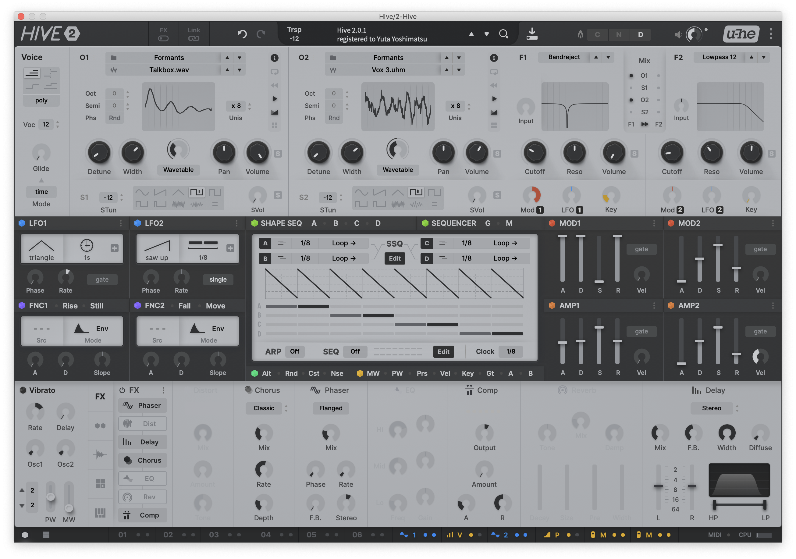
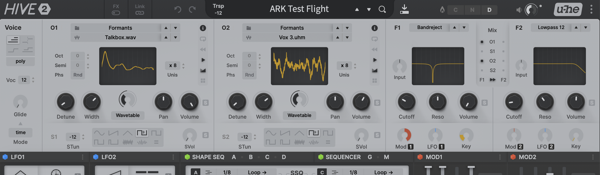
(Also, the brightness of light backgrounds are just a little bit darkened now.)

It is interesting. What truly makes you feel "oh, my eyes get burned" is not the lightness itself, but the intensive alteration between dark/light. It must have something to do with eye pupils. On watching dark areas your pupils are dilated, then all the lights around there surge into your eyes.

Image

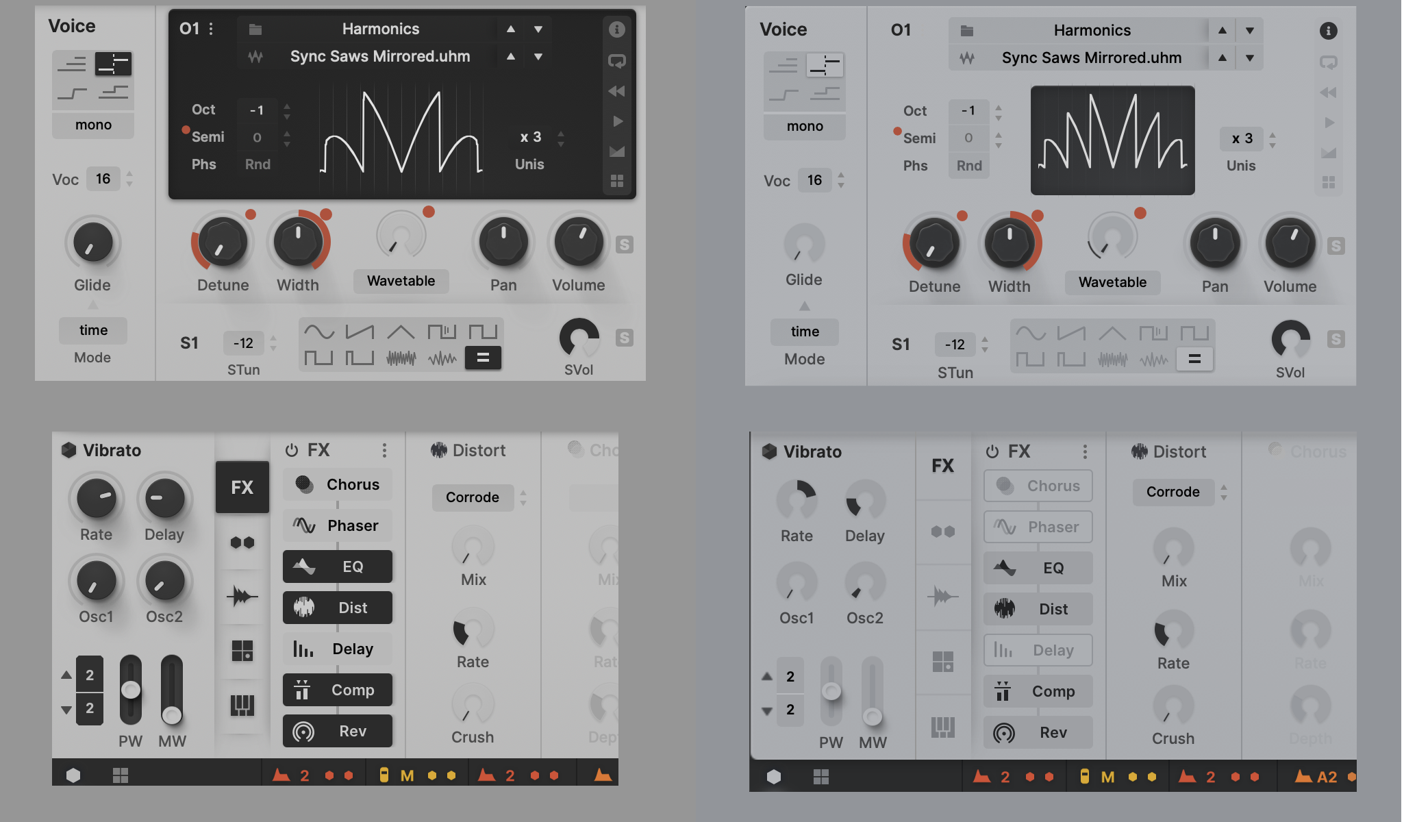
So despite the fact that the right one is brighter in terms of pure proportion of light/dark, it looks much easier on the eyes.
It's getting better all the time, better better better :phones:
ImageMONA, the new skin for DIVA is released! | Follow me on Twitter.

Post

I much preferred the previous version to be honest. Especially the one with coloured (purple / yellow) waveforms. I can see that this could be easier on the eyes in for longer usage. Maybe something in between? A darker shade of grey background in the OSCs and LFOs, instead of the original black?

Post

I prefer this one easier on the eyes

Post

would it be possible/good to render the waveforms and filter curves themselves using the dark grey?

put them onto the same lighter background as the rest of the section?

Post

lonnyman wrote: Thu Jan 28, 2021 10:25 am I much preferred the previous version to be honest. ....................
Me too.
this just looks dull and blah to me.
rsp
sound sculptist

Post

octaveup wrote: Thu Jan 28, 2021 3:26 pm would it be possible/good to render the waveforms and filter curves themselves using the dark grey?

put them onto the same lighter background as the rest of the section?
Likely to happen.

Image

This further reduces abrupt contrast, but personally I feel comfortable of conventional dark display + light graph (somehow feel weird of watching the dark lines waving & wiggling). I think this has quite software-ish touch and would be suitable for total flat design...


lonnyman wrote: Thu Jan 28, 2021 10:25 am I much preferred the previous version to be honest. Especially the one with coloured (purple / yellow) waveforms. I can see that this could be easier on the eyes in for longer usage. Maybe something in between? A darker shade of grey background in the OSCs and LFOs, instead of the original black?
Colored graph is still on the table! It does look fine too.

Image
ImageMONA, the new skin for DIVA is released! | Follow me on Twitter.

Post

impressively quick work!

i was thinking more like a fully-uniform background:

hive-3.png
You do not have the required permissions to view the files attached to this post.

Post

Definitely prefer the colored graphs. The little splashes of color go a long way IMO.

I'm not totally sure about the new, lower contrast look but it might be easier in the long run. On the other hand, it looks a bit more like an FXpansion GUI (thinking Bloom, Geist) and no one really loved those either. Has a bit of a "draft" or "mock-up" look. Like these are just placeholder elements and more change is coming. But I'm not using it, I'm just reacting to a small screen print on a forum. So take any of this with a grain of salt.

What I can see is that for me, this looks a little too soft. It exists in the current version and this looks like it may make it a little worse. Like the text is a little too anti-aliased and blurry, a little too gray against the gray background. Everything feels a like it has a soft blur applied. Even the knobs. And there's some shadows/lighting I'm seeing around some labels which just add to the gray/low contrast feeling. I feel like my eyesight is going. Is my eyesight going? lol

I say it all the time, my favorite plugmon skin is Tokyo Ghost. Crisp text. Bright GUI, but not unbearably so. Good use of color and contrast IMO. But then again, I don't keep my studio super dark, working with the lights off at a night, and a bright monitor. Some people like to work that way to set a mood, and then I could see Tokyo Ghost being too bright.

Post

yes, for me, the previous version never burnt my eyes

i feel that the low-contrast of this version might rather cause more eyestrain, long-term

(ymmv)

let's put them side-by-side:

(bear in mind that choice of browser can affect things: Chrome renders these blurry for me, whereas Firefox is sharper but has a yellow cast)


Hive1.png
hive-2.png
You do not have the required permissions to view the files attached to this post.

Post

this is INSANE
now hive looks like MassiveX

Post

i *personally* prefer the knobs of the first one to the filling-up-circles of the second (everyone else might disagree)

i think the circles is how some u-He synths have looked in the past, and might have associations with that?

i hope everyone remembers (or even still uses) the excellent zebraCM for instance:

uhe-zebracm-screenshot-fullui-1150x775 - small.png

(image from the u-He website - I hope you don't mind :D )
You do not have the required permissions to view the files attached to this post.
Last edited by octaveup on Thu Jan 28, 2021 4:42 pm, edited 1 time in total.

Post

dune_rave wrote: Thu Jan 28, 2021 4:40 pm now hive looks like MassiveX
except better :D

Post

octaveup wrote: Thu Jan 28, 2021 4:34 pm yes, for me, the previous version never burnt my eyes

i feel that the low-contrast of this version might rather cause more eyestrain, long-term

(ymmv)

let's put them side-by-side:

(bear in mind that choice of browser can affect things: Chrome renders these blurry for me, whereas Firefox is sharper but has a yellow cast)


Hive1.png

hive-2.png
Thanks a lot for the comparison :D I also prefer the first one, I like how the sections are visually separated. But I have to say, the second version also looks great, I would love any of them.

Post

Funkybot's Evil Twin wrote: Thu Jan 28, 2021 4:13 pm it looks a bit more like an FXpansion GUI (thinking Bloom, Geist) and no one really loved those either.
hehe It's too much to say but I understand what you mean. If GUI goes too unified, flat, simple and still, it starts to drain your passion. I'm gonna make some patch with this skin and see how it feels like -- relaxing or uninspiring, the two sides of the same coin :)
ImageMONA, the new skin for DIVA is released! | Follow me on Twitter.

Post

I haven't gone through the whole thread, but I have a bug report. Should I report this here or in the main Hive beta thread?:

In Bitwig 3.3.1 running on a 2019 16" MacBook Pro, this skin has a significantly slower frame rate than the factory default. I'm seeing a lot of knob jitter and stuttered animations during interaction. With the factory default, everything runs smoothly.

Post Reply

Return to “u-he”