Hive 2.1 Izmo skin by Plugmon

Official support for: u-he.com
Post Reply New Topic
RELATED
PRODUCTS

Post

Long time no see, everybody!

I just wanted to stop in and say how great that Izmo skin looks. The original wasn't bad by any stretch and I prefer night mode skins, but Izmo is the one I'm using. I also appreciate that even though it's "white" it's actually more a light grey that looks white due to contrast, so it's not eye-searing for my cave-dwelling eyes. I look forward to a proper dark mode skin!

I apologize for not going through the full thread so if these are repeats just consider them a +1 from me:
  • I feel like clicking the FX name/header should turn it on and off, but it does nothing. You have to use the FX list on the left.
  • Kinda related to the above, the mouse pointer doesn't change so it isn't always clear what is actually clickable. This isn't a huge deal because if it exists it's probably clickable, not a lot of dead space. If I had a feature request around pointers though, it would be that the pointer changes to indicate the type of action. So up&down arrows for sliders/knobs, the hand-pointer thing for buttons, etc. Nice to haves, not a big deal. The target-dragging pointer is primo BTW!
  • The "FX bypass" icon I feel like should have a slash through it, it's kind of misleading as is.
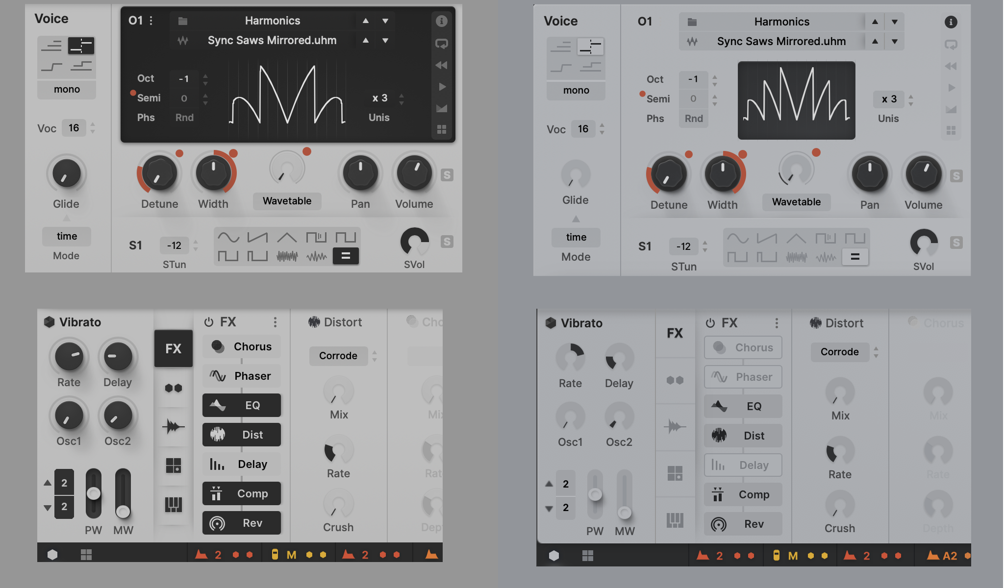
  • I did see comments about the abbreviations, yeah those could use some improvement. "Phs" when "Semi" is right there I figure at least "Phas" would fit? I've gotten used to seeing just "Sync" or "Reset" on eurorack gear, but I can see how that might be confusing.
  • I don't mind the monochrome waveforms, but Tron teal would look good I think too.
I thought you were using exaggerated marking speak when you said it's like a whole new synth, but you're right! Hive even sounds better when I use the Izmo skin ;)
noise and beats: Negutyv Xeiro do people actually click these?
gearlust: Roland JP-8000, too much/not enough eurorack
machinecode by: u-he, Bitwig, Fabfilter, NI, et al

Post

I was thinking Tron teal & orange too. Although I also like the current look.

Post

plugmon wrote: Sat Jan 30, 2021 7:03 am especially regarding sequencer
this doesn't mean you're going to take out the piano roll, does it? :cry: :cry: :cry:

Post

octaveup wrote: Sun Jan 31, 2021 2:19 am
plugmon wrote: Sat Jan 30, 2021 7:03 am especially regarding sequencer
this doesn't mean you're going to take out the piano roll, does it? :cry: :cry: :cry:
hehe, I said "most of the arguments", which means not all I agree on. Pianoroll consumes only small space so it will never be removed unless I desperately need room for something huuuuge :)
ImageMONA, the new skin for DIVA is released! | Follow me on Twitter.

Post

plugmon wrote: Sun Jan 31, 2021 5:01 am
octaveup wrote: Sun Jan 31, 2021 2:19 am
plugmon wrote: Sat Jan 30, 2021 7:03 am especially regarding sequencer
this doesn't mean you're going to take out the piano roll, does it? :cry: :cry: :cry:
hehe, I said "most of the arguments", which means not all I agree on. Pianoroll consumes only small space so it will never be removed unless I desperately need room for something huuuuge :)
Piano roll is a top feature! :wink:

Post

plugmon wrote: Sun Jan 31, 2021 5:01 am
octaveup wrote: Sun Jan 31, 2021 2:19 am this doesn't mean you're going to take out the piano roll, does it? :cry: :cry: :cry:
hehe, I said "most of the arguments", which means not all I agree on. Pianoroll consumes only small space so it will never be removed unless I desperately need room for something huuuuge :)
I wasn't suggesting that the piano roll should be removed. I was just pointing out that it can be a bit misleading to the un-initiated. I've got the transposition values above, so I'm good. :ud:

Post

I’m obviously missing something, but how do I get the the wave selector from WT view?
Last edited by lonnyman on Sun Jan 31, 2021 5:50 am, edited 1 time in total.

Post

Deleted
Last edited by lonnyman on Sun Jan 31, 2021 5:48 am, edited 1 time in total.

Post

lonnyman wrote: Sun Jan 31, 2021 5:46 am Image

So despite the fact that the right one is brighter in terms of pure proportion of light/dark, it looks much easier on the eyes.
It's getting better all the time, better better better :phones:
I still think that giving the OSC and filters a dark background makes it more coherent. In the new versions the waveforms look too isolated and feel smaller.

Post

plugmon wrote: Sun Jan 31, 2021 5:01 am hehe, I said "most of the arguments", which means not all I agree on. Pianoroll consumes only small space so it will never be removed unless I desperately need room for something huuuuge :)
:wheee:

karlfranz wrote: Sun Jan 31, 2021 5:29 am I wasn't suggesting that the piano roll should be removed. I was just pointing out that it can be a bit misleading to the un-initiated. I've got the transposition values above, so I'm good. :ud:
100% we can both be happy :D :party:

Post

lonnyman wrote: Sun Jan 31, 2021 5:46 am how do I get the the wave selector from WT view?
99% sure i've misunderstood (sorry) - do you mean where you select the wavetables themselves? if so (but i doubt it): for me on PC, i just L/R click on either the wavetable illustration itself, or the texts above it (or use the arrows to cycle through)

or do you mean the multis? if so, for me on PC: click on the "i" at the top-right of the oscillator region, or the little 4-box icon bottom-right

lonnyman wrote: Sun Jan 31, 2021 5:47 am I still think that giving the OSC and filters a dark background makes it more coherent. In the new versions the waveforms look too isolated and feel smaller.
i also agree: i've been using the skin as it currently stands for a good while today, and i'm really getting used to (and liking) the large dark boxes - they make a really nice logical grouping

Post

octaveup wrote: Sun Jan 31, 2021 6:42 am
i also agree: i've been using the skin as it currently stands for a good while today, and i'm really getting used to (and liking) the large dark boxes - they make a really nice logical grouping
yes, "logical grouping" is what it is really. Without the dark boxes, all the small icons and selectors feel randomly scattered on the same background. Maybe easier on the eyes, but harder on the brain :hihi:

p.s. the dark boxes also give it a meaner look, very important when making techno!

Post

One of the things I love about u-he plugins is how we are able to customize the UI any way we want to suit our needs and our sense of aesthetic.
Here, I changed the look of Plugmon's Mixcontrol using the same pretty slider elements he used elsewhere in the Izmo design. I also came up with different icons for representing if a sound generator is plugged-in to the signal path or bypassed. (I didn't care too much for the 3D arrows floating on top of the graphic).

Opinions are always welcome.
.
Serial.png
.
Parallel.png
You do not have the required permissions to view the files attached to this post.

Post

Urs wrote: Thu Jan 28, 2021 10:33 pm
plugmon wrote: Thu Jan 28, 2021 6:07 pm
neuromod wrote: Thu Jan 28, 2021 5:59 pm thelizard, you don't need to file bug report - talk/read about it here:

viewtopic.php?f=31&t=559587
Besides this, u-he's UI designer has found out where does the IZMO's GUI heaviness comes from. It'll be improved.
We're quite in awe (that's a good thing) as to how you work, and how you use our concepts in ways we haven't anticipated.
Does that mean there will be an official Plugmon skin coming standard with future u-he products? :)

Plugmon, I would not mind your take on Filterscape and MFM2 ;)

Post

EvilDragon wrote: Tue Feb 02, 2021 12:19 pm
Does that mean there will be an official Plugmon skin coming standard with future u-he products? :)

Plugmon, I would not mind your take on Filterscape and MFM2 ;)
Do.Not.Make.Me.Dream!!!

Filterscape VA would be amazing, if it got the Plugmon treatment!!!!
But then a strange fear gripped me
and I just couldn't ask....

Post Reply

Return to “u-he”