Yes, of course.plugmon wrote: Thu Feb 04, 2021 3:55 am This has not been discussed between me and u-he side, but I think it should be free for everyone to modify & share my skin as derivative works. There're tons of modified Gearporn skin out there, which I think is a good culture.
Hive 2.1 Izmo skin by Plugmon
-

- u-he
- 30255 posts since 8 Aug, 2002 from Berlin
-

- KVRAF
- 24458 posts since 7 Jan, 2009 from Croatia
@plugmon:

This specific part feels slightly inconsistent to me. I feel that unselected tabs could be even more transparent (brighter gray, "falling back into the background"), see for example how the disabled FX slot looks. Matching those two seems it could improve the visual cue that FX really IS the currently selected tab.
Rough (apologies!) shoop of it:
-

- KVRist
- 396 posts since 3 Mar, 2015 from Japan
Thanks, I personally prefer this way. The reason I made these icons a bit dark was the fear for the people whose eyes or monitors are not so sharp as to distinguish these low contrast icons,

-
- KVRAF
- 24458 posts since 7 Jan, 2009 from Croatia
Gotcha. Maybe then, to retain consistency, the disabled FX slot should take on the color of the inactive tab icons? 
But also, the unselected tabs could have a darker background? Or the selected one could have a brighter one? I vaguely remember drzhnn showing something similar to that...
But also, the unselected tabs could have a darker background? Or the selected one could have a brighter one? I vaguely remember drzhnn showing something similar to that...
-
- KVRist
- 33 posts since 21 Apr, 2020
I like having different colors for active FX in the original. I’d like to see that in this skin too. It would also solve this issueEvilDragon wrote: Thu Feb 04, 2021 1:27 pm Gotcha. Maybe then, to retain consistency, the disabled FX slot should take on the color of the inactive tab icons?
But also, the unselected tabs could have a darker background? Or the selected one could have a brighter one? I vaguely remember drzhnn showing something similar to that...

-
Funkybot's Evil Twin Funkybot's Evil Twin https://www.kvraudio.com/forum/memberlist.php?mode=viewprofile&u=116627
- KVRAF
- 12517 posts since 16 Aug, 2006
When it comes to plugmon's current-state skin, I wonder if anything can be done with the FX section to get some color in there. Whether it's coloring the backgrounds, the text, maybe colorizing the FX names on the left and having them match up with the FX Names in the actual slots. You know...gray tab = off, colored text = enabled. The gray in that section feels to minimalistic for what FX represent (I think "technicolor" once I start adding fx).
-
- KVRAF
- 24458 posts since 7 Jan, 2009 from Croatia
indeed each effect could have its own color. Or colour, for Howie.
-
- KVRAF
- 2911 posts since 3 Mar, 2006
so I love the layout and features of this skin but I do think it could use a bit of colour - one guy on the surge discord (not sure if he is on KVR as well) is working on a skin that manages to be bright while keeping contrast mild that looks gorgeous with a "solarized" kinda theme...
Some type of muted gold/navy/off-white scheme might be easier on the eyes than black/gray/white
Some type of muted gold/navy/off-white scheme might be easier on the eyes than black/gray/white
You do not have the required permissions to view the files attached to this post.
-
- KVRer
- 17 posts since 8 Nov, 2018
I'd have to see it, but my initial impression is that it may look a bit too garish and totally take away from Izmo's original design aesthetic which appears to be inspired by a sheet of paper. Little hints of color are already in the modulators and orbits and those colors have meaning in the design.You start throwing in many more colors and it'll start looking like the Playschool section at Toys 'R' Us.Funkybot's Evil Twin wrote: Thu Feb 04, 2021 5:38 pm When it comes to plugmon's current-state skin, I wonder if anything can be done with the FX section to get some color in there. Whether it's coloring the backgrounds, the text, maybe colorizing the FX names on the left and having them match up with the FX Names in the actual slots. You know...gray tab = off, colored text = enabled. The gray in that section feels to minimalistic for what FX represent (I think "technicolor" once I start adding fx).
BTW, like 7% of the male population, I'm partially colorblind, so telling colors apart (especially in small elements) will already be a challenge.
Of course, the beauty of u-he VSTs is that it's pretty trivial to redo the color palette to your preference. The part I'm most happy with is Plugmon's actual control layout. The original theme always put me off and discouraged me from using the VST except as a preset player. Since I discovered Plugmon's Eclipse and now Izmo, I'm more motivated to experiment with the sounds.
-
- KVRist
- 75 posts since 2 Jan, 2021
especially the step sequencerkarlfranz wrote: Thu Feb 04, 2021 6:13 pm The part I'm most happy with is Plugmon's actual control layout
(i tease)
since Izmo, using Hive a lot more - wouldn't want to return to the original layout, which i used to really like - great work Plugmon
(and u-He for getting Plugmon onboard in the first place)
would be super-interested to go deeper into the effect of graphic-versus-pie-slice knobs, in terms of color/contrast perception especiallykarlfranz wrote: Thu Feb 04, 2021 6:13 pm BTW, like 7% of the male population, I'm partially colorblind
@karlfranz (or anyone): do you find either of these a lot better than the other?
You do not have the required permissions to view the files attached to this post.
-
- KVRist
- 396 posts since 3 Mar, 2015 from Japan
Yeah, yeah I'm curious (and worried) of this too. Yellow on the light gray contrast issue is a big wall for light skins. The very latest build (the one I'm refining up until now) has been improved on this point -- make the background a bit darker & the yellow is slightly saturated + lean to orange side, to create more contrast.octaveup wrote: Fri Feb 05, 2021 5:34 amwould be super-interested to go deeper into the effect of graphic-versus-pie-slice knobs, in terms of color/contrast perception especiallykarlfranz wrote: Thu Feb 04, 2021 6:13 pm BTW, like 7% of the male population, I'm partially colorblind
@karlfranz (or anyone): do you find either of these a lot better than the other?
knob-comparison.png
Still not sure if it's OK for most users. Flipping orange/yellow is a feasible choice if it's problematic. -- or the Dark skin may eventually win.
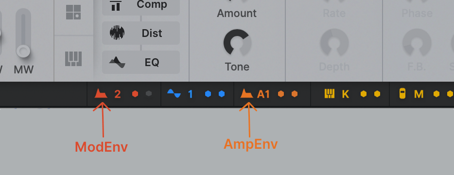
For the same regard (color blind universality), in footer matrix, ModEnv and AmpEnv are now distinguished by the "A" capital letter, not only by just colors.
Last edited by plugmon on Fri Feb 05, 2021 8:56 am, edited 1 time in total.
-
- KVRist
- 396 posts since 3 Mar, 2015 from Japan
Yes, paper, exactly!!karlfranz wrote: Thu Feb 04, 2021 6:13 pmI'd have to see it, but my initial impression is that it may look a bit too garish and totally take away from Izmo's original design aesthetic which appears to be inspired by a sheet of paper.Funkybot's Evil Twin wrote: Thu Feb 04, 2021 5:38 pm When it comes to plugmon's current-state skin, I wonder if anything can be done with the FX section to get some color in there. Whether it's coloring the backgrounds, the text, maybe colorizing the FX names on the left and having them match up with the FX Names in the actual slots. You know...gray tab = off, colored text = enabled. The gray in that section feels to minimalistic for what FX represent (I think "technicolor" once I start adding fx).
-
- KVRer
- 1 posts since 11 Feb, 2018
Hi,
Some of us are working in a dark environment and others in a high light one... sometime for many hours. Could you propose a menu where we can choose between a skin that can be pretty dark such as the current one when the light around is low, and one that is like the light grey you show us that will be cool when it s lightish ? That would be cool for our eyes to have the ability to choose between two color screen dark/light !
Some of us are working in a dark environment and others in a high light one... sometime for many hours. Could you propose a menu where we can choose between a skin that can be pretty dark such as the current one when the light around is low, and one that is like the light grey you show us that will be cool when it s lightish ? That would be cool for our eyes to have the ability to choose between two color screen dark/light !