There already is such a feature. It's possible to have multiple themes in your application support folder, some light and some dark, and choose which to display on the fly. You can even adjust the gamma (brightness) of the theme if it is a little too bright or dark on your particular monitor.pguardio wrote: Fri Feb 05, 2021 6:24 am Hi,
Some of us are working in a dark environment and others in a high light one... sometime for many hours. Could you propose a menu where we can choose between a skin that can be pretty dark such as the current one when the light around is low, and one that is like the light grey you show us that will be cool when it s lightish ? That would be cool for our eyes to have the ability to choose between two color screen dark/light !
Hive 2.1 Izmo skin by Plugmon
-
- KVRer
- 17 posts since 8 Nov, 2018
-
- KVRer
- 17 posts since 8 Nov, 2018
Many factors contribute to how we perceive color. Our minds use a combination of these in different degrees in order to help us in telling them apart. Some of these factors are:
- Hue: The actual color frequency. This is the starting ground for how we all determine color and is also where the physical limitation for most colorblindness stems from. We literally have less of the color detectors (cones) in our eyes than those with “normal” color perception so we’re starting with slightly less information. There are different degrees of colorblindness so it’s not a binary “yes they are” or “no they’re not” issue, but research has shown that is way more prevalent in men than women.
- Intensity (saturation): This is what we normally refer to as the “shade” of a color. Think of the people who mix color at the paint department in Home Depot. They start with a can of white paint and add a bit of red pigment so the paint becomes a light pink. As they add more, it eventually becomes fire engine red. I tend to have an easier time with colors that are in the middle of the saturation range.
- Brightness (luminance): As we take away some of the color information (saturation) from a sample, some colors tend to shift to lighter or darker grays. On a traffic light, the red light is much darker to me than the green (which looks almost white by comparison).
- Relative brightness (contrast): Colors that have similar brightness are much harder for me to tell apart. I’ve noticed that, if you add the R, G and B values of one color and compare it to the sum of those on a second color, I have an easier time telling them apart when the difference between those two sums is greater.
- Size of the sample: The smaller the object, the less data I have to determine the color. I might have a hard time determining the color of an icon that is only 16x16 pixels, but might not have any problem if the entire screen was filled with that color.
- Surrounding colors: Put black next to purple and I can tell it’s purple most of the time. Put blue next to purple and it becomes much more difficult for me.
- Position: Sometimes my mind cheats in helping to determine a color. For example, I know that the green traffic signal is always the lowest or rightmost light.
-
- KVRer
- 17 posts since 8 Nov, 2018
Since the orbit rings are only displayed whilst the modulation source is selected, I would suggest adding a contrasting orbit ring background like this:plugmon wrote: Fri Feb 05, 2021 5:58 am Yeah, yeah I'm curious (and worried) of this too. Yellow on the light gray contrast issue is a big wall for light skins. In the very latest build (the one I'm refining up until now) has been improved on this point -- make the background a bit darker & the yellow is slightly darkened + lean to orange side, to create more contrast.
Still not sure if it's OK for most users. Flipping orange/yellow is a feasible choice if it's problematic. -- or the Dark skin may eventually win.
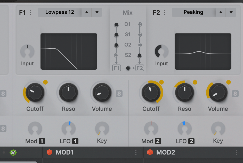
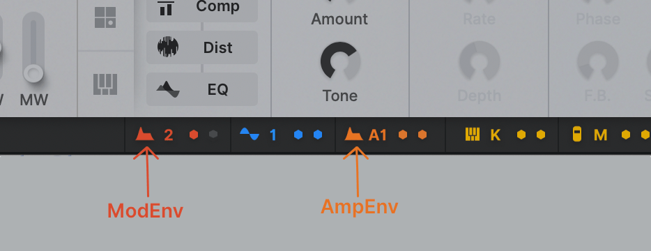
Yes, orange, red and even yellow are difficult to tell apart when the icons are small, so adding a letter "hint" is helpful. The same problem also happens with the blue vs. purple icons.plugmon wrote: Fri Feb 05, 2021 5:58 am For the same regard (color blind universality), in footer matrix, ModEnv and AmpEnv are now distinguished by the "A" capital letter, not only by just colors.
You do not have the required permissions to view the files attached to this post.
-

- KVRAF
- 24456 posts since 7 Jan, 2009 from Croatia
I think if you're using A for the first envelope (A1/A2), why not use M for mod env (M1/M2)?
-
- KVRist
- 33 posts since 21 Apr, 2020
I support the minimalistic approach. My idea of color in the FX is just a small accent, like a dot or an underline.plugmon wrote: Fri Feb 05, 2021 6:18 amYes, paper, exactly!!karlfranz wrote: Thu Feb 04, 2021 6:13 pmI'd have to see it, but my initial impression is that it may look a bit too garish and totally take away from Izmo's original design aesthetic which appears to be inspired by a sheet of paper.Funkybot's Evil Twin wrote: Thu Feb 04, 2021 5:38 pm When it comes to plugmon's current-state skin, I wonder if anything can be done with the FX section to get some color in there. Whether it's coloring the backgrounds, the text, maybe colorizing the FX names on the left and having them match up with the FX Names in the actual slots. You know...gray tab = off, colored text = enabled. The gray in that section feels to minimalistic for what FX represent (I think "technicolor" once I start adding fx).That's where the whole concept comes from.
-
- KVRian
- 751 posts since 9 Mar, 2001
Nice work!!
Personally I have a problem with the shade of gray. It looks like something that is "unfocused" or "disabled" to me. One almost expects more brightness when working with a certain area/function/module. Or less brightness (more dark) so it doesn't feel "in between". I would want a much darker version where the background does not take my attention or feels "unfocused". I really don't have anything against the original Hive skin (maybe expect the mirroring of filters/oscs etc), so having this is just a bonus of course.
Personally I have a problem with the shade of gray. It looks like something that is "unfocused" or "disabled" to me. One almost expects more brightness when working with a certain area/function/module. Or less brightness (more dark) so it doesn't feel "in between". I would want a much darker version where the background does not take my attention or feels "unfocused". I really don't have anything against the original Hive skin (maybe expect the mirroring of filters/oscs etc), so having this is just a bonus of course.
-
Funkybot's Evil Twin Funkybot's Evil Twin https://www.kvraudio.com/forum/memberlist.php?mode=viewprofile&u=116627
- KVRAF
- 12515 posts since 16 Aug, 2006
Really like that. I'd go so far as to make the same suggestion for the primary skin. Really connects the modulation to the floaty dot in a clean way.
-
Funkybot's Evil Twin Funkybot's Evil Twin https://www.kvraudio.com/forum/memberlist.php?mode=viewprofile&u=116627
- KVRAF
- 12515 posts since 16 Aug, 2006
I think your describing the same thing I mentioned yesterday. The GUI looks soft and blurry to me. The fonts aren't particularly crisp. The medium-dark gray text on medium-light gray backgrounds with soft-gray background elements and shadows, just results in a very blurry/unfocussed/soft appearance to me.cnt wrote: Fri Feb 05, 2021 3:00 pm Nice work!!
Personally I have a problem with the shade of gray. It looks like something that is "unfocused" or "disabled" to me. One almost expects more brightness when working with a certain area/function/module. Or less brightness (more dark) so it doesn't feel "in between". I would want a much darker version where the background does not take my attention or feels "unfocused". I really don't have anything against the original Hive skin (maybe expect the mirroring of filters/oscs etc), so having this is just a bonus of course.
-

- KVRist
- 396 posts since 3 Mar, 2015 from Japan
I really wish this too but the background images for modulation rings & spots are not available in current GUI schemeFunkybot's Evil Twin wrote: Fri Feb 05, 2021 3:41 pmReally like that. I'd go so far as to make the same suggestion for the primary skin. Really connects the modulation to the floaty dot in a clean way.

-
Funkybot's Evil Twin Funkybot's Evil Twin https://www.kvraudio.com/forum/memberlist.php?mode=viewprofile&u=116627
- KVRAF
- 12515 posts since 16 Aug, 2006
Would it look terrible with the Gray ring and Gray circle in the background for all knobs, only to be colored when modulation is active? I'd think that's possible, but would have to try it out/see it to figure out if it would actually look good. 
-
- KVRAF
- 24456 posts since 7 Jan, 2009 from Croatia
Yeah I totally love how that looks - much more visible modulation, way better contrast. at least the knobs should have arcs around for the mod ring to fit...
-

- KVRAF
- 27005 posts since 3 Feb, 2005 from in the wilds
Yeah, it looks too blurry for me... my eyes keep trying to focus it. Not sure if different people are seeing it differently on their machines.Funkybot's Evil Twin wrote: Fri Feb 05, 2021 3:43 pmI think your describing the same thing I mentioned yesterday. The GUI looks soft and blurry to me. The fonts aren't particularly crisp. The medium-dark gray text on medium-light gray backgrounds with soft-gray background elements and shadows, just results in a very blurry/unfocussed/soft appearance to me.cnt wrote: Fri Feb 05, 2021 3:00 pm Nice work!!
Personally I have a problem with the shade of gray. It looks like something that is "unfocused" or "disabled" to me. One almost expects more brightness when working with a certain area/function/module. Or less brightness (more dark) so it doesn't feel "in between". I would want a much darker version where the background does not take my attention or feels "unfocused". I really don't have anything against the original Hive skin (maybe expect the mirroring of filters/oscs etc), so having this is just a bonus of course.
-

- u-he
- 30253 posts since 8 Aug, 2002 from Berlin
We can certainly talk about this, and iteratively improve the skin through releasesplugmon wrote: Fri Feb 05, 2021 4:03 pmI really wish this too but the background images for modulation rings & spots are not available in current GUI schemeFunkybot's Evil Twin wrote: Fri Feb 05, 2021 3:41 pmReally like that. I'd go so far as to make the same suggestion for the primary skin. Really connects the modulation to the floaty dot in a clean way.
Currently we expect Hive 2.1 to come out in two stages anyway. Because of lack of support for Apple Silicon and Big Sur, there will be no AAX version for Mac initially (we don't know why Avid insist on supporting medieval concepts like iLok which again and again throws wrenches in their gears). Hence there'll be a 2.1.1 a few months later for which we can add polished UI ideas (also for the orig skin).
-
- KVRAF
- 2685 posts since 14 Jul, 2005 from Australia
On the modulation rings, as someone who is colourblind, I honestly never even knew they existed in Hive! (crazy, I know) They were there in front of me literally for years but I simply couldn't see them in the default skin. I think they are too thin and the colour selection is extremely hard for those of us who are colourblind as it results in a very similar shade of grey to the background.
The image above makes it significantly easier for me to see personally.
The image above makes it significantly easier for me to see personally.