I've got a mod of the original Hive theme that fixes this. I also moved some stuff around in the filt 2 section to make it appear more mirrored. Once I update the skin for 2.1, I'll post it.
Hive 2.1 Izmo skin by Plugmon
-
Funkybot's Evil Twin Funkybot's Evil Twin https://www.kvraudio.com/forum/memberlist.php?mode=viewprofile&u=116627
- KVRAF
- 11508 posts since 16 Aug, 2006
- KVRAF
- 18546 posts since 16 Sep, 2001 from Las Vegas,USA
Cool, I thought I remembered someone did a non mirrored version I just didn't remember who. So yea thanks that would be great if you post it.......Funkybot's Evil Twin wrote: ↑Sun Mar 07, 2021 4:10 pm I've got a mod of the original Hive theme that fixes this. I also moved some stuff around in the filt 2 section to make it appear more mirrored. Once I update the skin for 2.1, I'll post it.
None are so hopelessly enslaved as those who falsely believe they are free. Johann Wolfgang von Goethe
-
- KVRist
- 192 posts since 23 Apr, 2006
Just repeating this in case it got skipped over - a small tweak to the colours to make things more consistent, so almost all the controls are dark text on light background rather than a confusing mix of both.
You do not have the required permissions to view the files attached to this post.
- KVRist
- 204 posts since 7 Jul, 2004 from CrAzY-SoUnDlAbS
oh no, not a 2nd imho ugly MassiveX GUI
but the most will like, don´t know why...
the 1st HiVE was the best, this honey-orange-theme GUI I miss totally!
but the most will like, don´t know why...
the 1st HiVE was the best, this honey-orange-theme GUI I miss totally!
Penta says...
https://soundcloud.com/sonical-dreams
https://soundcloud.com/sonical-dreams
-
moscom_electronics moscom_electronics https://www.kvraudio.com/forum/memberlist.php?mode=viewprofile&u=269081
- KVRist
- 243 posts since 21 Nov, 2011 from France
It might have been mentionned earlier, but as a colour-blind person, Izmo is quite... all about variations of gray  I feel that I look at a very extreme example flat design. Not that it is bad, I actually like it. But it is funny to me when I read discussions about the shades of colours, I see none except gray levels
Edit : the version that ships with the final release is really nice, Congrats Plugmon!
Edit : the version that ships with the final release is really nice, Congrats Plugmon!
- KVRian
- 537 posts since 31 May, 2015 from the Iberian Peninsula
Nice skin, it really is a departure from the original. It's cool that people now can choose whatever fits their workflow, this is not just a recoloring of the original.
- KVRist
- 344 posts since 3 Mar, 2015 from Japan
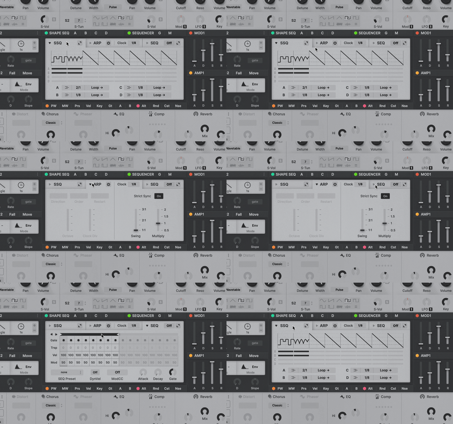
For those who have hard times finding ARP section:
2 days ago I came up with a better organization for SSQ/ARP/SEQ in the center panel : make tabs for ARP/SEQ just like SSQ has.

Users can choose between small seq and big seq, depending on the situations
Though it was not in time for the initial release, this will be added at some point in the future update.
And now that it's released officially, drastic color change is very unlikely to happen. It will be better to make actual variants than to discuss here.
But small improvements like above can still be added afterwards!
2 days ago I came up with a better organization for SSQ/ARP/SEQ in the center panel : make tabs for ARP/SEQ just like SSQ has.

Users can choose between small seq and big seq, depending on the situations
Though it was not in time for the initial release, this will be added at some point in the future update.
And now that it's released officially, drastic color change is very unlikely to happen. It will be better to make actual variants than to discuss here.
But small improvements like above can still be added afterwards!
-
- KVRist
- 192 posts since 9 Dec, 2018
Im digging the IZMO theme, particularly for the workflow. For the life of me though, i can't find the global fine tune adjustment? Can someone who knows point that out to me 
Edit: i finally just found it, its under the Keyboard section.
Edit: i finally just found it, its under the Keyboard section.
-
Funkybot's Evil Twin Funkybot's Evil Twin https://www.kvraudio.com/forum/memberlist.php?mode=viewprofile&u=116627
- KVRAF
- 11508 posts since 16 Aug, 2006
-
- KVRAF
- 2675 posts since 14 Jul, 2005 from Australia
+1 that's way way better!
- KVRian
- 706 posts since 9 Apr, 2005 from Japan
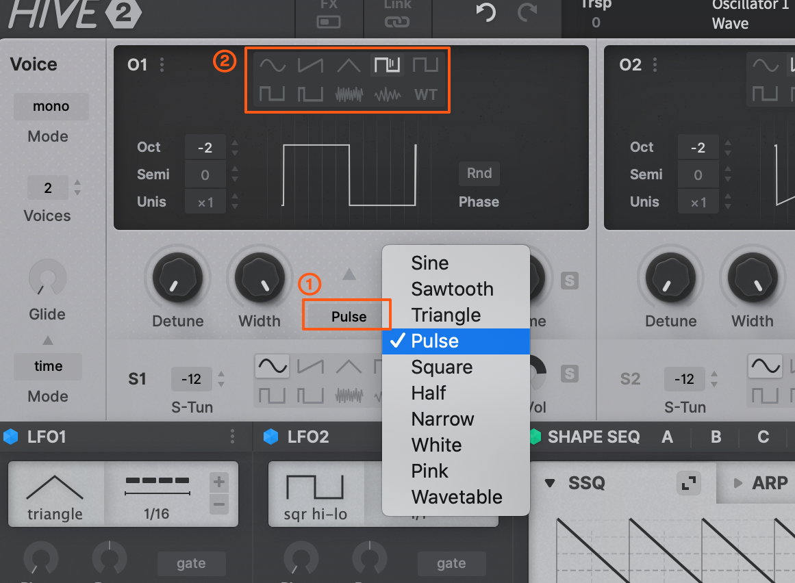
Don’t know if this has already been mentioned (I don’t have time to read through 25 pages), but I ran into an issue with the Izmo skin. When you click the WT button to switch an oscillator to wavetable mode, there’s no easy way to switch back to one of the simple waveforms. Plugmon’s own Eclipse skin has a dropdown at the top of each oscillator for this, and in the original skin you can just click the waveform to open a popup menu, but in Izmo there’s no way out other than reinitializing the oscillator. Seems like an oversight. Because the WT button is part of a button group, you’d expect to be able to switch to any of the other buttons after selecting it (all the other buttons in the group behave this way), but the entire oscillator UI gets replaced. Plugmon skins often have conceptual problems like this.
Stormchild
- KVRAF
- 18546 posts since 16 Sep, 2001 from Las Vegas,USA
You can click on the Osc number and select "--Init--" and it will take you back to the basic wave forms or is that what you meant by reinitialize?
None are so hopelessly enslaved as those who falsely believe they are free. Johann Wolfgang von Goethe
- KVRist
- 344 posts since 3 Mar, 2015 from Japan
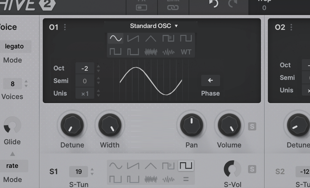
There're 2 Waveform selectors, one in the upper display (which disappear when in WT mode), the other in the lower which is kept visible across in all modes.Arashi wrote: ↑Thu Mar 11, 2021 3:22 am Don’t know if this has already been mentioned (I don’t have time to read through 25 pages), but I ran into an issue with the Izmo skin. When you click the WT button to switch an oscillator to wavetable mode, there’s no easy way to switch back to one of the simple waveforms. Plugmon’s own Eclipse skin has a dropdown at the top of each oscillator for this, and in the original skin you can just click the waveform to open a popup menu, but in Izmo there’s no way out other than reinitializing the oscillator. Seems like an oversight. Because the WT button is part of a button group, you’d expect to be able to switch to any of the other buttons after selecting it (all the other buttons in the group behave this way), but the entire oscillator UI gets replaced. Plugmon skins often have conceptual problems like this.

The upper one was added in later stage of development. I understand this is a hierarchy disorder (a button inside a container rules the container itself), and having 2 menus for 1 parameter is unusual. So in this thread before I threw a question if it should be removed for clearer structure, or should stay for faster waveform selection. -- and end up with as-is now, thinking that it benefits than it confuses, in a long run.
I would have added a dropdown like one in Eclipse if There had been another 20px height in that area -- or I can make that space somehow?
- KVRist
- 344 posts since 3 Mar, 2015 from Japan
- KVRian
- 706 posts since 9 Apr, 2005 from Japan
Thanks. I didn't notice the smaller menu. It's not clear that it's a dropdown — it just looks like a label. I suggest adding pop-up menu arrows to make it obvious there's a menu. I also think if the button group is not always visible, it should just be removed, because it's not really intuitive that there would be two different ways to switch waveform modes (and one of them sometimes disappears).
You do not have the required permissions to view the files attached to this post.
Stormchild


