E-Phonic Invader 2 v1.0.11 (WIN / OSX)

VST, AU, AAX, CLAP, etc. Plugin Virtual Instruments Discussion
Post Reply New Topic
RELATED
PRODUCTS
Invader 2

Post

e-crooner wrote: Mon May 24, 2021 10:20 pm The resolution and contrast are so poor that I don't even see the min and max lines, frankly :hihi:
I think those scale lines are there merely so that the knob is not naked. The lines as such don't seem to mean anything.
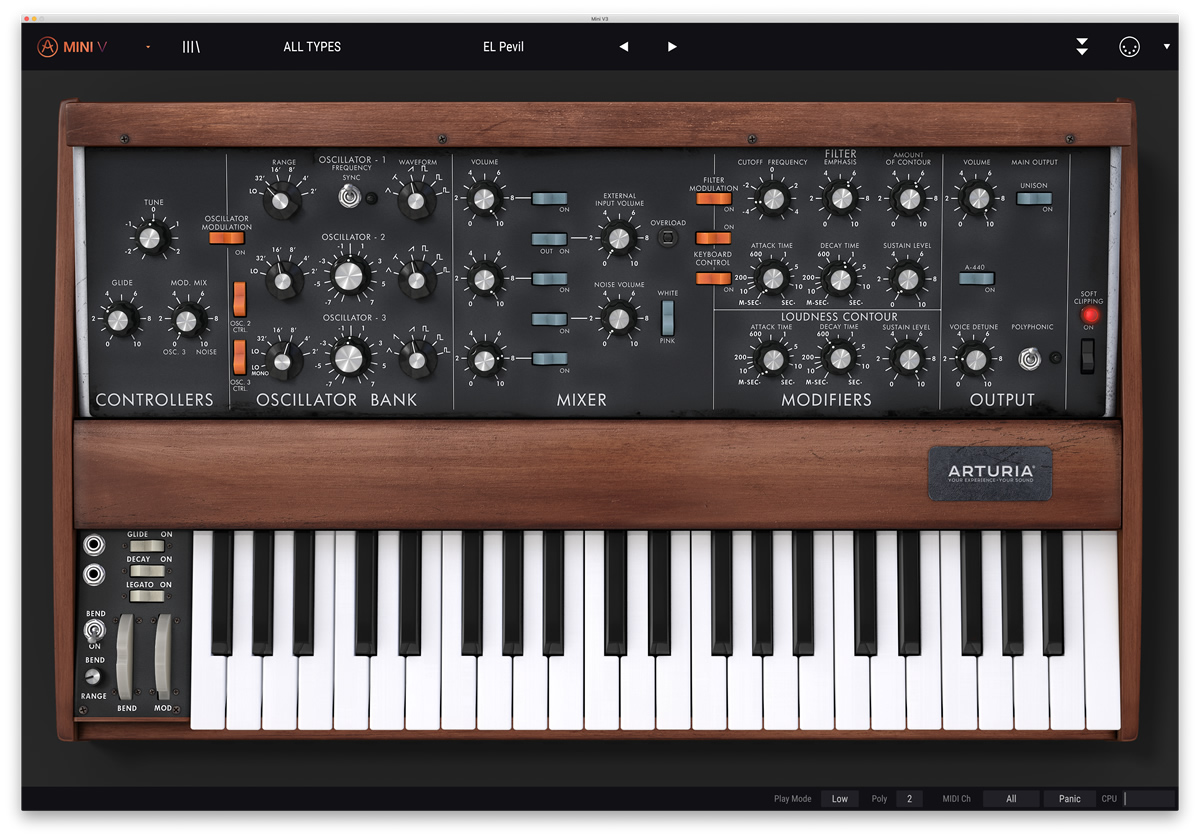
Yeah, and I don't necessarily need the lines to mean anything, but the min, max, center should match up with the knob ranges IMO. The rest can be anything.

But bonus points if the rest did line up with semi-tones on the FREQ knob. Not necessary. But nice if possible.

Post

e-crooner wrote: Mon May 24, 2021 10:20 pm The resolution and contrast are so poor that I don't even see the min and max lines, frankly :hihi:
The resolution should not be poor. Can you tell me what you mean with that?
Even on HDPI monitors it should look sharp.

Contrast is really hard to get right. All monitors are different. Older monitors tend to be darker, newer monitors lighter. I try to have my UI somewhere in the middle. :D Here on all of my different monitors it looks good so far.

Post

I don't have contrast issues here either. I really love this synth, high quality stuff! :phones: :tu:
i7-9700K @ 4.6 GHz - Asus Prime Z390-A - Corsair DDR4 32 GB 3600 MHz - Samsung 970 EVO Plus 500 GB - RME HDSPe AIO + XLR balanced breakout - 2x Iiyama PL2492H - Novation Impulse 61 - Evolution UC-16 - Clavia Nord Lead 2 - Yamaha S80

Post

the GUI is a bit blurry here, at any size that fits on the screen.
it's usable, but noticeably blurry.
macbook pro mid 2012.

Post

Looks like an Arturia GUI design.

Image

Image
Last edited by VitaminD on Tue May 25, 2021 2:38 pm, edited 1 time in total.

Post

sqigls wrote: Tue May 25, 2021 2:09 pm the GUI is a bit blurry here, at any size that fits on the screen.
it's usable, but noticeably blurry.
macbook pro mid 2012.
Can you share a screenshot at 100% scale?

Post

e-phonic wrote: Tue May 25, 2021 5:31 am The resolution should not be poor. Can you tell me what you mean with that?
Even on HDPI monitors it should look sharp.

Contrast is really hard to get right. All monitors are different. Older monitors tend to be darker, newer monitors lighter. I try to have my UI somewhere in the middle. :D Here on all of my different monitors it looks good so far.
The overall contrast is fine, however I suggest you lessen the brightness a bit on the big labels on the second row (Mixer, Unison, fx ...) and see how that feels.

I assume they have the same settings as the top ones (OSC1, OSC2...) but the top row need that level of brightness due to the background but the Mixer row has a much darker background so it sticks out a bit to much compared to it's surrounding elements and can also create the perception that the elements are less sharp because of it.

In reverse you could then test if the labels (on the top section) of the controls and parameters needs to be a bit brighter instead... (Type, Freq, Cut, Reso and so on) ... I'm not talking about much.

It's a nit pick, but in the end it's the details that matters....

Post

I noticed that when both Invader 1.0.3 and Invader2 1.0.4 are installed, FL Studio has an issue where it sees and registers both but will only load Invader 1.0.3 no matter which you choose. This is not a huge deal. Most users moving forward will only install Invader 2. But I thought I would bring it up.

I'm probably going to remove Invader 1.0.3 even if it changes the sounds a little bit.
Surely there must be consensus by now...

Post

This GUI would be so much better on the eyes. Just took me half a dozen or so clicks in MS Photo Editor :hihi:
invader GUI.jpg
But still, fixing the patch saving bug is much more urgent, I don't even want to open it anymore since it makes no sense to make new sounds that one can't save.
You do not have the required permissions to view the files attached to this post.

Post

e-crooner wrote: Tue May 25, 2021 4:20 pm This GUI would be so much better on the eyes. Just took me half a dozen or so clicks in MS Photo Editor :hihi:

invader GUI.jpg

But still, fixing the patch saving bug is much more urgent, I don't even want to open it anymore since it makes no sense to make new sounds that one can't save.
If you want to make KVR angry...make a monochrome synth with a mostly white GUI. A bunch of people will say it burns their eyes, it's too bright. Others will say it lacks contrast. Some will say it has too much contrast and the background should be way more gray. Then someone else will say then it's losing contrast. Nope...don't go there.

See: U-he Izmo thread.

I should point out I had synths that I thought were way too dark. Then I ran the Windows "Calibrate Display Colors" tool and realized my gamma was too low. For folks where theirs is too high, a white GUI will indeed probably be too bright. Particularly in dark studios.

Post

Hehe, never heard of such a dislike of white GUI's before :)

There are a few white ones, I like them. For instance the ones on Tone2 synths.

I really do think that black fonts on white background are easier than the other way round. After all, it's how books and documents are printed :hihi: Eyes need light to work properly...

Post

Funkybot's Evil Twin wrote: Tue May 25, 2021 4:28 pm Then I ran the Windows "Calibrate Display Colors" tool and realized my gamma was too low. For folks where theirs is too high, a white GUI will indeed probably be too bright. Particularly in dark studios.
I find white GUIs too bright for long periods of viewing on both of my perfectly calibrated monitors. :wink:

Anyway a little lighter Invader might not hurt......

Invader.png
You do not have the required permissions to view the files attached to this post.
None are so hopelessly enslaved as those who falsely believe they are free. Johann Wolfgang von Goethe

Post

Funkybot's Evil Twin wrote: Tue May 25, 2021 4:28 pm If you want to make KVR angry...make a monochrome synth with a mostly white GUI. A bunch of people will say it burns their eyes, it's too bright. Others will say it lacks contrast. Some will say it has too much contrast and the background should be way more gray. Then someone else will say then it's losing contrast. Nope...don't go there.
:hihi:

That's most likely to the fact that most people have not set their display properly.

I have a small guide that I have used for 20 years now, it's simple yet effective. I give it to all my friends and it has always made an improvement so It's worth the little time it takes... however if the display is crappy (like one of the laptop my brother got) and can lack any settings besides brightness then you're doomed.

I uploaded a small html version of it in my Voxengo color preset thread.
Direct Download:
Calibrate_Your_Monitor_-_The_basics (v2).html.zip
33 KiB
(It's really small so it probably won't do for any display over 1080p... )

Edit: Updated link to Calibrate.Zip download... (v2 = better background color)
Last edited by Kr3eM on Tue May 25, 2021 11:52 pm, edited 1 time in total.

Post

e-crooner wrote: Tue May 25, 2021 4:38 pm Hehe, never heard of such a dislike of white GUI's before :)

There are a few white ones, I like them. For instance the ones on Tone2 synths.

I really do think that black fonts on white background are easier than the other way round. After all, it's how books and documents are printed :hihi: Eyes need light to work properly...
synths aren't books though, musical instruments are often used in darkened rooms (stage, rehearsal rooms, home studios if youre cool!) (im not, too many trip hazards).
in these settings white text on a dark background works better.

however, software, sure it's not too difficult to offer a choice in some cases? (not sure people would deal well with a moog emu that had a white gui, bloody traditionalists)
:ud:

Post

I would definitely like light vs. dark keys but I don't find the rest of the Invader GUI too dark in it's current state.

Post Reply

Return to “Instruments”