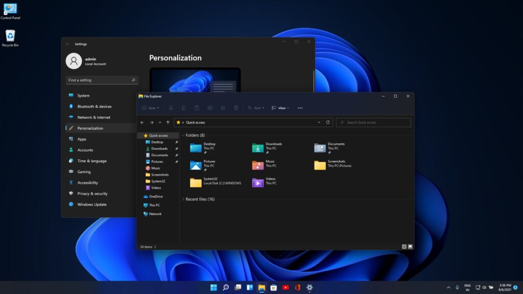
Rounded corners are back

Anything about MUSIC but doesn't fit into the forums above.
RELATED
PRODUCTS

Post

Windows 11 is going to be an annoyance to Apple which just optimized its UI rendering for hard corners.

Image

I find this particularly funny. People ridiculed my Yofiel site design for using rounded corners and white fonts as looking out of date, which was because I liked the look of Joomla 1.0. Actually there's technical reasons for it. Rounded corners help separate elements, but require more graphics power, which is now readily available. And dark backgrounds are less fatiguing on the eyes, but white fonts didn't work for a while because anti-aliasing edges only worked with black text. Those problems are gone, which is good news for graphics designers.

Reaktor had a very clever method for making rounded corners in v4. I don't know how many people are using it these days, but I used it for my synth designs.

Post

thats new

Post

As I said, it's not. Windows originally had rounded corners, but Microsoft removed them a very long time ago due to complaints about performance.

Post

yofiel wrote: Sun Oct 03, 2021 6:15 am

Reaktor had a very clever method for making rounded corners in v4. I don't know how many people are using it these days, but I used it for my synth designs.
Please enlighten me .
Are you talking about the poly or multi display object ?
Afaik , the only mehod is to import png or targa files with rounded corners
Eyeball exchanging
Soul calibrating ..frequencies

Post

yofiel wrote: Wed Oct 06, 2021 1:18 pm As I said, it's not. Windows originally had rounded corners, but Microsoft removed them a very long time ago due to complaints about performance.
Windows 1.0 didn't have rounded corners.
https://www.cnet.com/a/img/4Sh08rruhvUG ... ows1.0.png

Post

It didnt make it to the commercial release. For reasons stated. It was originally based on some UNIX UI standard, I forget its name.

Post

I’m so happy that they’re going back to this kind of look. Windows 10 was a huge step backwards for a million reasons, including being able to differentiate between stacked windows. The illusion of depth is a very important way to communicate things when doing a user interface. To throw it out in the name of a “clean” look is so short sighted.
Zerocrossing Media

4th Law of Robotics: When turning evil, display a red indicator light. ~[ ●_● ]~

Post

posix. I remembered while I was sleeping.

Post

Why is this in Modular Synthesis?
Zerocrossing Media

4th Law of Robotics: When turning evil, display a red indicator light. ~[ ●_● ]~

Post

You know it's an interesting thing. Ive liked rounded corners for a long time, but they require transparency, which used to be a performance problem. Well with a recent nvidia driver update, there is zero overhead for alpha channels now. Zero. Im enjoying making 16-layer overlays in my instruments now :)

Post

Will these rounded corners make my soft synths sound more analogue?

Post

yofiel wrote: Sun Oct 03, 2021 6:15 am Windows 11 is going to be an annoyance to Apple which just optimized its UI rendering for hard corners.

Image

I find this particularly funny. People ridiculed my Yofiel site design for using rounded corners and white fonts as looking out of date, which was because I liked the look of Joomla 1.0. Actually there's technical reasons for it. Rounded corners help separate elements, but require more graphics power, which is now readily available. And dark backgrounds are less fatiguing on the eyes, but white fonts didn't work for a while because anti-aliasing edges only worked with black text. Those problems are gone, which is good news for graphics designers.

Reaktor had a very clever method for making rounded corners in v4. I don't know how many people are using it these days, but I used it for my synth designs.
Round Rects are everywhere!

https://www.folklore.org/StoryView.py?s ... ywhere.txt

Post

I don’t care much about rounded corners, but I heartily dislike the current trend to dark backgrounds. It might be true that it can be easier on the eye under some light conditions, but then white text on a dark background is definitely harder to read for the eye (or even worse, some dark gray on black, like I’ve seen on some plugin). I find dark backgrounds incredibly hard on the eye.
It’s not always black and white ;)
Previous versions of windows (and other applications like DAWs) might’ve looked old fashioned with their grey colors, but for readability and ease on the eye it was the best, at least for me.
If you’re a graphic designer for doing UIs, always offer a light theme as an alternative!

Post

Maybe you find it helpful to know dark backgrounds wear out monitors more quickly. the transistor which pulls the signal back on horizontal sync has to work harder to create a strong enough pullback, and its usually the first component to wear out as it is.

Post

Interesting.
drab

Post Reply

Return to “Everything Else (Music related)”