Confession: I can't use ugly plugins.

VST, AU, AAX, CLAP, etc. Plugin Virtual Effects Discussion
Locked New Topic
RELATED
PRODUCTS

Post

Related, here's Uhe's triple cheese from 2006:
Image

Which, IMNSHO, is fugly and very dated.

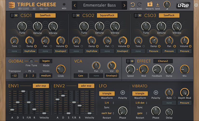
And here's triple cheese from today:
Image

The difference is much more than just a few color changes and slight adaptations of the old style. It's a rethink of the design with just a few cues to what it was. I certainly am not privy to any actual insight to the redesign process, but my guess is that this is what happens when you actively choose adapt to current tastes.

In any case, I think that it looks fine. Let's be clear, I think that Uhe's stuff looks pretty good, but there are a number of things that I don't like as well. However, like the Blackhole example, there is nothing here that would prevent me from using this. In contrast, I found the original so garish that I confess I've never left it installed long enough to give it a proper evaluation.

MFM and Filterscape are also dated looking, but they're different enough that they don't convey a sense that Uhe doesn't update their products. The truly bad stuff is under retired plugins.
Post

Didn't even know that Triple Cheese has updated interface, thanks!
Personally I don't really care about the 'ugliness' but I do care about the UX.
Updated Triple Cheese looks to be easier to use for me.


The only plugins I gave up purchasing because of the GUI is Exponential Audio.
They sounded really nice though :neutral:

Post

I like the look of Voxengo plugins. Everything laid out logically, lots of relevant information displayed clearly, and virtually no wasted space.

Post

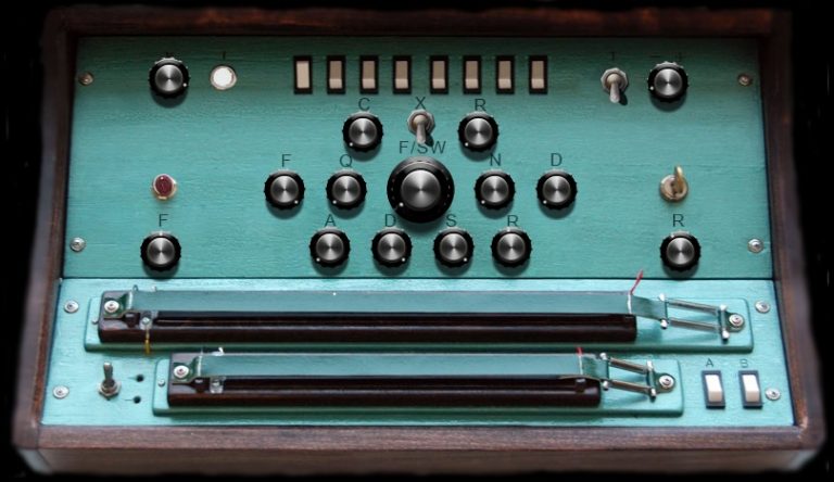
Found on a reddit post, this one hit all the branches on the way down...

Image

Interestingly, the post also lists Toxic Biohazard.

https://www.reddit.com/r/edmproduction/ ... y_an_ugly/

Post

I don't like ugly plugins, but Voxengo plugins are not in that category for me. Not the greatest but with good UX.
Example with U-he Triple Cheese (and other older U-he GUI) is ugly for me. Ugly and unusable because my eyes were getting tired when I worked with them. Now they have a much better GUI, except Hive, which, while it looks nice for the eye, the 'structure' doesn't makes use of it easy (for me).

Somehow sample players seem to be on top in a matter of making ugly GUI.
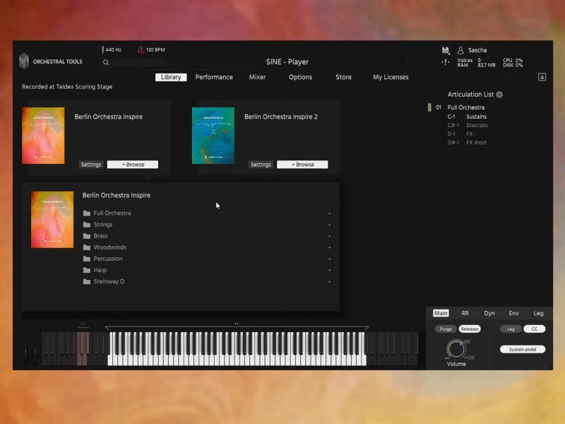
OT Sine: a big minimalistic black rectangle with white font. While UI is ugly, UX is almost horrible. They really need a GUI designer.
Image

Spitfire Audio 'Player': another giant minimalistic rectangle. Lots of empty space. After Sine, it has the second place of 'the most wasted space for no reason'.
Image

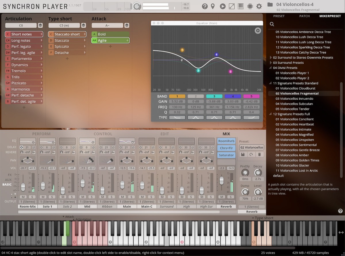
Vienna Synchron Player: has the best UX out of those tree but it looks like it was made in 2005.
Image

NI Kontakt...

Post

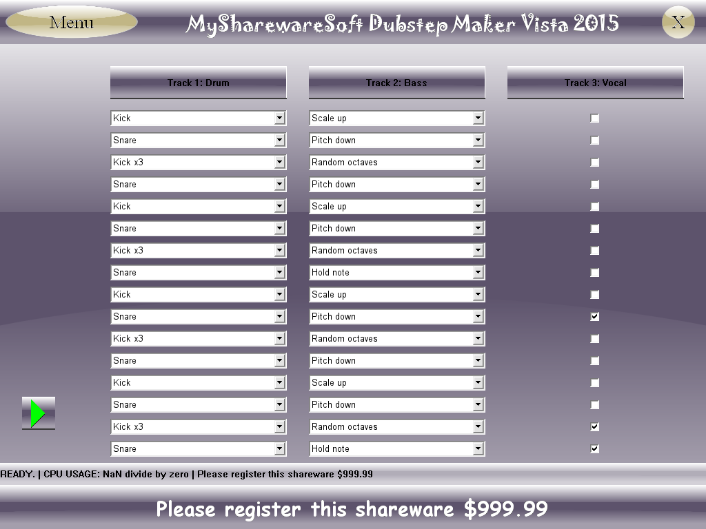
Not a plugin, but I think that we have a winner!

Image

Post

pixel85 wrote: Wed May 25, 2022 1:57 pm I don't like ugly plugins, but Voxengo plugins are not in that category for me. Not the greatest but with good UX.
Example with U-he Triple Cheese (and other older U-he GUI) is ugly for me. Ugly and unusable because my eyes were getting tired when I worked with them. Now they have a much better GUI, except Hive, which, while it looks nice for the eye, the 'structure' doesn't makes use of it easy (for me).

Somehow sample players seem to be on top in a matter of making ugly GUI.
OT Sine: a big minimalistic black rectangle with white font. While UI is ugly, UX is almost horrible. They really need a GUI designer.
Image
Agreed on the oversized minimal dark rectangle, and I like good minimal interfaces.

Post

ghettosynth wrote: Wed May 25, 2022 1:57 pm Not a plugin, but I think that we have a winner!

Image
999.99 sign me up!!!

Post

All of you, take this shit to HPC! We're talking about GUIs, not your personal drama, go away!

Post

DNnX wrote: Wed May 25, 2022 11:18 am Didn't even know that Triple Cheese has updated interface, thanks!
Personally I don't really care about the 'ugliness' but I do care about the UX.
Updated Triple Cheese looks to be easier to use for me.


The only plugins I gave up purchasing because of the GUI is Exponential Audio.
They sounded really nice though :neutral:
Yeah, I'm also not a fan of EA GUIs, they're flat gone wrong. I wonder why there's so much reluctance for small devs to hire artists to help with this? Just money? Of course I'm assuming that they don't, I could be wrong, they might just be hiring bad artists, LOL!

Post

Where does this desire for weird perspective come from? I've noticed it the SSL plugins and polyanna. Also, this:

Image

Post

pixel85 wrote: Wed May 25, 2022 1:57 pmSomehow sample players seem to be on top in a matter of making ugly GUI.

NI Kontakt...
I dunno, I have some amazing looking Kontakt instruments -

Substance.jpg
Straylight.jpg
Novo.jpg
_______________________________________________________________________________

I was working on an old song tonight and I had to tweak Continua and I got to wondering what you guys think of Audio Damage's UI design. I really like it, and not just because the guywho does it used to be Sister Machine gun. They faciitate a great workflow and they are extremely aesthetically pleasing to my eyes. What do you guys think?

AudioDamage.jpg
You do not have the required permissions to view the files attached to this post.
NOVAkILL : Asus RoG Flow Z13, Core i9, 16GB RAM, Win11 | EVO 16 | Studio One | bx_oberhausen, GR-8, JP6K, Union, Hexeract, Olga, TRK-01, SEM, BA-1, Thorn, Prestige, Spire, Legend-HZ, ANA-2, VG Iron 2 | Uno Pro, Rocket.

Post

BONES wrote: Wed May 25, 2022 2:30 pm
pixel85 wrote: Wed May 25, 2022 1:57 pmSomehow sample players seem to be on top in a matter of making ugly GUI.

NI Kontakt...
I dunno, I have some amazing looking Kontakt instruments -
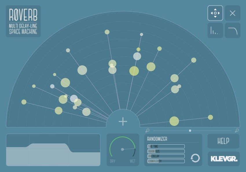
Well, those look like too much form for too little function for me. I'm a fan of klevgrand's style.

Image

Post

Those new NI libraries often have lots of empty space, like Straylight mentioned above. I know this one has parameters in other tabs. Just the 'front panel' is big and empty. When the option for bigger GUIs was introduced in Kontakt, their first libraries had only that 'front panel'. Later they added more tabs and parameters.
Still, the need to use tabs just because the front panel is a big empty picture is not the best design.

From memory (as I don't have their plugins), I like Audio Damage GUIs.

Post

Who remembers Ohm Force plugins? It just came to my mind.

They often had two interfaces: 'artistic' - where parameters blended well with the background and labels couldn't be more cryptic and 'classic' - easier for the eye, could be called also 'normal interface'.
Besides GUIs, their plugins were great.

Locked

Return to “Effects”