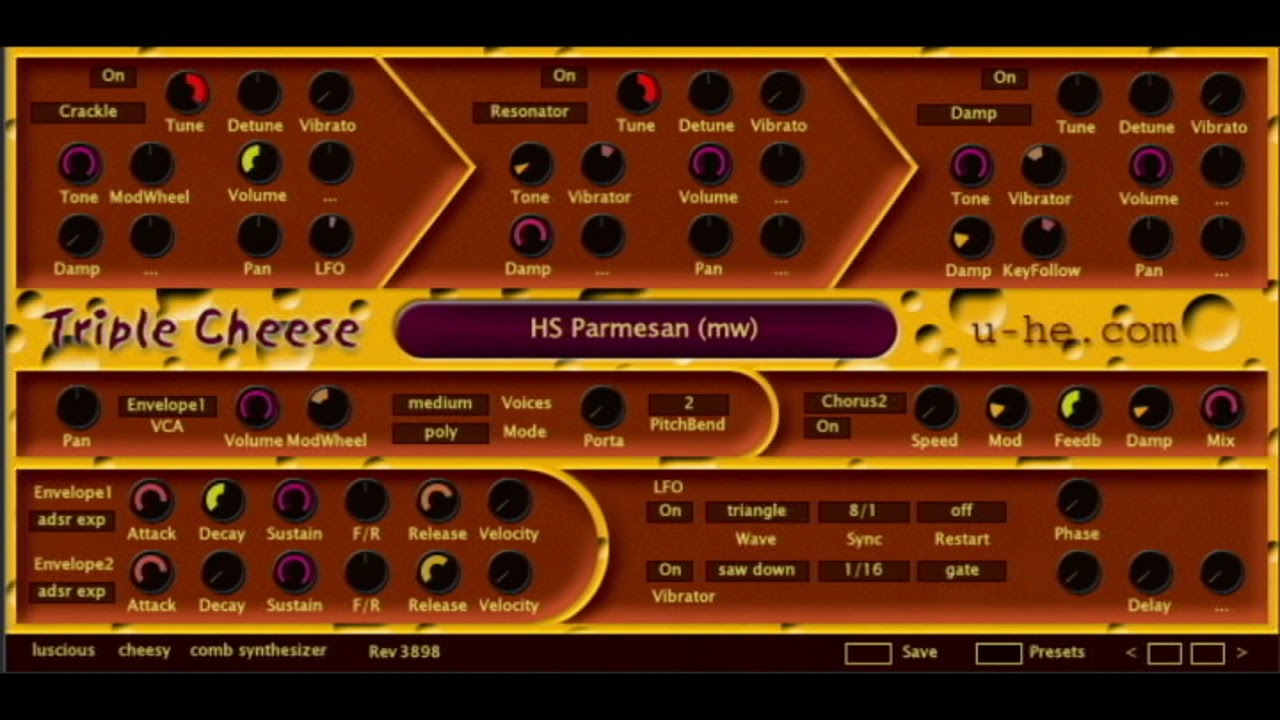
Which, IMNSHO, is fugly and very dated.
And here's triple cheese from today:
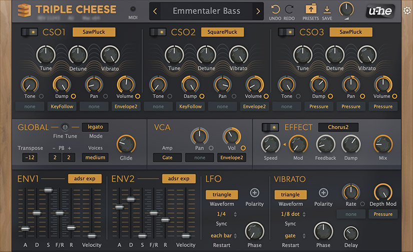
The difference is much more than just a few color changes and slight adaptations of the old style. It's a rethink of the design with just a few cues to what it was. I certainly am not privy to any actual insight to the redesign process, but my guess is that this is what happens when you actively choose adapt to current tastes.
In any case, I think that it looks fine. Let's be clear, I think that Uhe's stuff looks pretty good, but there are a number of things that I don't like as well. However, like the Blackhole example, there is nothing here that would prevent me from using this. In contrast, I found the original so garish that I confess I've never left it installed long enough to give it a proper evaluation.
MFM and Filterscape are also dated looking, but they're different enough that they don't convey a sense that Uhe doesn't update their products. The truly bad stuff is under retired plugins.