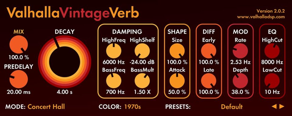
Valhalla plugins look bad, especially that one, but it's a sound maker, who cares?v1o wrote: Fri Jul 01, 2022 10:04 am Beauty's truly in the eyes of the beholder. I dont see how people can really like how Valhalla DSP looks but dislike Galactic?
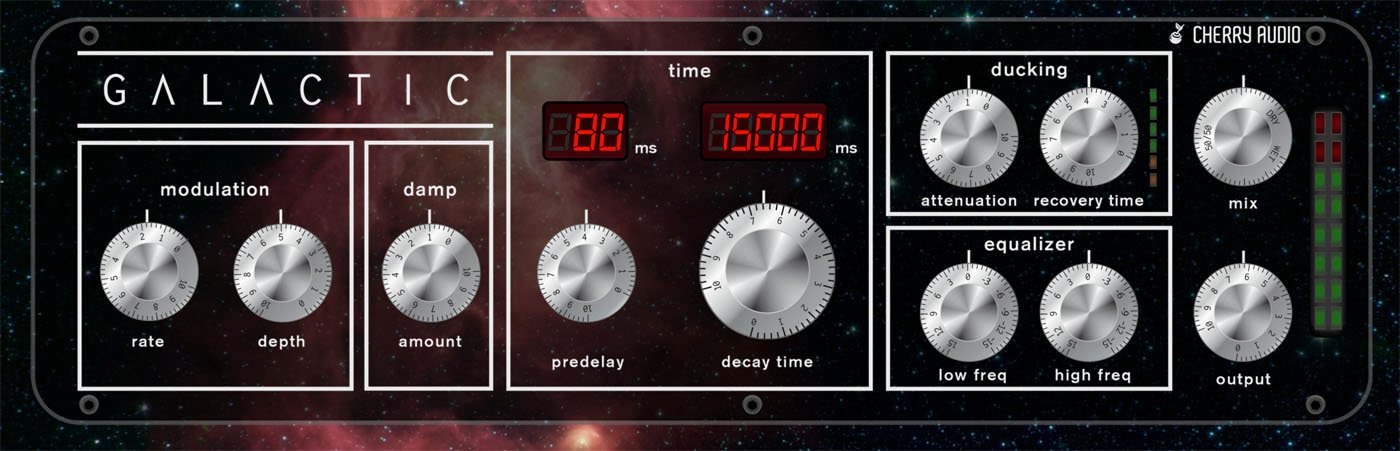
(Apparently a lot of people if it has the name Cherry on it)
I think if anything is making the Cherry design look bad, it's the knobs. They should have made the knobs white outlines, so you could still see the space background, and they'd look invisible like the rest of the case. Could look cool as long as the numbers on the knobs were still made very highly visible.


