Choose one of the other install options. I'm on 150% as ideal at the moment.Halonmusic wrote: Thu Jan 05, 2023 12:07 pm Love the sound of this.Question: I chose Auto Resize when installing but its a bit on the small side. Is it possible to make it larger somehow? Its not a deal breaker though.

Martinic AX Chorus (AAX/AU/CLAP/VST2/VST3) plugin released
-
- KVRAF
- 2317 posts since 11 Mar, 2003
-

- KVRist
- Topic Starter
- 288 posts since 2 Jan, 2017 from The Netherlands
If you rerun the installer and only check "Customize GUI Scale" in the component selection you can change the scale. In the future, we will try to make this happen from the plugin but at the moment we need to know the scale before the plugin is started to make it work correctly with all DAWs.Halonmusic wrote: Thu Jan 05, 2023 12:07 pm Love the sound of this.
-
- KVRAF
- 2317 posts since 11 Mar, 2003
I would prefer less perspective and no background clutter, so something like:
Or, if you really don't like fully flat-on:
(although I would still have a little less perspective than that personally)
I do prefer the hardware look overall though.
-

- KVRAF
- 3362 posts since 31 Dec, 2004 from People's Republic of Minnesota
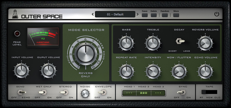
Yeah, I wish GUI didn’t have a placebo effect, but sometimes they’re distractingly bad. However, I’m actually fine with your GUIs. The only time the background bugs me is on the initial GUI of AX73. The tremolo and chorus are simple enough so it doesn’t bother me.
As a personal note, I only wish you’d port the oscillators, fx, and filters to Voltage Modular.
As a personal note, I only wish you’d port the oscillators, fx, and filters to Voltage Modular.

-
- KVRist
- Topic Starter
- 288 posts since 2 Jan, 2017 from The Netherlands
Thanks for this detailed feedback. We like the real-looking instruments/effect view and not the flat KnobMan views you like. So these interfaces will not be replaced. But we could maybe make a config setting in the future to make a KnobMan view an option for the settings screen. You could think about replacing the instruments/effect view with the KnobMan view but that would make the setting view useless. We will look closely at your feedback for we like to always improve.
-
- KVRAF
- 2317 posts since 11 Mar, 2003
The main issue (apart from the fussy background, which Arturia like a lot too) is the AX knobs are so far right that they get the most perspective shift and you can't even see the markings on the other side of the knob. I can't even see the name of the knob functions completely.martinic wrote: Thu Jan 05, 2023 4:12 pm Thanks for this detailed feedback. We like the real-looking instruments/effect view and not the flat KnobMan views you like. So these interfaces will not be replaced. But we could maybe make a config setting in the future to make a KnobMan view an option for the settings screen. You could think about replacing the instruments/effect view with the KnobMan view but that would make the setting view useless. We will look closely at your feedback for we like to always improve.
Now in the instance of AX this isn't too problematic as there's only two knobs, but I would find a more complex interface irritating if it was full of this perspective.
As I say, if you're married to perspective then maybe reign it in a little. I'm looking at some actual hardware right in front of me with knobs far left and far right and I can still see the markings. This, for instance, still has a little top-down perspective going on. You could even add a little left/right perspective here and it would be OK. I'm not so interested in rubber plants in GUIs though
This is all minor stuff though, I don't want you to think I'm making a big deal about it as I think your plugins are great.
-

- Banned
- 7624 posts since 13 Nov, 2015 from Norway
thanksmartinic wrote: Thu Jan 05, 2023 2:31 pmIf you rerun the installer and only check "Customize GUI Scale" in the component selection you can change the scale. In the future, we will try to make this happen from the plugin but at the moment we need to know the scale before the plugin is started to make it work correctly with all DAWs.Halonmusic wrote: Thu Jan 05, 2023 12:07 pm Love the sound of this.
EnergyXT3 - LMMS - FL Studio | Roland SH201 - Waldorf Rocket | SoundCloud - Bandcamp
-

- KVRAF
- 1583 posts since 26 Aug, 2019
I don't see resize options in my installer. Is that only for Windows?
Also agree with Aloysius that it would be nice for preset browser to show a master list in addition to left/right cycle through (on all Martinic effects).
Also agree with Aloysius that it would be nice for preset browser to show a master list in addition to left/right cycle through (on all Martinic effects).
-
- KVRist
- Topic Starter
- 288 posts since 2 Jan, 2017 from The Netherlands
Yes the resize is done natively by Windows. As macOS does not have this feature we need to do it in the plugin with a software scaler and remap all mouse coordinates and/or provide images in all sizes making our plugins big (like some competitors do to solve this). It is on our feature wishlist but not a simple one for many reasons.kidslow wrote: Thu Jan 05, 2023 9:16 pm I don't see resize options in my installer. Is that only for Windows?
Also agree with Aloysius that it would be nice for preset browser to show a master list in addition to left/right cycle through (on all Martinic effects).
Until we ported the default preset browser from the AX73 to all plugins you could only select presets from the DAW Preset browser. This is still the only option for AU plugins and is still working with VST. So the in-plugin preset browser can be controlled from the DAW in VST probably already providing a master list. On CLAP there is no preset DAW integration defined so there only the in-plugin browser works. As we are implementing AAX, Pro Tools might have new Preset browsing restrictions. We agree with Aloysius and you that a pulldown listing of all default presets would be a nice feature. Also already on our feature wishlist. Thanks for the feedback!
-
- KVRist
- Topic Starter
- 288 posts since 2 Jan, 2017 from The Netherlands
-

- KVRAF
- 1584 posts since 21 Nov, 2018
Remove the clutter and have just the UI as the entire plug, maybe preset dropdown in the LCD display with preset name ?

-
 Synthient Sound Synthient Sound https://www.kvraudio.com/forum/memberlist.php?mode=viewprofile&u=428766
 - KVRist
- 128 posts since 29 Oct, 2018
I'd agree...just have the main GUI as Digivolt suggested, but expand it downward with knobs for the extra controls. I'd suggest less perspective on the knobs though.
I like the vintage 80s rack unit look, just give it more knobs so I don't have to switch to the flat look for the extra controls.
Also, I demoed this and bought it a few weeks ago (at a much higher price, d'oh!). Holidays were busy and I just went to install the license and the download link no longer works. The Fastspring (anything but fast) form to fill out is a total pain in the ass. Took me 15 minutes to find all the information they asked for. Please...this system is awful. Please give us at least a user page on your website so we can get what we need without the hoops and hassle.
-

- KVRAF
- 6287 posts since 8 Jul, 2009
Yes this design is much cleaner. Now, one refinement I'd recommend is making the knobs more "head on" - no angled effect. By making the front panel square/head on, the angled knobs are out of place. Of course its a lot of work to render that so perhaps you were thinking the same but wanted to pass this mockup by us first. I think if the knobs were symetrical is would look better. If you wanted to bring in a 3D effect you could still cast shadows from the knobs. Just make them faint just to bring out the 3D effect, if you go that route. Just my suggestions with no expectations.
#NONFR Check out my music at Bandcamp  Free Streaming!
Free music with your support on Patreon | Youtube: Music of Plexus Videos (music videos) | Youtube: Plexus Productions (audio related) Stop whining. Make music.
Free music with your support on Patreon | Youtube: Music of Plexus Videos (music videos) | Youtube: Plexus Productions (audio related) Stop whining. Make music.
-
- KVRian
- 535 posts since 11 Sep, 2004 from inne Büchs
Trying it out for a bit, like it so far.
Didnt pay attention to Martinic before, have come across the GUI pictures for the synths which drove me away.
Went for the chorus anyway. Looking at the FX view i didn realize it was an actual GUI so i used the settings view which is perfectly fine for the few amount of controls.
Didnt pay attention to Martinic before, have come across the GUI pictures for the synths which drove me away.
Went for the chorus anyway. Looking at the FX view i didn realize it was an actual GUI so i used the settings view which is perfectly fine for the few amount of controls.
Andy is a support ninja.