DJErmac wrote: Sun Jan 22, 2023 7:22 pm Very, very surprising skin...
Please don’t take any offense from it, as I truly respect your way of seeing things (you like what you like, I like what I like, let’s be friends and talk about it in peace), but, even if it has a lot of qualities concerning colours choices, harmony in design, for some reason it looks kiddish and unprofessional to me. I think it’s this kind of overcontrast and crazy brightness that remind me of tweaked cars with neons and things that pass by you at night with stupid music playing so loud it’s unscrewing the whole thing. You see ? I’m not buying the "concept"...
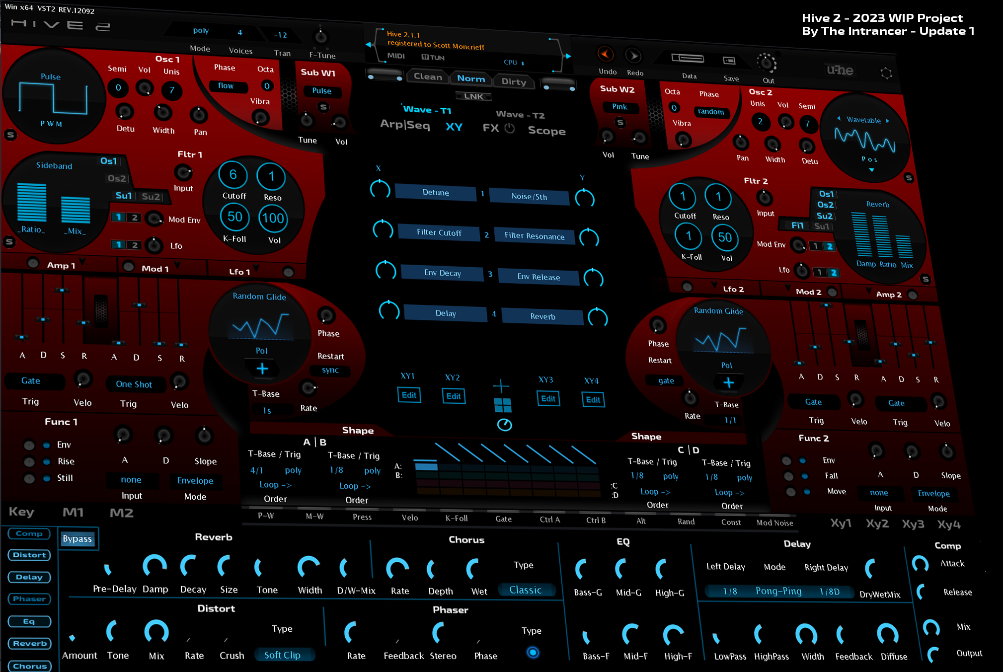
The current skin on page one is still in development as the new functional design elements are created as I outlined in my long post on page one in response to others. I've always tended to produce music at night and in the dark, so that's why I prefer dark skins so I'm not blinded by them as I open them. That said, not all my Hive skins have been entirely dark, Dune 3 as well as Rapid skins have had light versions of them.Lbdunequest wrote: Sun Jan 22, 2023 7:46 pm THE INTRANCER why all of your guis so dark? i have a gut feeling that you have not well calibrated display monitor, because the contrast and brightness is horrible on mobile phone, display monitor and my tv and only with your skins.