The theme is super chic and truly inspiring to look at. I have some observations tough.
The overall plugin window size works best at 80% or 90% for me. At 100% the plugin window is a little too wide, mainly because of the 2 big LFOs. I notice some labels get blury (e.g. LFO, sync, restart) when scaling is used. Others stay sharp (e.g. Shape mod, Tune mod). Is this possible to fix or reduce?
The numbers and icons around knobs are rather small and thin. To some extend the same is true for the labels above knobs (e.g. Attack, Decay). At 100% they are ok but already small. But at 90% and 80% they get a bit too small. I'm wondering if it could make sense to make the icons/numbers a bit bigger or thicker in general? The orginal Diva theme work great in this regard, just to have a reference.
MONA - New GUI for Diva
-
midi_transmission midi_transmission https://www.kvraudio.com/forum/memberlist.php?mode=viewprofile&u=298730
- KVRian
- 1045 posts since 13 Feb, 2013
-

- KVRist
- Topic Starter
- 395 posts since 3 Mar, 2015 from Japan
It's technically possible and reasonable as wellmidi_transmission wrote: Sun Jun 25, 2023 4:51 pm Idea: A possibility to disable the scope in some way? Super individual thing I guess, but it's a bit too busy for me visible all the time. I'd be fine when the ui stays but no waveform is drawn. Like when no sound is playing.

I'm not sure if I can find a good place for a toggle around the scope, but at least I can put it in "appearance settings" panel (accessible from the footer).

-
- KVRist
- Topic Starter
- 395 posts since 3 Mar, 2015 from Japan
To be honest, that part is what I sacrificed. If I try to cover the compatibility for smaller zoom rate, the beauty in 100% zoom has to be diminished, which I want to avoid.midi_transmission wrote: Sun Jun 25, 2023 5:10 pm
The numbers and icons around knobs are rather small and thin. To some extend the same is true for the labels above knobs (e.g. Attack, Decay). At 100% they are ok but already small. But at 90% and 80% they get a bit too small. I'm wondering if it could make sense to make the icons/numbers a bit bigger or thicker in general? The orginal Diva theme work great in this regard, just to have a reference.
That said, it will be possible to serve alternative images with bigger/larger fonts and let users replace resources.
My basic idea is; more options will make more people happy

-
- KVRian
- 923 posts since 13 Jul, 2006
Agree here. I really love the design overall, but also my first feeling is that the DCO is the current weak point.midi_transmission wrote: Sun Jun 25, 2023 4:47 pm Why not the orginal layout (DCO) was my first thought too. At the same time I think it's a smart design and I don't have a problem with it.
One additional DCO nitpick DCO though. I think a dark instead of a white surrounding at the DCO display would like a bit easier on the eye?
The white border makes the impression that it was by accident, as the LFOs do not have such a white border. I also wonder if the "screens" they are representing here could be made a bit bigger and have less blurry shadow. But such things are very subjective.
You do not have the required permissions to view the files attached to this post.
Find my (music) related software projects here: github.com/Fannon
-

- KVRAF
- 4072 posts since 28 Jan, 2011 from MEXICO
Great release I bought it straight away. I have some comments nevertheless:
The things I like:
1.- The graphics are great, I like the look of all knobs, the single panel for all settings and voice stuff
2.- The controls above the Kb, the simplified FX specially
3.- The fonts
4.- The access to parameters in the browser
Things I am not vibing with:
1.- The DCO panel, looks alien in the overall design
2.- The label text size, the GUI default 100% is bigger but the fonts are still to me a bit small
3.- Yep, I am missing the small browser.
Overall enjoying it a lot.
dedication to flying
-
- KVRist
- 282 posts since 4 Feb, 2015
Stunning, simply stunning ... 
My wish for the "Alternative Parts" folder: BG-Module-OSC-JN.png without the white frame/background AND/OR BG-Module-OSC-JN.png with that frame/background but coloured exactly like the dark background that surrounds it (so it would look a little "elevated").
And, maybe ... bigger font for the browser - or can that be changed in the script?
Fantastic work, huge respect!
-
RugerioDelStereo RugerioDelStereo https://www.kvraudio.com/forum/memberlist.php?mode=viewprofile&u=466409
- KVRist
- 163 posts since 23 May, 2020
Holy shit. You made me buy my first theme for Diva. Awesome work!
-
midi_transmission midi_transmission https://www.kvraudio.com/forum/memberlist.php?mode=viewprofile&u=298730
- KVRian
- 1045 posts since 13 Feb, 2013
Which scaling do you use?e-musician wrote: Sun Jun 25, 2023 9:01 pm
And, maybe ... bigger font for the browser - or can that be changed in the script?
Fantastic work, huge respect!
I just wanted to post that the font is too big in the browser. And not as well readable as the orginal Diva theme.
I feel a jump from the smaller font in the synth ui a very large font size in the browser. For my liking the 100% scale should use the font size of the 90% scale. In general the orginal Diva theme was very good in this regard as a reference.
Browser
https://plugmon.jp/files/uploads/2023/0 ... caled.webp
- For me the font size is a bit too large in the browser
- Maybe a bit more line spacing in the preset list?
- The background to font color contrast is to low in the folder tree from the browser (bright font on lighter gray background). It's fine in the list.
- "Tags": the tag cloud on the left looks a bit strange, like there is no padding in this area, I'm not sure if it's a bug?
+ The tweak section in the browser is a neat idea.
+ Only small issues, the general direction is great.
I use Windows on a WQHD 27" display, have the font installed, and use currently 100% scaling. I just toyed around 2 hours with Diva and the theme and had much fun and new inspiration.
Last edited by midi_transmission on Sun Jun 25, 2023 11:52 pm, edited 1 time in total.
-
midi_transmission midi_transmission https://www.kvraudio.com/forum/memberlist.php?mode=viewprofile&u=298730
- KVRian
- 1045 posts since 13 Feb, 2013
plugmon wrote: Sun Jun 25, 2023 5:23 pmIt's technically possible and reasonable as wellmidi_transmission wrote: Sun Jun 25, 2023 4:51 pm Idea: A possibility to disable the scope in some way? Super individual thing I guess, but it's a bit too busy for me visible all the time. I'd be fine when the ui stays but no waveform is drawn. Like when no sound is playing.
I'm not sure if I can find a good place for a toggle around the scope, but at least I can put it in "appearance settings" panel (accessible from the footer).
My first idea was to add a "none" entry in the context menu where you set fire, eco, etc. - but not sure if it's possible. But the "appearance settings" is absolutly fine too!
-
- KVRist
- Topic Starter
- 395 posts since 3 Mar, 2015 from Japan
The impression of the look of browser may be strongly affected by environments and zoom rates because it's made of rows of texts. And it seems that the font size (I guess) is rounded by system-- say 14px * 90% = 12.6 but it's rounded to 12.5, 12 or 13? Something like that can cause the browser look somehow irregular.midi_transmission wrote: Sun Jun 25, 2023 11:33 pmWhich scaling do you use?e-musician wrote: Sun Jun 25, 2023 9:01 pm
And, maybe ... bigger font for the browser - or can that be changed in the script?
Fantastic work, huge respect!
I just wanted to post that the font is too big in the browser. And not as well readable as the orginal Diva theme.
Thus this is one big part that is hard to please everyone. I think that "too small" is more problematic than "too big" so the font size is set to a bit bigger. As a result, in 100% zoom the impression may well lean toward "Isn't it big?"
It's a bit geeky but you can manually set the font sizes just by changing the value of following lines in Diva.txt in "Scripts" folder.
----------------
-Font size for folder list
line 10740 : PROPERTY control='_PresetManagerView' name='labelTextSize' id='0' value='13.00'
-Font size for tag cloud
line 10782 : PROPERTY control='_TagFilterView' name='tag font size' id='0' value='13.00'
-Font size for preset list
line 10875 : PROPERTY control='THE_PRESETSELECTOR' name='mLabelTextSize' id='0' value='14.00'
----------------
And no line spacing options here! how I wish it had.

-
- KVRist
- Topic Starter
- 395 posts since 3 Mar, 2015 from Japan
That label is intentional, though I'm still on the fence if it's good or bad.easynam wrote: Tue Jun 27, 2023 11:08 am Really nice work!
Have noticed one small issue: the multi knob for the supersaw seems to be currently mislabeled as mix.
In the first place, MONA calls the mode "SUPERSAW" instead of "MULTISAW". I didn't know why u-he didn't use this well-known word. (some trade-mark kind of issue?)
I thought that the word "SUPERSAW" will inspire/excite users more than "MULTISAW" so I chose the former as the label.
Then, using the label "multi" seems to be inconsistent and I also always feel that the name "multi" is not much clear to understand what it is. I referred to the model hardware and found that its original label was "mix", which felt more intuitive to me.
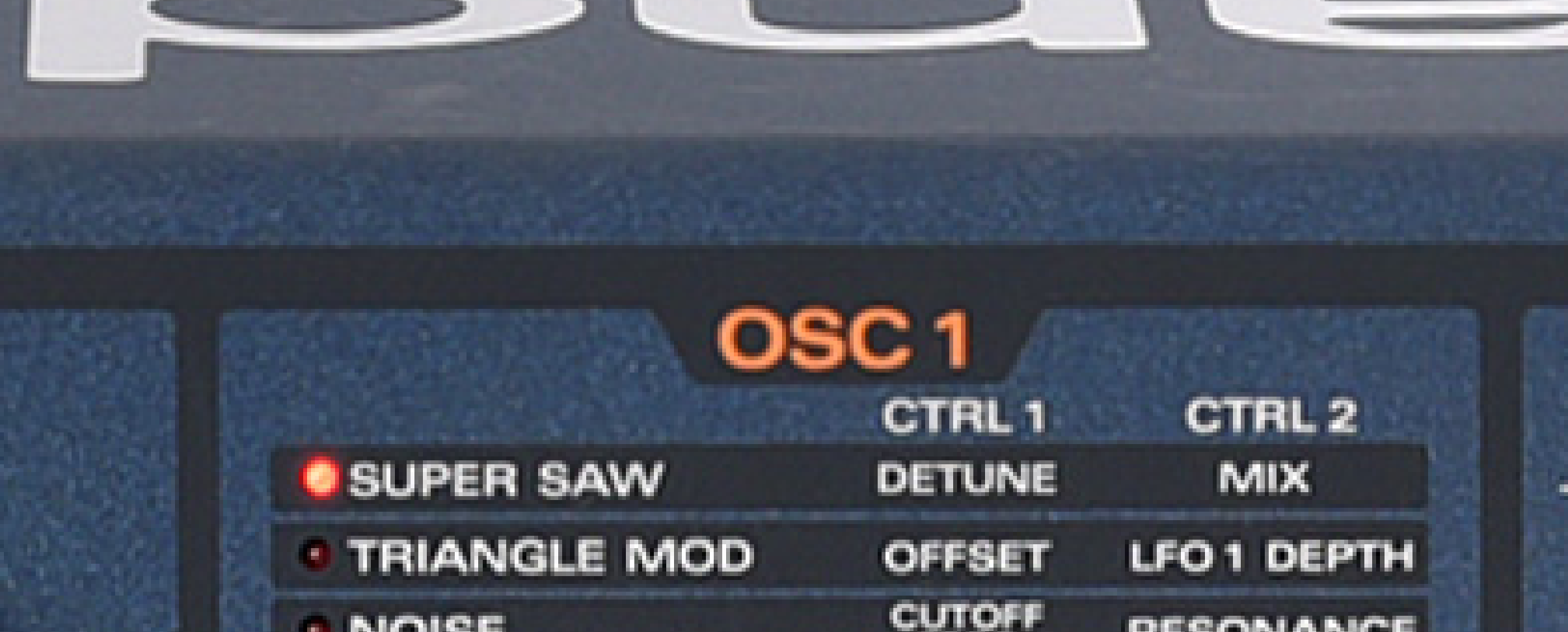
It feels to me that the label "mix" tells that "unless you turn this knob up, you get no supersaw however you turn the detune knob'.
And it is one norm of MONA to follow the labelings of original synths as much as possible, say, Bite filter has the label "CUTOFF FREQUENCY", DVCO has the label "SOURCE MIX", blah blah. The label "mix" in supersaw is one of them.
-
- KVRer
- 7 posts since 27 Sep, 2015
Ah, that makes sense. My first thought was that it was the oscillator level originally, but being the mix between the central voice and the others seems obvious in retrospect. (I’m not familiar with the original hardware)plugmon wrote: Tue Jun 27, 2023 12:14 pmThat label is intentional, though I'm still on the fence if it's good or bad.easynam wrote: Tue Jun 27, 2023 11:08 am Really nice work!
Have noticed one small issue: the multi knob for the supersaw seems to be currently mislabeled as mix.
In the first place, MONA calls the mode "SUPERSAW" instead of "MULTISAW". I didn't know why u-he didn't use this well-known word. (some trade-mark kind of issue?)
I thought that the word "SUPERSAW" will inspire/excite users more than "MULTISAW" so I chose the former as the label.
Then, using the label "multi" seems to be inconsistent and I also always feel that the name "multi" is not much clear to understand what it is. I referred to the model hardware and found that its original label was "mix", which felt more intuitive to me.
It feels to me that the label "mix" tells that "unless you turn this knob up, you get no supersaw however you turn the detune knob'.
And it is one norm of MONA to follow the labelings of original synths as much as possible, say, Bite filter has the label "CUTOFF FREQUENCY", DVCO has the label "SOURCE MIX", blah blah. The label "mix" in supersaw is one of them.