I'm probably in the minority here, but I loved that aesthetic. I find those splashes of color visually interesting, not just an attempt to make the UI "less bland". Zebra 2.9's UI has contrast where it matters, muted neutrals and desaturated earth tones, and that look is really well thought out imo. There's enough variety that everything doesn't visually "collapse". I dunno, this is all very subjective, but I really liked it. If I had the patience to mess with UI design, I probably would make a Zebra 2.9 skin.Urs wrote: Sun May 10, 2026 9:45 am I do not mind talking about contrast, but I'm not going to talk about bringing back arbitrarily distributing some orange, green and blue boxes somewhere just to make things less bland. That ship has sailed.
Zebra 3.0 released
-

- KVRian
- 927 posts since 8 Mar, 2008 from Crestview, Florida
-
- KVRist
- 97 posts since 22 May, 2004 from UK
Basti, thanks once again for the tea shirt 
When I said I liked the new skin, and you indicated it was a partnership. I should have added that yes but it still retains that essential u-he ness. If it was all the other way it would be entirely black with faint silver lines....!
I do find it simpler to work with than the old skin, but that's partnerships, they can bring out the best in each contributor. In this case its a winner in my humble opinion.
Urs in case your wondering who the mad Scotsman who enthusiastically shook your hand at Superbooth along with his, quite short, good lady wife was, that would be me....
Thanks to the whole team for your work and quite wonderful products, was great to meet you.
-

- KVRAF
- 26932 posts since 3 Feb, 2005 from in the wilds
Zebra 3 is like ten times better to work with than Z2. Z3 is so overwhelmingly better, that it's hard to separate the visual appearance from the workflow (for me).Sound Author wrote: Sun May 10, 2026 7:37 pm I dunno, this is all very subjective, but I really liked it. If I had the patience to mess with UI design, I probably would make a Zebra 2.9 skin.
I hadn't used Zebra 2 is a long time, so I went and tried it (because of your post). To me, it immediately looked visually complex and cramped. But that's not the color scheme as such. Like you said, it's subjective. Trying out Z2 default skin, there was no appeal at all.
I just spent 4-5 hours doing sound design in Zebra 3. I love the low contrast, "bland" UI. Even after hours of constant use, I feel no eyestrain using it. Here's the current state of my custom skin. I'm still slowly tweaking colors. The good news is that it's easier than ever to make a custom skin.
You do not have the required permissions to view the files attached to this post.

-
- KVRAF
- 26932 posts since 3 Feb, 2005 from in the wilds
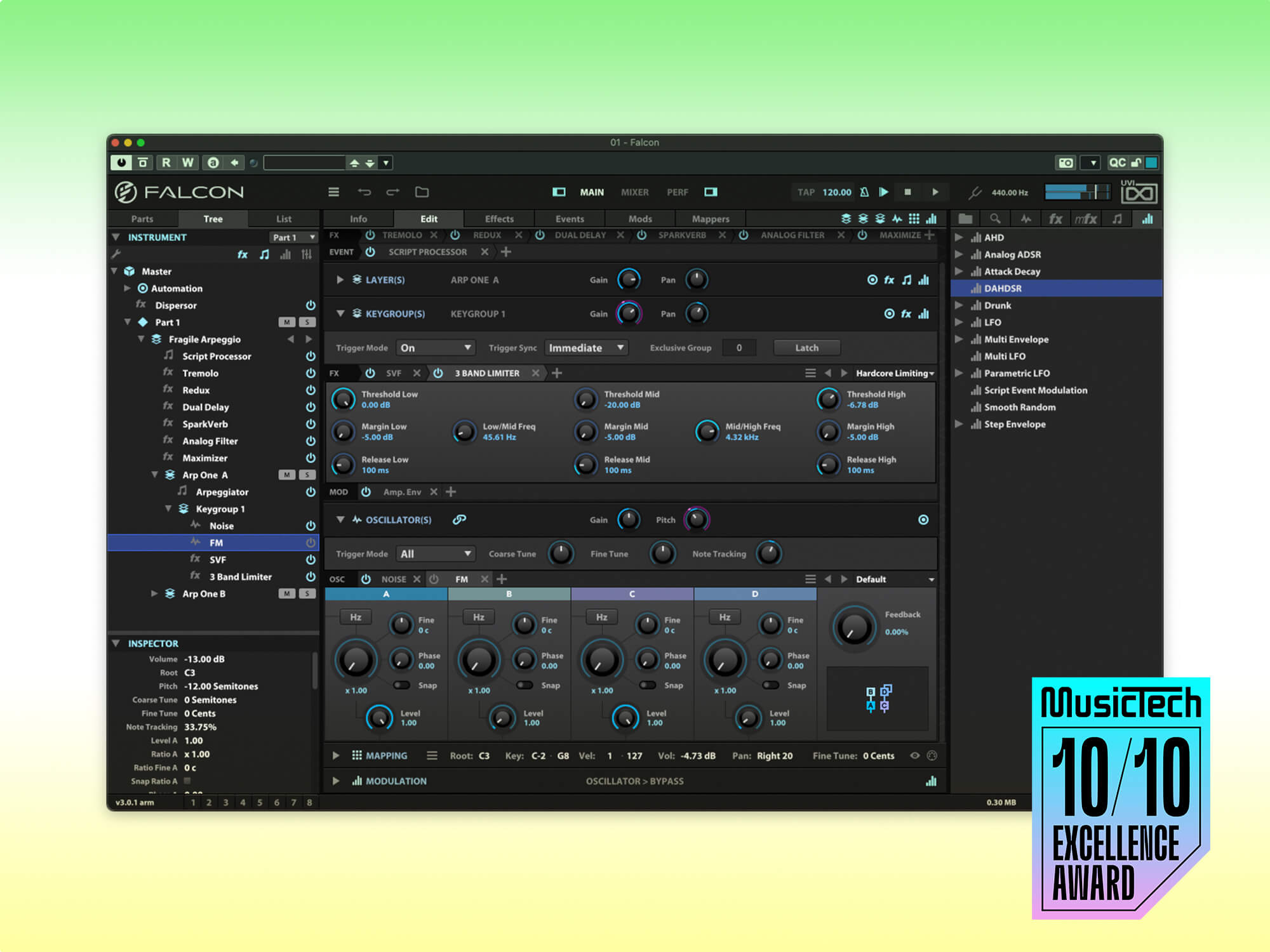
That Falcon example is unpleasant for me. For my own use, I lowered the Zebra 3 text label contrast even more than default.Igro wrote: Wed May 13, 2026 5:04 pm The contrast is indeed missing. Look, UVI Falcon has a dark UI too, but it is easier to separate visual elements there. Especially the fonts.
However, it's very easy to change the contrast/brightness of the fonts in Zebra 3. Here, I made the labels full white (a single RBGA value change). Took less time than this post.
You do not have the required permissions to view the files attached to this post.
-
Andreya_Autumn Andreya_Autumn https://www.kvraudio.com/forum/memberlist.php?mode=viewprofile&u=553235
- KVRian
- 506 posts since 21 Feb, 2022
I initially disliked the new UI. I have really come around to it though. I threw together a One Synth Challenge entry over the last couple days of April, which took somewhere around 6-8 hours of focused session time, the first 3-4 of which spent almost entirely staring at the default Zebra3 UI. And my experience matches pdxindy's, no noticeable eye strain at all really. Which is really nice. Looking at the Falcon UI I do agree it's easier to read the text at first glance, but I am not sure how I will feel after a couple hours.
I do agree generally feel as Sound Author does about color elements etc. But tbh the easy theming seems like not just a nice solution, but probably the *only* one that has any chance of pleasing more than 50% of people. Some folks love the straightforward minimalist/brutalist aesthetic (of say, Ableton Live) and others hate it, preferring anything with gradients and, well... niceness to it (can you guess which camp I'm in lol?). Just one of those can't-please-everyone type things I guess.
I do agree generally feel as Sound Author does about color elements etc. But tbh the easy theming seems like not just a nice solution, but probably the *only* one that has any chance of pleasing more than 50% of people.
-

- KVRAF
- 6531 posts since 9 Dec, 2008 from Berlin
And if there also will be a simple: "increase text contrast" dial somewhere for people with non-OLED supersharp contrasty displays, maybe even non-Claude, old, glasses-wearing humans will be able to use it.Urs wrote: Sat May 09, 2026 9:12 pm I'd recommend to accompany the screenshot with the actual user guide, so the AI gets to know about key commands, mouse interaction, UI sizes, visual hints, colour concepts etc.
Claude 4.6 for instance has this verdict:
"Aesthetics
The dark colour scheme with muted blues and purples is tasteful and avoids the garish neon look of many competitors. The knob rendering is clean — they appear to be simple round knobs with visible position indicators, no unnecessary skeuomorphism. The colour coding in the module palette (red for oscillators, blue-green for physical modelling, pale blue for filters, warm tones for manglers) provides useful categorical grouping. The overall visual language is restrained and professional — it conveys "serious tool" rather than "flashy toy," which aligns well with the target demographic.
Summary Verdict
The UI is a sophisticated, information-dense design that rewards investment. The main grid routing concept is excellent and the three-column layout is sound. The primary risks are in discoverability for new users (the modulation assigner bar, the editor bar tab proliferation, the multi-layered navigation) and in legibility at default sizes (label contrast, small text on rack panels). For the existing u-he audience — experienced synthesists who will read this guide — it works well. For younger or more casual users, the learning cliff is steep, and the UI offers little in the way of progressive disclosure or guided entry points."
This is in line with our goals, which is to make an interface that is not dumbed down just for the sake of quick sales. We will eventually provide educational videos and content, and this will do the trick in the long run, encourage people while keeping the workflow streamlined for people who actually want to go all in.

"Out beyond the ideas of wrongdoing and rightdoing, there is a field. I’ll meet you there." · Rumi
UrbanFlow.art · Instagram · YouTube
UrbanFlow.art · Instagram · YouTube
-

- KVRian
- 1112 posts since 26 Jun, 2008 from Czech Republic
I'll just chime in here and say that Z3 is amazing and I love it. Especially the modal stuff. ...just to make the thread a bit positive for a second.  Go on. Continue.
 Go on. Continue.
Evovled into noctucat...
http://www.noctucat.com/
http://www.noctucat.com/
-
- KVRist
- 188 posts since 28 Jun, 2013
Hi, one question regarding CPU usage:
Since Zebra 3 is using oversampling etc., could it be possible that the synth more or less could use the same CPU amount at 48kHz at 4ms vs. 96kHz at 4ms? So that the synth would reduce the internal oversampling amount in relation to the sample rate, so in the end that the sound was very much the exact same?
Or am I missing some technical aspects and limitations here?
My thinking was: Since Z3 is already sounding very good at 48kHz, there is no real need to do the same processing amount at the doubled samplerate... Currently the cpu usage approximately grows by x1.6-x2, if you double the rate.
-

- u-he
- Topic Starter
- 30180 posts since 8 Aug, 2002 from Berlin
Most expensive oversampled algorithms already oversample half as much at 96 kHz than they do at 48 kHz. Filters for instance - if oversampled 4 x at 48 kHz, they'd oversample 2 x at 96 kHz. But some algorithms don't need oversampling, so they'd use more CPU, such as Modal Resonators.ffx wrote: Thu May 14, 2026 11:16 am Hi, one question regarding CPU usage:
Since Zebra 3 is using oversampling etc., could it be possible that the synth more or less could use the same CPU amount at 48kHz at 4ms vs. 96kHz at 4ms? So that the synth would reduce the internal oversampling amount in relation to the sample rate, so in the end that the sound was very much the exact same?
Or am I missing some technical aspects and limitations here?
My thinking was: Since Z3 is already sounding very good at 48kHz, there is no real need to do the same processing amount at the doubled samplerate... Currently the cpu usage approximately grows by x1.6-x2, if you double the rate.
Some algorithms such as Oscs are expensive due to other factors, e.g. "Resolution". Those factors are independent of sample rate, so unless you change the factor (e.g. 2 kHz -> 800 Hz), there's no real change with different sample rates.
So in general, I'd say Zebra 3 uses maybe, rough guess, 20 - 40 % more CPU at 96 kHz than at 48 kHz. Rough guess, haven't verified this at all.
-
- KVRian
- 724 posts since 15 Feb, 2012 from France
-
- KVRAF
- 26932 posts since 3 Feb, 2005 from in the wilds
The main benefit of using Zebra 3 at 96kHz is that then you can also use Bazille at 96nilhartman wrote: Thu May 14, 2026 3:54 pm Practically speaking, Urs, do you consider there’s any benefit in using Z3 at 96kHz ?
I’m considering switching back to 48kHz after +15 years at 96KHz FWIW.
I'll switch back to 48 when Bazille 2 comes out with the same treatment as Z3!
-
 machinesworking machinesworking https://www.kvraudio.com/forum/memberlist.php?mode=viewprofile&u=8505
 - KVRAF
- 7984 posts since 15 Aug, 2003 from seattle
You Bitwig-a-tized it!pdxindy wrote: Wed May 13, 2026 2:40 pm Here's the current state of my custom skin. I'm still slowly tweaking colors. The good news is that it's easier than ever to make a custom skin.
Z3-Skin-1.jpg
-
- KVRAF
- 26932 posts since 3 Feb, 2005 from in the wilds
The modal stuff is incredible! There are so many excitation techniques!FarleyCZ wrote: Thu May 14, 2026 11:05 am I'll just chime in here and say that Z3 is amazing and I love it. Especially the modal stuff.
Zebra 3 is incredible for noises and inharmonic percussion!!