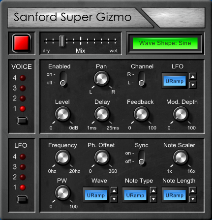
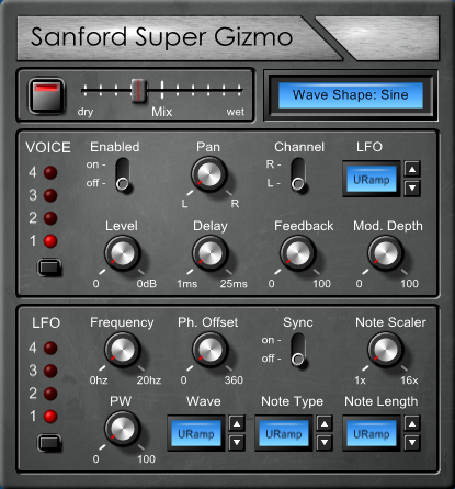
1.it looks a bit like a Mondrian the way the lines run through it.
2. The lcd frames are inconsistent - I like the top green one, inset. The lower ones are a bit portly and raised.
3. Some times I think in a plug like this, if you got rid of the ridge separating the voice from the rest of the signal path for 2 big black areas (even 1) and just used rounded square lines to group things- as if the lines were painted on, it would be more cohesive?
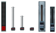
4. maybe some knob variations or slider for volume?
anyways, just some quick hits to honor your request