
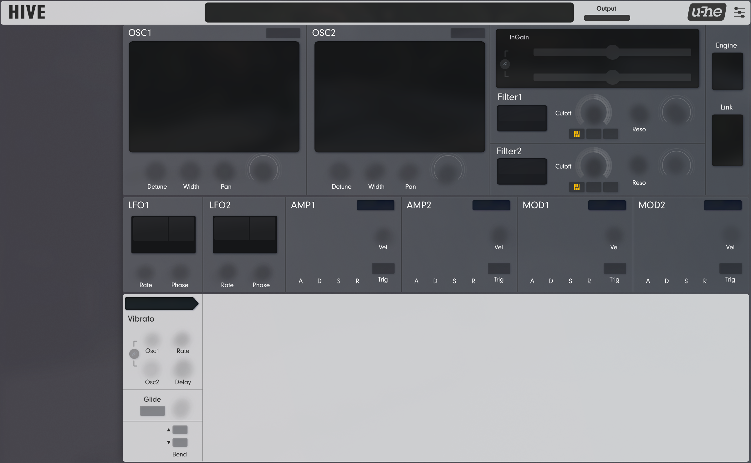
For me, I actually prefer the original symmetrical design, and whist there is some neat interactive elements and the ability to view things like the displays simultaneously and in different ways, I still felt it slower and less intuitive to use and like Funkybot, I'm not a fan of the aesthetic look, but that's more a matter of taste I think. So it's more 50 / 50 for me, but well done on capitalising on what is possible outside the core code and knowing how to manipulate the scripting to this level. Clearly, some sacrifices are evident such as the small floating keyboard section as well.
I do my own incremental mods to Hive, but as I've learnt in the past with previous GUI projects where you're not the core developer, things can break and it can take a lot of work to try and fix and update, or simply have to abandon. The original and basic Hive design layout is important to me and such a dramatic change in design from it, really doesn't work for me from a musical interactive stand point. It's like taking a synthesizer keyboard and rearranging all the knobs and buttons.
"Eclipse" skin & soundset for Hive
-
- KVRAF
- 3251 posts since 30 Dec, 2014
KVR S1-Thread | The Intrancersonic-Design Source > Program Resource | Studio One Resource | Music Gallery | 2D / 3D Sci-fi Art | GUI Projects | Animations | Photography | Film Docs | 80's Cartoons | Games | Music Hardware |
-

- KVRist
- Topic Starter
- 344 posts since 3 Mar, 2015 from Japan
Color variations will come after it gets in some stable stage. Hive 2.0 will come and I'll have to maintain the skin for that. Having variations means having hard times updating the skin (I've experienced this in Massive Modular.) So it's not soon before variations will be released...Funkybot's Evil Twin wrote: ↑Fri Jan 11, 2019 10:00 pm In regards to the GUI, the purple text on black really just doesn't jive with my eyes (not enough contrast maybe), and the flat, gray GUI doesn't do the layout changes justice IMO. WOuld love to see a variant with a color scheme closer to the default version of AIKO. Thinking: bottom panels in white, white or light blue text on black up top. But really, anything other than purple on black would be an improvement IMO.
Yes, that's exactly what I didTHE INTRANCER wrote: ↑Sat Jan 12, 2019 11:31 pm It's like taking a synthesizer keyboard and rearranging all the knobs and buttons.

And to be poetic, it's not 50/50 but 100/100. You like the original and enjoy 100%, I like mine and enjoy 100%

 Some may like the original, others like mine and the whole world becomes happier

-
Funkybot's Evil Twin Funkybot's Evil Twin https://www.kvraudio.com/forum/memberlist.php?mode=viewprofile&u=116627
- KVRAF
- 11520 posts since 16 Aug, 2006
Totally understandable. In the interim, I've started working on a custom mod of your skin for my own personal use (won't be sharing any elements for obvious reasons - this is just for me). Still need to finish the FX and Arp/Seq backgrounds and better match some colors here and there. But this will give you an idea of what I was thinking. I really just couldn't read the purple on black, and this blue works much better for me. The white bottom was just to break things up visually.plugmon wrote: ↑Sun Jan 13, 2019 12:22 amColor variations will come after it gets in some stable stage. Hive 2.0 will come and I'll have to maintain the skin for that. Having variations means having hard times updating the skin (I've experienced this in Massive Modular.) So it's not soon before variations will be released...Funkybot's Evil Twin wrote: ↑Fri Jan 11, 2019 10:00 pm In regards to the GUI, the purple text on black really just doesn't jive with my eyes (not enough contrast maybe), and the flat, gray GUI doesn't do the layout changes justice IMO. WOuld love to see a variant with a color scheme closer to the default version of AIKO. Thinking: bottom panels in white, white or light blue text on black up top. But really, anything other than purple on black would be an improvement IMO.
You do not have the required permissions to view the files attached to this post.
-
- KVRist
- Topic Starter
- 344 posts since 3 Mar, 2015 from Japan
Inspiring! 
Yeah blue is the definite color choice. Blue rings on white pane are also beautiful, which reminds me of Logic Alchemy synth.
Combining dark & light background is a difficult work. White header might bring a good balance...Not sure but something like this :
Yeah blue is the definite color choice. Blue rings on white pane are also beautiful, which reminds me of Logic Alchemy synth.
Combining dark & light background is a difficult work. White header might bring a good balance...Not sure but something like this :
-
Funkybot's Evil Twin Funkybot's Evil Twin https://www.kvraudio.com/forum/memberlist.php?mode=viewprofile&u=116627
- KVRAF
- 11520 posts since 16 Aug, 2006
Looks great!plugmon wrote: ↑Sun Jan 13, 2019 4:51 am Inspiring!
Yeah blue is the definite color choice. Blue rings on white pane are also beautiful, which reminds me of Logic Alchemy synth.
Combining dark & light background is a difficult work. White header might bring a good balance...Not sure but something like this :
-
- KVRian
- 814 posts since 26 May, 2013 from France, Sisteron
Regarding color variations, could you use a template engine so you only edit one template and generate all the variations from it?
Maybe the pictures could be generated this way as well: color in background then you put your image on top with some alpha. Would that work?
Maybe the pictures could be generated this way as well: color in background then you put your image on top with some alpha. Would that work?
-
- KVRist
- Topic Starter
- 344 posts since 3 Mar, 2015 from Japan
I don't clearly understand what you mean, but anyway, since the GUI is composed of many separated images to create animations, it is hard to offer something like "Just change this image, and it affects the whole UI".abique wrote: ↑Sun Jan 13, 2019 7:19 am Regarding color variations, could you use a template engine so you only edit one template and generate all the variations from it?
Maybe the pictures could be generated this way as well: color in background then you put your image on top with some alpha. Would that work?
-
Funkybot's Evil Twin Funkybot's Evil Twin https://www.kvraudio.com/forum/memberlist.php?mode=viewprofile&u=116627
- KVRAF
- 11520 posts since 16 Aug, 2006
Finished up the Arp/Seq panel to a level I'm reasonable happy with (may still adjust the fonts later). Now the question is: do I feel like re-doing all those effect panels or just waiting to see what you do? 
For my own skin, I'm not going to touch that top panel. Not because it wouldn't look good, but rather, I don't want to have to manually have to rebuild it from scratch. Anyway, I really like the white and blue combo. Livens things up. Even went with a more pure white this time and still like it.
For my own skin, I'm not going to touch that top panel. Not because it wouldn't look good, but rather, I don't want to have to manually have to rebuild it from scratch. Anyway, I really like the white and blue combo. Livens things up. Even went with a more pure white this time and still like it.
You do not have the required permissions to view the files attached to this post.
-
- KVRAF
- 2087 posts since 24 Jun, 2006 from London, England
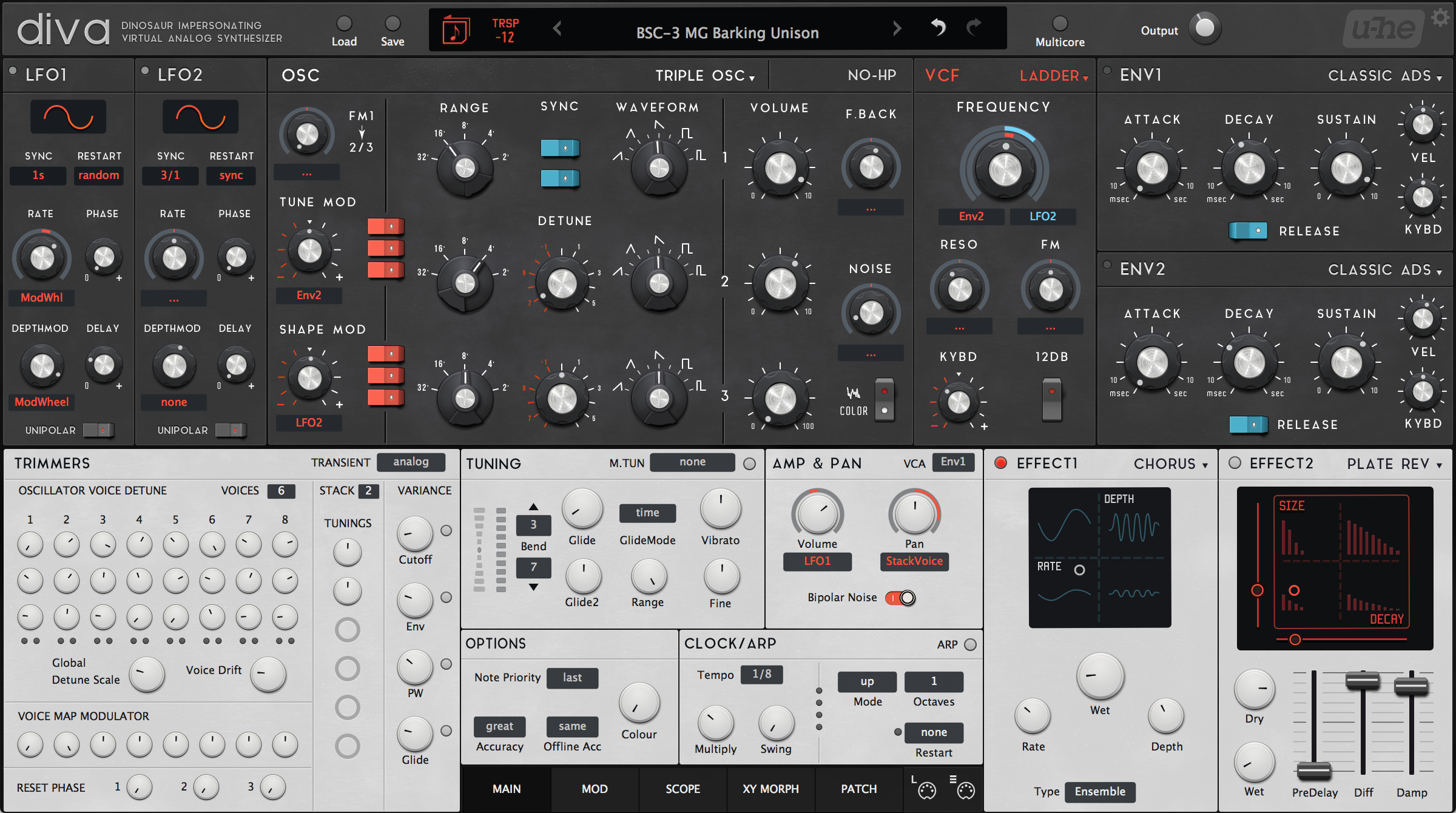
How you did it with Diva was absolutely spot on -plugmon wrote: ↑Sun Jan 13, 2019 4:51 am Inspiring!
Yeah blue is the definite color choice. Blue rings on white pane are also beautiful, which reminds me of Logic Alchemy synth.
Combining dark & light background is a difficult work. White header might bring a good balance...Not sure but something like this :
-
Funkybot's Evil Twin Funkybot's Evil Twin https://www.kvraudio.com/forum/memberlist.php?mode=viewprofile&u=116627
- KVRAF
- 11520 posts since 16 Aug, 2006
Here's my version of Diva. Use the darker knobs (compared to AIKO White). Also, this has a white top-header and dark U-he GUI. At this point, honestly not sure if that was stock in the original AIKO skin of if I customized parts of that top section. I think it was alternate parts, and I may have just used a different logo. Might be stock too...can't remember.
Either way, I think the dark knobs and white top/bottom do a great job framing the synth, and contrasting the main synth elements in gray. That's where I got the idea/inspiration for the tweaks to the Hive skin.
Clearly I'm a big fan of the Plugmon skins!
EDIT Jan 19 2018
After revisiting this Diva skin with some help Elektronisch, I can confirm that all I did was add a flat, black U-he logo to one of the modifications of the standard AIKO skin. There's a version of the divaheader.png with the white header is in the alternate artwork, as one of the stock modifications the skin ships with.
You do not have the required permissions to view the files attached to this post.
Last edited by Funkybot's Evil Twin on Sat Jan 19, 2019 9:42 pm, edited 1 time in total.
-
- Banned
- 3889 posts since 3 Feb, 2010
Oh i like this version.Funkybot's Evil Twin wrote: ↑Sun Jan 13, 2019 9:37 pm Here's my version of Diva. Use the darker knobs (compared to AIKO White). Also, this has a white top-header and dark U-he GUI. At this point, honestly not sure if that was stock in the original AIKO skin of if I customized parts of that top section. I think it was alternate parts, and I may have just used a different logo. Might be stock too...can't remember.
Either way, I think the dark knobs and white top/bottom do a great job framing the synth, and contrasting the main synth elements in gray. That's where I got the idea/inspiration for the tweaks to the Hive skin.
Clearly I'm a big fan of the Plugmon skins!
Also does it only look to me but do the texture on diva plugmons skin looks a little bit smushy?
-
- KVRAF
- 2087 posts since 24 Jun, 2006 from London, England
Not sure if it's intentional or not but I always assumed the 'smushy' bits around the dials of the dark background top panel were meant to be like fingerprints/marks worn down by the hands of the person tweaking the dials

-
- KVRian
- 938 posts since 29 May, 2011 from Germany
I like the new layout and the overall aesthetic of the Eclipse skin a lot better than Hive´s original look, I just wish the colour scheme was a bit more like Aiko´s (darker top 2/3rds, brighter bottom 1/3rd ie the fx/sq/xy panels, maybe even a 3-colour-stripe-scheme?).
Plus I wish that Aiko and Eclipse were procured by u-he and included in the standard installation packages to ensure continued maintenance
Plus I wish that Aiko and Eclipse were procured by u-he and included in the standard installation packages to ensure continued maintenance
-
Funkybot's Evil Twin Funkybot's Evil Twin https://www.kvraudio.com/forum/memberlist.php?mode=viewprofile&u=116627
- KVRAF
- 11520 posts since 16 Aug, 2006
Hi Plugmon, hope you don't mind some small workflow suggestions. Just a few things that I think would either improve ease of use or speed up the workflow. Not sure what's possible via skinning either, so no idea if some of this is even feasible.
1. Previous/Next buttons for waveform selections. It took a second to figure out how to move out of the Wavetable Oscillator. Would be nice if in addition to the dropdown menu, there was a set of previous/next buttons on other side of the Wavetable Osc. This would be in addition to the dropdown menu. Would just make it a little more obvious and offer another option. Particularly if clicking the forward button from the Wavetable osc would cycle back to the sine waveform at the start of the list.
2. If an effect is inactive, would be nice if clicking on the effect name could activate it (and vice versa), or maybe have on/off toggle switches. Just saves some mouse motion and improves workflow.
3. Some way to "Bypass FX" from the preset browser. Was thinking maybe putting the Effect Bypass in the main header, but if the preset browser is open, clicking in that header closes the browser, so maybe a Bypass FX button in the browser itself? If possible that'd be a nice option to help audition presets with fewer effects.
4. Filter Input Gain and Vibrato link...thought they were broken. Was thinking this was a button. Didn't realize I had to click and drag up or down to make these work. Was thinking about how to fix that and thought, "up/down arrows." Maybe right above/bekiw each link icon have a set of up/down arrows that indicates to the user they should click and drag in this hot zone. Now that I know about it, not a big deal, but would've helped me figure that feature out more quickly.


