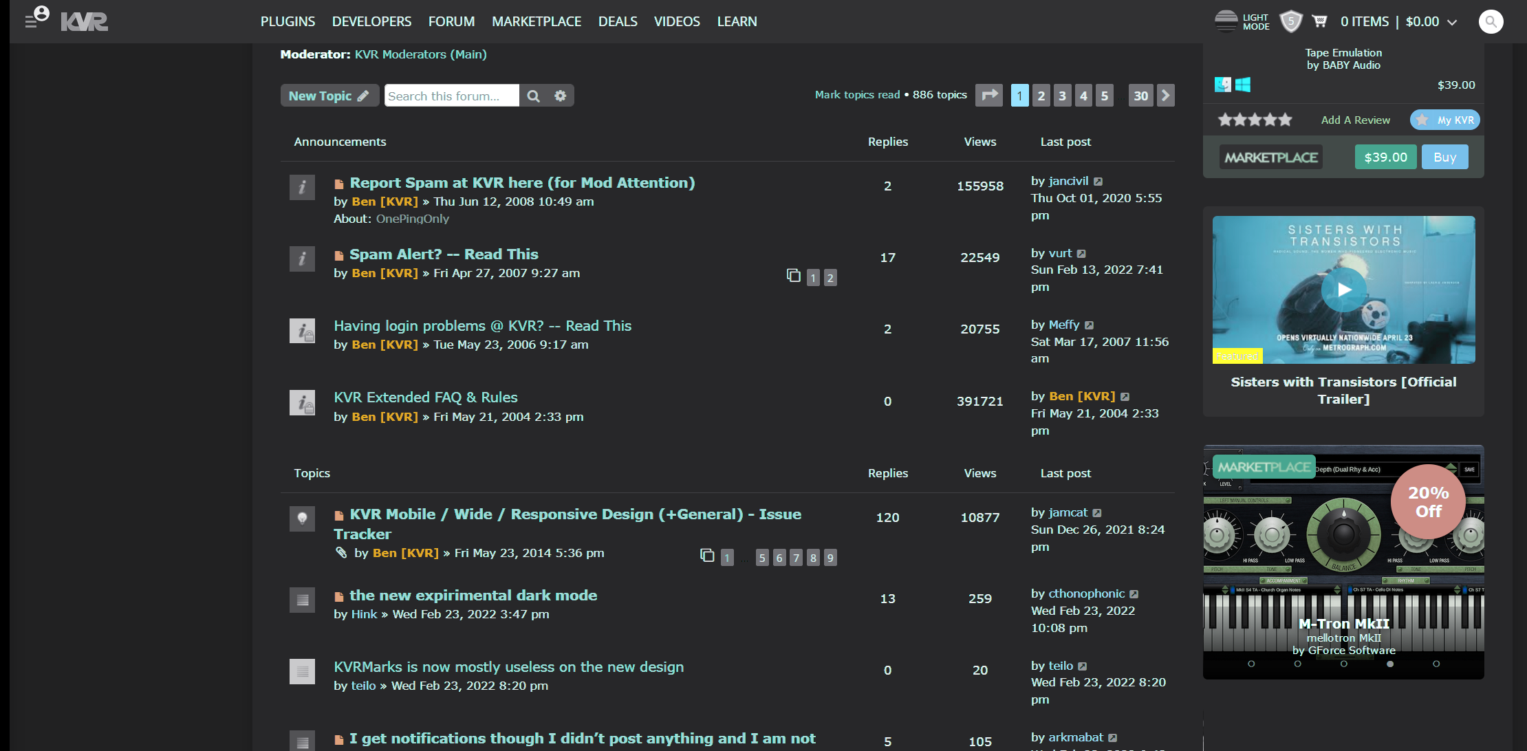
the new experimental dark mode
- Rad Grandad
- Topic Starter
- 38044 posts since 6 Sep, 2003 from Downeast Maine
yay...in the new user area you have to dig a little go to the upper corner, the new user dropdown>then click on your name (you will see PMs there too), scroll down>account settings and the first thing you see...
The highest form of knowledge is empathy, for it requires us to suspend our egos and live in another's world. It requires profound, purpose‐larger‐than‐the‐self kind of understanding.
- Rad Grandad
- Topic Starter
- 38044 posts since 6 Sep, 2003 from Downeast Maine
bump because I responded to another thread and would like to keep this post visible for all to see in the forun list so no one misses this and I would like tp wxpress my appreciation to those who did this...I had no clue it was coming but when I saw an ugly framed page with new icons I got concerned, (I think the site was down then)...as soon as I switched to the dark mode...well it's awesome...great job, Thank you 
The highest form of knowledge is empathy, for it requires us to suspend our egos and live in another's world. It requires profound, purpose‐larger‐than‐the‐self kind of understanding.
- KVRAF
- 23102 posts since 7 Jan, 2009 from Croatia
I love it!
-
- addled muppet weed
- 105855 posts since 26 Jan, 2003 from through the looking glass
- Rad Grandad
- Topic Starter
- 38044 posts since 6 Sep, 2003 from Downeast Maine
say, is it just me (could be because my view is different) or is the buttons better moving the quote to the end...does this help with accidental dupes as well?
The highest form of knowledge is empathy, for it requires us to suspend our egos and live in another's world. It requires profound, purpose‐larger‐than‐the‐self kind of understanding.
- KVRAF
- 35294 posts since 14 Sep, 2002 from In teh net
It’s a bit disjointed still because I seem to be in dark mode right now when posting in specific threads, but when I go back to browsing recent posts it’s all blue and white again - big step forwards though
- KVRAF
- 18561 posts since 16 Sep, 2001 from Las Vegas,USA
At first glance I'm not a fan either. I'll give it a chance for a while but it seems harder to read at least for my eyes/monitor/viewing conditions. Maybe after some use it will grow on me.
Is it my imagination or is the white mode much brighter now? I noticed it when first visiting today before switching to dark mode.
Is it my imagination or is the white mode much brighter now? I noticed it when first visiting today before switching to dark mode.
None are so hopelessly enslaved as those who falsely believe they are free. Johann Wolfgang von Goethe
- Rad Grandad
- Topic Starter
- 38044 posts since 6 Sep, 2003 from Downeast Maine
The highest form of knowledge is empathy, for it requires us to suspend our egos and live in another's world. It requires profound, purpose‐larger‐than‐the‐self kind of understanding.
- KVRAF
- 9800 posts since 18 Aug, 2007 from NYC
Is anyone else getting login errors? It’s also harder to navigate to the latest posts.
I’m only mentioning here because I’m guessing the changes are likely related.
I’m only mentioning here because I’m guessing the changes are likely related.
-
- addled muppet weed
- 105855 posts since 26 Jan, 2003 from through the looking glass
- KVRAF
- 10255 posts since 7 Sep, 2006 from Roseville, CA
Yeah, when I first logged in this morning, the white nearly blinded my sensitive blue eyes
I prefer the non-blindiness of the dark mode, but it's much harder to read the font. Can we get a medium-dark-no-fat-extra-whip-grande-grey mode?
Logic Pro | PolyBrute | MatrixBrute | MiniFreak | Prophet 6 | Trigon 6 | OB-6 | Rev2 | Pro 3 | SE-1X | Polar TI2 | Blofeld | RYTMmk2 | Digitone | Syntakt | Digitakt | Integra-7
- KVRian
- 665 posts since 1 Jan, 2018
Functionally, the thing I find most annoying about the new design is the lack of an immediately accessible button for "latest posts" while a topic is already open. I want to drink from the firehose right now; I don't want to have to click on the hamburger menu icon and then scroll down to the little "LP." Anyway, it would be nice to have that button on the nav. bar when using the site on a desktop, if you guys are taking feature requests. On mobile, it's fine.
-
- KVRAF
- 3251 posts since 30 Dec, 2014
Much prefer the darker look but still not a fan of the green text. Red text looks like it's floating in 3D (KVR Mods)
I've tweaked the dark colour of the site to something I think is a little nicer.

There are problems with trying to view the site on Web Based TVs. The forums and everything else is hard left squashed and the forum topics are not accessible to view. It's like only a quarter of the screen is being used. Before you could view the full web page as it's supposed to be, just as it is on a computer.
I've tweaked the dark colour of the site to something I think is a little nicer.

There are problems with trying to view the site on Web Based TVs. The forums and everything else is hard left squashed and the forum topics are not accessible to view. It's like only a quarter of the screen is being used. Before you could view the full web page as it's supposed to be, just as it is on a computer.
Last edited by THE INTRANCER on Wed Feb 23, 2022 11:22 pm, edited 1 time in total.
KVR S1-Thread | The Intrancersonic-Design Source > Program Resource | Studio One Resource | Music Gallery | 2D / 3D Sci-fi Art | GUI Projects | Animations | Photography | Film Docs | 80's Cartoons | Games | Music Hardware |


