That's great to hear. One of the most annoying things is when different parameteres types of the same parameter are actually completely different parameters (like Albino's filters or Breverbs controls between algorithms).Urs wrote:Yes, corresponding parameters across module borders are the same for host automation.Echoes in the Attic wrote:Here's a question:
When you switch to different filter or oscillator models, or envelopes or whatever, or the equivalent controls seen as the same parameters by the host?
For example I could see having a certain sound with filter automation or something, or a certain envelope, and wanting to try a different filter while keeping the automation or the same envelope etc. They aren't entirely different parameters between models are they?
Note that we didn't actually scale the parameters so that they match any hardware synth. In Diva, same cutoff frequency is same cutoff frequency at the same knob position in every filter module. Which also means that we won't support synth programs stored on data cassettes.
However, the vibe doesn't get lost. To the contrary, some of our hardware synth suddenly sound dull to my ears... (we're contemplating to add "muffle" parameters though to constrain cutoff frequencies where they don't go to 20+ kHz)
Urs
The long DIVA thread
-
Echoes in the Attic Echoes in the Attic https://www.kvraudio.com/forum/memberlist.php?mode=viewprofile&u=180417
- KVRAF
- 12038 posts since 12 May, 2008
-

- KVRAF
- 24415 posts since 7 Jan, 2009 from Croatia
...or like Kontakt's filters. God damn, that's annoying!
-

- KVRian
- 1095 posts since 12 Jan, 2011
ryandfl wrote:I think the knobs would benifit from some contrast around their edges, seperating them from the surface more. They would look more 'grab-able' that way, I think.
Ditto.
+ no wood. hehehe
-

- u-he
- Topic Starter
- 30208 posts since 8 Aug, 2002 from Berlin
That refers mostly to the Moogy knobs on the envelopes, right?tommyzai wrote:ryandfl wrote:I think the knobs would benifit from some contrast around their edges, seperating them from the surface more. They would look more 'grab-able' that way, I think.
Ditto.
+ no wood. hehehe
If the background was slightly brighter (as on the left side), I think it would be perfect.
Als, need to blend the slider tickmarks a bit more comfy into the background. They really look clumsy atm.
-
- KVRian
- 753 posts since 22 Aug, 2002 from on the inside looking out
Urs - are you going to be modelling the VCA component as well? I've found with my modular that the vcf-vca interaction can change a sound a lot...
p.s. if this has already been discussed, I apologise but there is a lot of information scattered over too many threads for me to process
p.s. if this has already been discussed, I apologise but there is a lot of information scattered over too many threads for me to process
-
- u-he
- Topic Starter
- 30208 posts since 8 Aug, 2002 from Berlin
Yes. Technically the VCA is built into our filter modules. So the VCA is swapped out with the filter types as well. (Only this way can we model zero delay filter feedback for resonance *and* vca->mixer)suthnear wrote:Urs - are you going to be modelling the VCA component as well? I've found with my modular that the vcf-vca interaction can change a sound a lot...
The most drive in the VCA happens to happen behind the transistor ladder filter. It's basically responsible for that "creamy" top end that could be heard in this example:
http://www.u-he.com/music/DivaNoodle.wav
-
- KVRian
- 1095 posts since 12 Jan, 2011
Urs et al,Urs wrote:That refers mostly to the Moogy knobs on the envelopes, right?tommyzai wrote:ryandfl wrote:I think the knobs would benifit from some contrast around their edges, seperating them from the surface more. They would look more 'grab-able' that way, I think.
Ditto.
+ no wood. hehehe
If the background was slightly brighter (as on the left side), I think it would be perfect.
Als, need to blend the slider tickmarks a bit more comfy into the background. They really look clumsy atm.
Please allow me to make a few suggestions. I mean absolutely no disrespect to you or your designer as you have a nice, sleek thing going. Still, can't help but to give a few suggestions that could help. At the very least it will give you something to consider and reject. I wish I could figure out how to put an image in here to illustrate. Ahrrr.
1. No wood. Emulate the effect . . . visually suggest/trick the view/user to seeing wood. Within the color-scheme of the mock-up below you add wood fibers inside that boarder. It can all tie in. At present the wood is stuck on there.
2. Reverse the backgrounds of the two upper quads. Move the darker background to the left and the lighter to the right.
OR
Brighten and darken knobs, sliders, and lines as needed to adjust contrast on the two sides.
3. Have a slight boarder wrap around entire .png. It seems chopped off at present, and having such an abrupt bottom will cause users (like me) to point the mouse or scroll into the abyss whereby launching things from our dock or something.
4. Make the Diva logo bigger, more slender lines, more silver and glitzy, and wander down a little into the black below . . . maybe just the swoop of the D.
5. Have the U-he logo NOT wander down a little . . . move it up, neatly into the boxed area . . . something is not right with this . . . looks like the logo is thrown on and will fall off the GUI. Also, something is not right with the color . . . not sure what.
6. Brighten or darken lines as needed after doing any of the above.
7. More square? I'm not sure if there is a standard ratio you are using for size optimization on a screen, but I think it would look a little better slightly squarer. Maybe it's the wood that's making it too long to my eyes.
Last edited by tommyzai on Fri Nov 11, 2011 5:03 pm, edited 9 times in total.
-
- KVRAF
- 24415 posts since 7 Jan, 2009 from Croatia
For inserting images you use the IMG tag... before that you host the image to Imageshack.us or somewhere.
-
- KVRian
- 1095 posts since 12 Jan, 2011

-

- KVRian
- 1216 posts since 6 Jul, 2005
Have to say I love the wooden panels as they were, it feels incomplete to me without them... plus they hint nicely at the 'vintageness' of Diva.
Just my tuppence!
Just my tuppence!
-
- KVRian
- 1095 posts since 12 Jan, 2011
I would add wood fibers within the above color scheme. This way it's still there to give a vintage flavor, but also work within this post-mod interface.taoyoyo wrote:Have to say I love the wooden panels as they were, it feels incomplete to me without them... plus they hint nicely at the 'vintageness' of Diva.
Just my tuppence!
-
- u-he
- Topic Starter
- 30208 posts since 8 Aug, 2002 from Berlin
What do you mean by the two arrows? To swap the background panel style?
Note that each section has different backgrounds... related to their models...
Will post more screenshots...
-

- KVRAF
- 13128 posts since 7 May, 2006 from Southern California
A big problem with the screen shots, is that they don't really do the GUI justice (at least on my displays). I didn't initially get a good feeling from the images Urs posted but now that I got my hands on Diva (heh) I think it looks much better... especially in large mode on a big high-rez screen. The wood sides do work for me and the whole interface looks very well designed.
That said, I've never been a great judge of an interface... I've always preferred the look of Ableton Live/Numerology/Zebra to anything with a 3d look. Still I think Diva looks well done.
That said, I've never been a great judge of an interface... I've always preferred the look of Ableton Live/Numerology/Zebra to anything with a 3d look. Still I think Diva looks well done.
-
- u-he
- Topic Starter
- 30208 posts since 8 Aug, 2002 from Berlin
Hmmm, can one not right-click and open the images in HiRes?
Here's a representative assembly of matched combinations:
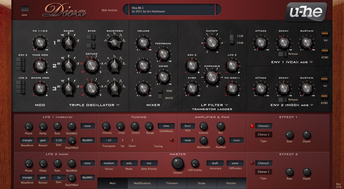
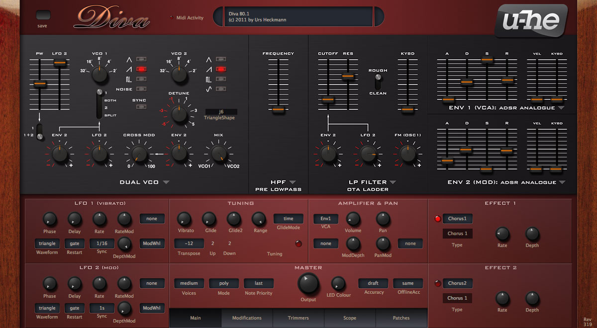
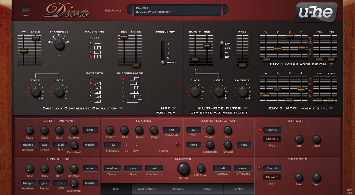
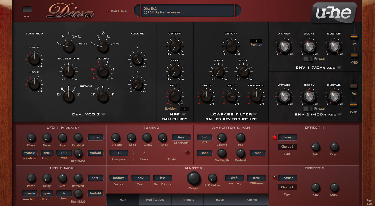
Here's a representative assembly of matched combinations: