I really like the mellow color scheme, and overall use of colors. A few things stand out to me as odd, like:
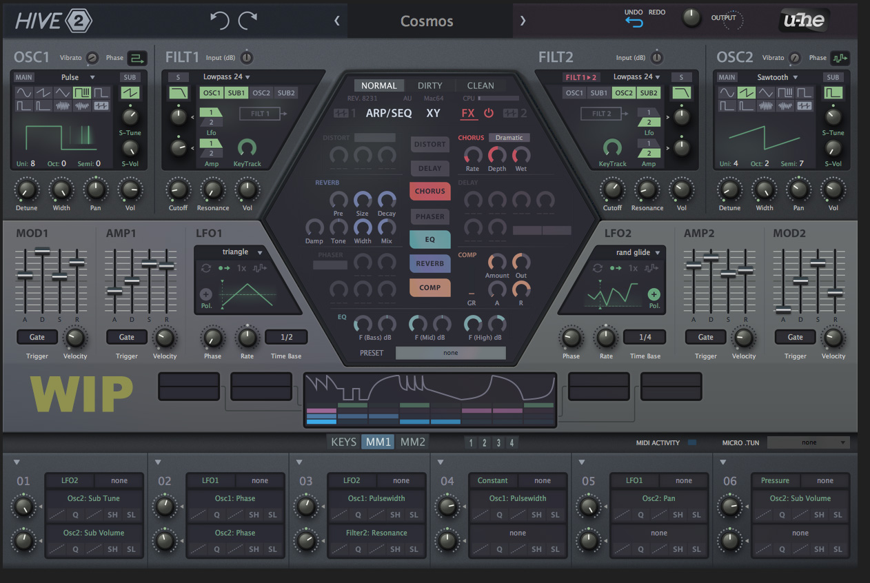
1. Sub2 to the left of Osc2 - get the symetry thing but my eyes go from left to right and Osc2 is more important and more likely to see use
2. The Cutoff and Resonance knobs are burried in the filter section (burying the lede). I'd probably put Cutoff and Responance where the Input and Volume knobs are, and adjust some things in that bottom row.
3. I'd probably put Mod1 to the left of Amp1. Most hardware synths are going to put the filter envelope (which is what Mod1 is more commonly assigned to) to the left of the amp envelope. This would also make it more consistent with Mod2, Amp2 (which are in the inverse order to Mod1/Amp1). The mirror image thing doesn't add value in this instance and would just have me reach for the wrong envelope.
Question: can the Global FX state, and individual FX states be locked in Hive 2? Sometimes I want to browse dry patches, or at least patches with no reverb, and having a lock on the on/off states would be awesome. Right now, I've been locking the reverb mix to 0, which is almost as good.

Hive 2 is coming!
-
Funkybot's Evil Twin Funkybot's Evil Twin https://www.kvraudio.com/forum/memberlist.php?mode=viewprofile&u=116627
- KVRAF
- 12515 posts since 16 Aug, 2006

-

- u-he
- 30253 posts since 8 Aug, 2002 from Berlin
-

- addled muppet weed
- 111341 posts since 26 Jan, 2003 from through the looking glass
-

- KVRian
- 807 posts since 7 Aug, 2015 from H2O
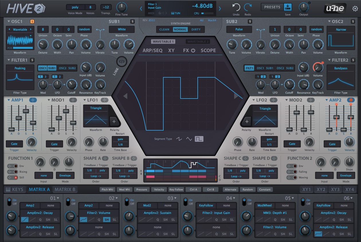
UIs are so like car designs - which is why we see everything available out on the road.Urs wrote: Wed Jan 30, 2019 1:25 pm Not finished in terms of contrasts and stuff, but a rough glimpse at what we're going for:
Thoughts?
(we've got until, say, early April to change things...)
I prefer the above design - so I hope that there are options. I like the colors because it's simply more fun to look at. Of course there are those who disagree, but there are those who agree....such is life.
-

- KVRAF
- 24456 posts since 7 Jan, 2009 from Croatia
-
- u-he
- 30253 posts since 8 Aug, 2002 from Berlin
We tried, it would make Hive look likeFunkybot's Evil Twin wrote: Fri Apr 12, 2019 1:37 pm1. Sub2 to the left of Osc2 - get the symetry thing but my eyes go from left to right and Osc2 is more important and more likely to see use
Lots of discussions here. We can refine this if necessary. We've planned to do some tests, but nothing set in stone.2. The Cutoff and Resonance knobs are burried in the filter section (burying the lede). I'd probably put Cutoff and Responance where the Input and Volume knobs are, and adjust some things in that bottom row.
That's been subject to many discussions too. I'm not sure which way really is better.3. I'd probably put Mod1 to the left of Amp1. Most hardware synths are going to put the filter envelope (which is what Mod1 is more commonly assigned to) to the left of the amp envelope. This would also make it more consistent with Mod2, Amp2 (which are in the inverse order to Mod1/Amp1). The mirror image thing doesn't add value in this instance and would just have me reach for the wrong envelope.
Global state can be locked, individual ones not yet. This is on our list, but maybe has to wait until a 2.x update.Question: can the Global FX state, and individual FX states be locked in Hive 2? Sometimes I want to browse dry patches, or at least patches with no reverb, and having a lock on the on/off states would be awesome. Right now, I've been locking the reverb mix to 0, which is almost as good.
-
- u-he
- 30253 posts since 8 Aug, 2002 from Berlin
I like more colours, too. There'll be further discussion.Bodhisan wrote: Fri Apr 12, 2019 1:54 pmI prefer the above design - so I hope that there are options. I like the colors because it's simply more fun to look at. Of course there are those who disagree, but there are those who agree....such is life.
Plus, we have built-in Exposure and Hue/Sat/Brightness filters for each UI image now. It'll be easy to try and adjust things.
-
Funkybot's Evil Twin Funkybot's Evil Twin https://www.kvraudio.com/forum/memberlist.php?mode=viewprofile&u=116627
- KVRAF
- 12515 posts since 16 Aug, 2006
Thanks for getting back Urs! Super stoked for this release. 
I'd suggest Cutoff and Resonance where the Input and Volume are. Then bottom row: have it start with input volume on the far left, and the output volume on the far right. From a graphical perspective, you'd be looking at minimal changes, but I think it would increase usability in a logical way.Urs wrote: Fri Apr 12, 2019 1:55 pmLots of discussions here. We can refine this if necessary. We've planned to do some tests, but nothing set in stone.2. The Cutoff and Resonance knobs are burried in the filter section (burying the lede). I'd probably put Cutoff and Responance where the Input and Volume knobs are, and adjust some things in that bottom row.
-
- KVRist
- 253 posts since 18 Dec, 2005
-
- u-he
- 30253 posts since 8 Aug, 2002 from Berlin
-

- KVRian
- 849 posts since 11 Mar, 2010
It looks absolutely gorgeous. I would like to give just a little a suggestion:Urs wrote: Fri Apr 12, 2019 1:17 pm Just, you know, keeping you up to date where we're heading with this...
Still a bit of work ahead, little colour corrections, a few pixels or highlights here and there.
In the upper gray area there are many similar knobs, and I see that you tried to highlight the more important ones (cutoff, resonance, volumes) with bolder labels around them, but I think it should be even more highlighted (well, I'd shrink the filter mod/lfo knobs as well, but it's not that important)
-

- KVRist
- 430 posts since 4 Jun, 2018 from The UK
I love the latest design!
I do also like how the OSC and Filters look grouped in the older design, but the newer design seems clearer and easier to use without learning. Having the OSC and filter horizontal instead of vertical makes better use of the space.
I do also like how the OSC and Filters look grouped in the older design, but the newer design seems clearer and easier to use without learning. Having the OSC and filter horizontal instead of vertical makes better use of the space.
-

- Beware the Quoth
- 35529 posts since 4 Sep, 2001 from R'lyeh Oceanic Amusement Park and Funfair
since the osc/filter blocks and the modulator blocks are now of equal height, wouldnt it be better to have similar sections mirrored vertically rather than horizontally? (ie both osc and filter blocks on the right, both lfo/amp/env/function blocks on the left)Urs wrote: Fri Apr 12, 2019 1:17 pm Just, you know, keeping you up to date where we're heading with this...
Still a bit of work ahead, little colour corrections, a few pixels or highlights here and there.
An idiot on Set Theory:
"In some cases there is an object called red that contains everything that is red. In much the same way a pot is a plate."
"In some cases there is an object called red that contains everything that is red. In much the same way a pot is a plate."
-
- KVRAF
- 9702 posts since 5 Aug, 2009
i love hive's sound and u-he products i think i got over 60%, the rest i just dont need but i still dont like HIVE's gui, it looks like a cheap synth somehow with the hexagon, no offense!
i dunno if this thing doesnt block the ease of use somehow. im open for new styled and modern GUI's (not the waves ones....) but it doesnt click yet for me, i got hive in the intro sale and wasnt dissapointed with the sound, FAT, and dirty if you want and massive!
it always reminds me of DIVERSION, i like its design also not much yet.
still i cannot wait for HIVE 2!
DAW FL Studio Audio Interface Focusrite Scarlett 1st Gen 2i2 CPU Intel i7-7700K 4.20 GHz, RAM 32 GB Dual-Channel DDR4 @2400MHz Corsair Vengeance. MB Asus Prime Z270-K, GPU Gainward 1070 GTX GS 8GB NT Be Quiet DP 550W OS Win10 64Bit