far from perfect, but it works like a charm (for me that is
Hive 2.1 Izmo skin by Plugmon
-

- KVRAF
- 3500 posts since 25 Apr, 2011
-
- KVRist
- 282 posts since 27 Aug, 2015 from Paris, France
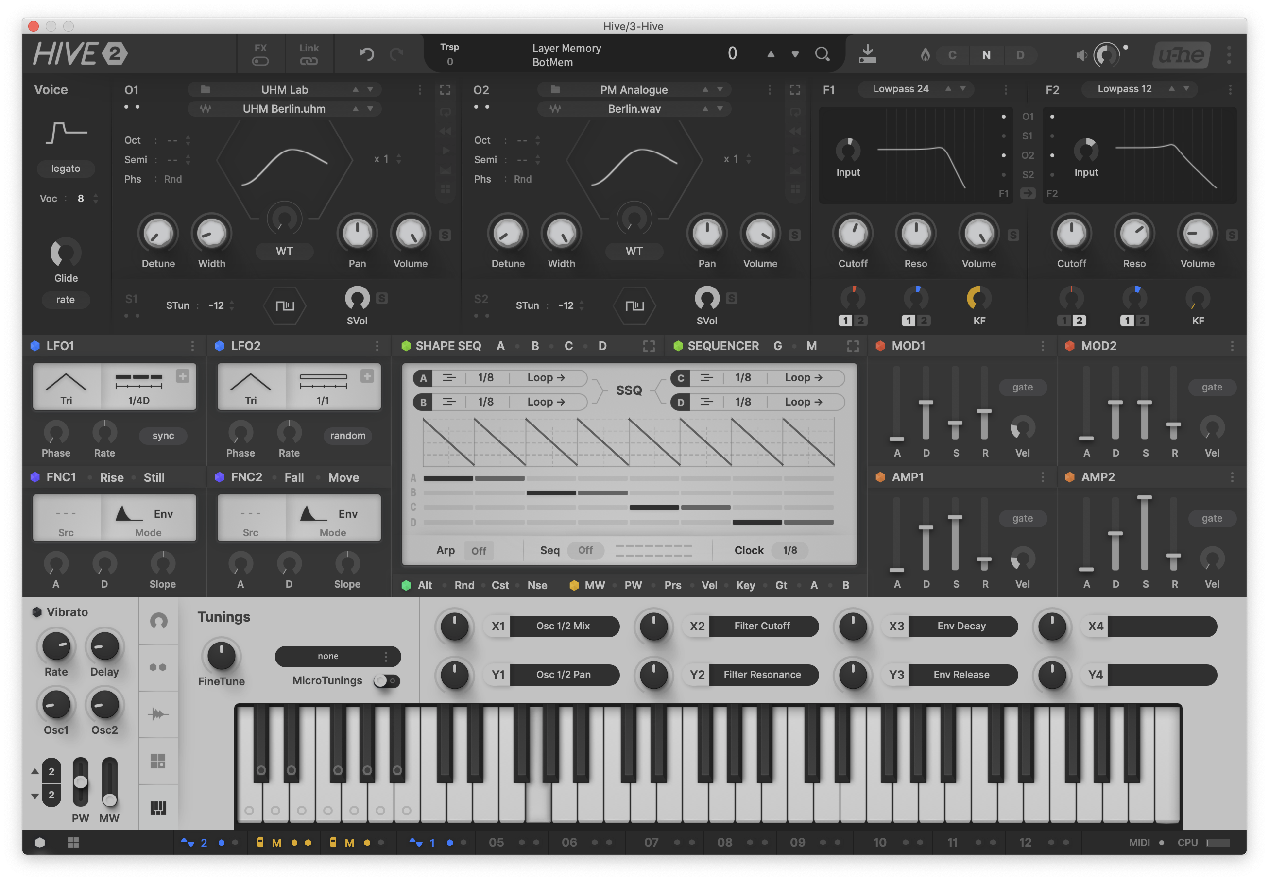
Izmo is a beautiful looking skin. Aesthetically top notch.
But as it has been said, it's too bright. Some elements are hard to see, like the filters env/lfo modulation rings. The skin would benefit from more colors.
I needed time to find the step sequencer, mod matrix etc. Seems to me that this GUI is less intuitive than the original one. Still, I like being able to edit more wavetable parameters on the main screen.
In the end, if I was discovering Hive today, I don't know which skin I would choose, Izmo might be more eye-catching. But I am used to the original one, I think it has one of the best workflow on the market, I wouldn't want to change that, so I'll stick with it.
Impressive work nonetheless
Soundcloud - Synthwave & More https://soundcloud.com/canapelee
-

- KVRian
- 643 posts since 28 Oct, 2010
Yeah some people prefer dark UIs. Shouldn't be too hard to provide dark and light options though.Funkybot's Evil Twin wrote: Fri Jan 22, 2021 5:59 pm I think that example in the right would really trigger complaints about the white being too much. Yeah, it's higher contrast, but it's significantly more retinal burning.
-

- KVRist
- 396 posts since 3 Mar, 2015 from Japan
Not hard. in fact, only 3 or 4 earlier revision had dark-dark-light design.pierb wrote: Sun Jan 24, 2021 11:26 pmYeah some people prefer dark UIs. Shouldn't be too hard to provide dark and light options though.Funkybot's Evil Twin wrote: Fri Jan 22, 2021 5:59 pm I think that example in the right would really trigger complaints about the white being too much. Yeah, it's higher contrast, but it's significantly more retinal burning.
dark-dark-dark, of-course possible, light-light-light vice versa.
As to "too bright" issue, I'd like to know if it's
"I do use light skins in other synth, but this one is too bright." or "I usually use dark skins, so this one is too bright."
If the former, the point is how it can be improved without dropping light background entirely. If the latter, it simply shows that existing Hive users prerer dark skins(no doubt, since the default one is relatively dark) and the point will be whether u-he should serve dark theme in parallel.
I'd like to make discussion as fruitful as much, not just an election between black and white.
Another thing I have to mention is; there's a GUI rendering issue in the current build and some colors are a little bit different than the last one I confirmed. e.g. The ring background color and the base background color are too close, almost identical. It was not so in the last build. The impression might differ when it's fixed.


-
Funkybot's Evil Twin Funkybot's Evil Twin https://www.kvraudio.com/forum/memberlist.php?mode=viewprofile&u=116627
- KVRAF
- 12513 posts since 16 Aug, 2006
I probably gravitate more towards lighter skins, that said, I really like that dark, dark, light variant above. Particularly the use of the hexagons which ties it back to the "Hive" concept. For me, I think the lack of colors in the current version is the biggest issue. The screens currently look like they're begging for colors, shape-sequencer included. It's just a little too monotone IMO. That said, in the dark, dark, light version you just posted, I'm not sure I have the same problem.
-
- KVRAF
- 2685 posts since 14 Jul, 2005 from Australia
I just tried out the beta and read through this thread and have to agree with all the comments. The new skin is too bright for me, but also too cryptic. Here are my comments in the 2.1 beta thread before I knew this one existed:
* I think it looks great, but is too bright for my taste, I would love a dark variant of it
* I do find it much more cryptic than the regular stkin and much more colour-oriented which is a bit of an issue for me personally (I'm colourblind)
* When switching an oscillator to wavetable, I honestly don't see how I can go back to an analog waveform
* There's enough room for "Unison" in the oscillator section, is it really necessary to cut it short to Unis? In fact, I think with some careful refinement, it would be possible to avoid shortening a lot more words on the GUI (e.g. SVol, Sub Vol would easily fit there. These shorter terms are what I mean by cryptic.
* It was a bit confusing to me to see where the two filter modulation targets marked 1/2 go, obviously one is Mod and one is LFO, but there are no labels and only colours are used.
Overall, I think the new skin would be harder for a new user to get comfortable with, despite the fact I think it has awesome potential in changing our Hive workflow.
Thanks to the comments here, I now know how to switch back to regular waveforms, but I literally needed the screenshot pointing exactly where it was to figure it out. Perhaps having two methods of selecting waveforms where only one method can take you back is not a great idea. I do like the one click nature of the new method, but it's too confusing having both.
Perhaps check out Massive X again but switch to the Dark theme to get an idea. That's a lot easier on the eyes imho.
Regarding the comments about the filters being on the right, some other really popular synths do this too, Serum being the main one that comes to mind. While it feels a bit unusual at first, it doesn't really bother me.
* I think it looks great, but is too bright for my taste, I would love a dark variant of it
* I do find it much more cryptic than the regular stkin and much more colour-oriented which is a bit of an issue for me personally (I'm colourblind)
* When switching an oscillator to wavetable, I honestly don't see how I can go back to an analog waveform
* There's enough room for "Unison" in the oscillator section, is it really necessary to cut it short to Unis? In fact, I think with some careful refinement, it would be possible to avoid shortening a lot more words on the GUI (e.g. SVol, Sub Vol would easily fit there. These shorter terms are what I mean by cryptic.
* It was a bit confusing to me to see where the two filter modulation targets marked 1/2 go, obviously one is Mod and one is LFO, but there are no labels and only colours are used.
Overall, I think the new skin would be harder for a new user to get comfortable with, despite the fact I think it has awesome potential in changing our Hive workflow.
Thanks to the comments here, I now know how to switch back to regular waveforms, but I literally needed the screenshot pointing exactly where it was to figure it out. Perhaps having two methods of selecting waveforms where only one method can take you back is not a great idea. I do like the one click nature of the new method, but it's too confusing having both.
For me, this is a step in the right direction, but I would want every bright thing in the current skin to be dark, basically nothing with light grey at all, I find it too hard to look at for long.plugmon wrote: Mon Jan 25, 2021 1:27 amNot hard. in fact, only 3 or 4 earlier revision had dark-dark-light design.pierb wrote: Sun Jan 24, 2021 11:26 pmYeah some people prefer dark UIs. Shouldn't be too hard to provide dark and light options though.Funkybot's Evil Twin wrote: Fri Jan 22, 2021 5:59 pm I think that example in the right would really trigger complaints about the white being too much. Yeah, it's higher contrast, but it's significantly more retinal burning.
dark-dark-dark, of-course possible, light-light-light vice versa.
As to "too bright" issue, I'd like to know if it's
"I do use light skins in other synth, but this one is too bright." or "I usually use dark skins, so this one is too bright."
If the former, the point is how it can be improved without dropping light background entirely. If the latter, it simply shows that existing Hive users prerer dark skins(no doubt, since the default one is relatively dark) and the point will be whether u-he should serve dark theme in parallel.
I'd like to make discussion as fruitful as much, not just an election between black and white.
Another thing I have to mention is; there's a GUI rendering issue in the current build and some colors are a little bit different than the last one I confirmed. e.g. The ring background color and the base background color are too close, almost identical. It was not so in the last build. The impression might differ when it's fixed.
Perhaps check out Massive X again but switch to the Dark theme to get an idea. That's a lot easier on the eyes imho.
Regarding the comments about the filters being on the right, some other really popular synths do this too, Serum being the main one that comes to mind. While it feels a bit unusual at first, it doesn't really bother me.
Last edited by fgimian on Mon Jan 25, 2021 4:07 am, edited 1 time in total.
-

- KVRAF
- 27005 posts since 3 Feb, 2005 from in the wilds
I would actually like the light area to be a bit brighter. It looks kinda dim and gloomy to me. Either that or dark dark dark... but if there is a light area, I would like it lighter cause it is a bit hard on my eyes as it is.plugmon wrote: Mon Jan 25, 2021 1:27 amAs to "too bright" issue, I'd like to know if it's
"I do use light skins in other synth, but this one is too bright." or "I usually use dark skins, so this one is too bright."
I like both light and dark skins, but tend towards dark skins given the choice. Hard to please everyone
-
Funkybot's Evil Twin Funkybot's Evil Twin https://www.kvraudio.com/forum/memberlist.php?mode=viewprofile&u=116627
- KVRAF
- 12513 posts since 16 Aug, 2006
I strongly agree with this feedback. And we're going into nitpick territory, so my apologies in advance. I find the shorthand very confusing and would always prefer longer labels. STun being another example. "What's 'Stun' mean in this context? Is that a new feature? Why is the T capitalized? [Move the parameter] Oh...sub tuning! Now I get it!"fgimian wrote: Mon Jan 25, 2021 3:51 am * There's enough room for "Unison" in the oscillator section, is it really necessary to cut it short to Unis? In fact, I think with some careful refinement, it would be possible to avoid shortening a lot more words on the GUI (e.g. SVol, Sub Vol would easily fit there. These shorter terms are what I mean by cryptic.
If those sections were labeled Sub 1 and Sub 2, instead of S1 and S2, then you could just label the fields Tune and Vol and I think most people would get we're talking about Sub Tune and Sub Volume. It would just need to be visually clear "that's the sub section."
It's the same for me in the Mod Matrix. Ctrl A fits. So why not Amp1? Or LFO1? That would be much more clear than L1 or A1 or M1. The voicing icons (Poly, Mono, Duo, Leg) in the top-left? I'd probably just stick to text. They've tripped me up on other Plugmon GUI's to be honest. Overall, I'm honestly just not a fan of icons when clear text labels will suffice. I've modified some labels on other skins just to make things more clear to me.
Now that I'm coming to grips with the bottom bar, I quite like it. But I did not understand it at all initially. But that's ok. Now that I get it, I appreciate it. Maybe an "Izmo" manual that includes some of the documentation you posted here (if not already planned) would help. There may even be one for all I know.
Anyway, I hope this isn't meant to be deflating at all. I really like the way you used the space and modified the layout. This feels a bit less cramped than the original Hive skin, while also exposing more parameters to the user and the overall look is great IMO. For me, a bit more color on the screens, some better labels, maybe less blurry fonts, and I'd be perfectly content. It's a really nice skin overall and I'm a big plugmon fan. Someone would need to pry Tokyo Ghost and AIKO from my cold dead hands, and the Eclipse soundset is underrated IMO.
-
- KVRAF
- 6780 posts since 17 Dec, 2009
Hm, on second tought +1 on dark.
Looks like original monolith. I like original monolith.
But dont mind me, despite the fact i have 3 plugmon skins i use instead of originals, Hive original just works for me. And the looks play well with sound. I’m very likely not gonna use Izmo
Looks like original monolith. I like original monolith.
But dont mind me, despite the fact i have 3 plugmon skins i use instead of originals, Hive original just works for me. And the looks play well with sound. I’m very likely not gonna use Izmo

-
- KVRAF
- 2911 posts since 3 Mar, 2006
I gotta say I dunno about the abbreviated labels and more "you gotta know where X is or what X does" workflow (granted I'm new to hive) but I love being able to edit the shape sequencer in the main window for it rather than one frame at a time in the hexagon, I love that the sequencer is a piano roll, I love the like with like layout rather than the mirrored layout, and I love the little switch panel for filter inputs all together.
-

- KVRAF
- 2265 posts since 25 Jun, 2008 from Montreal, Canada
How do you people can browse the web or use an office app? They're full of 255, 255, 255 white and for this skin even a dull grey is to bright for you? You have hyper sensitive eyes or something?
I've been staring at pure white almost all day for 30 years... my eyes must be burned now.
I've been staring at pure white almost all day for 30 years... my eyes must be burned now.
-

- KVRian
- 538 posts since 31 May, 2015 from the Iberian Peninsula
I like the contrast between the dark and light parts of the skin, I think it separates components very well. I don't think any of the modifications seen here is better than the original one but it's cool that people can adjust it to their likings.
Comparing it with other GUIs in the same style, I find it easier to recognize and separate elements in this one than, for example, Vital (which uses the same dark grey colour for all elements and is a bit less intuitive, colourwise.
I'm used to work in light colours, and so I'm happy with this one
Comparing it with other GUIs in the same style, I find it easier to recognize and separate elements in this one than, for example, Vital (which uses the same dark grey colour for all elements and is a bit less intuitive, colourwise.
I'm used to work in light colours, and so I'm happy with this one
-
- KVRAF
- 3500 posts since 25 Apr, 2011
If a dark UI is possible on a vst(i), i'll choose that. I work mainly at night, so the darker the better.