Hive 2 - GUI ReDesign Project 2023

VST, AU, AAX, CLAP, etc. Plugin Virtual Instruments Discussion
Post Reply New Topic
RELATED
PRODUCTS
Delay Lama Dustbin Freek Monstrous Horror Synth OnePingOnly SkinMan

Post

Update 2 - 30th Jan 2023

Image


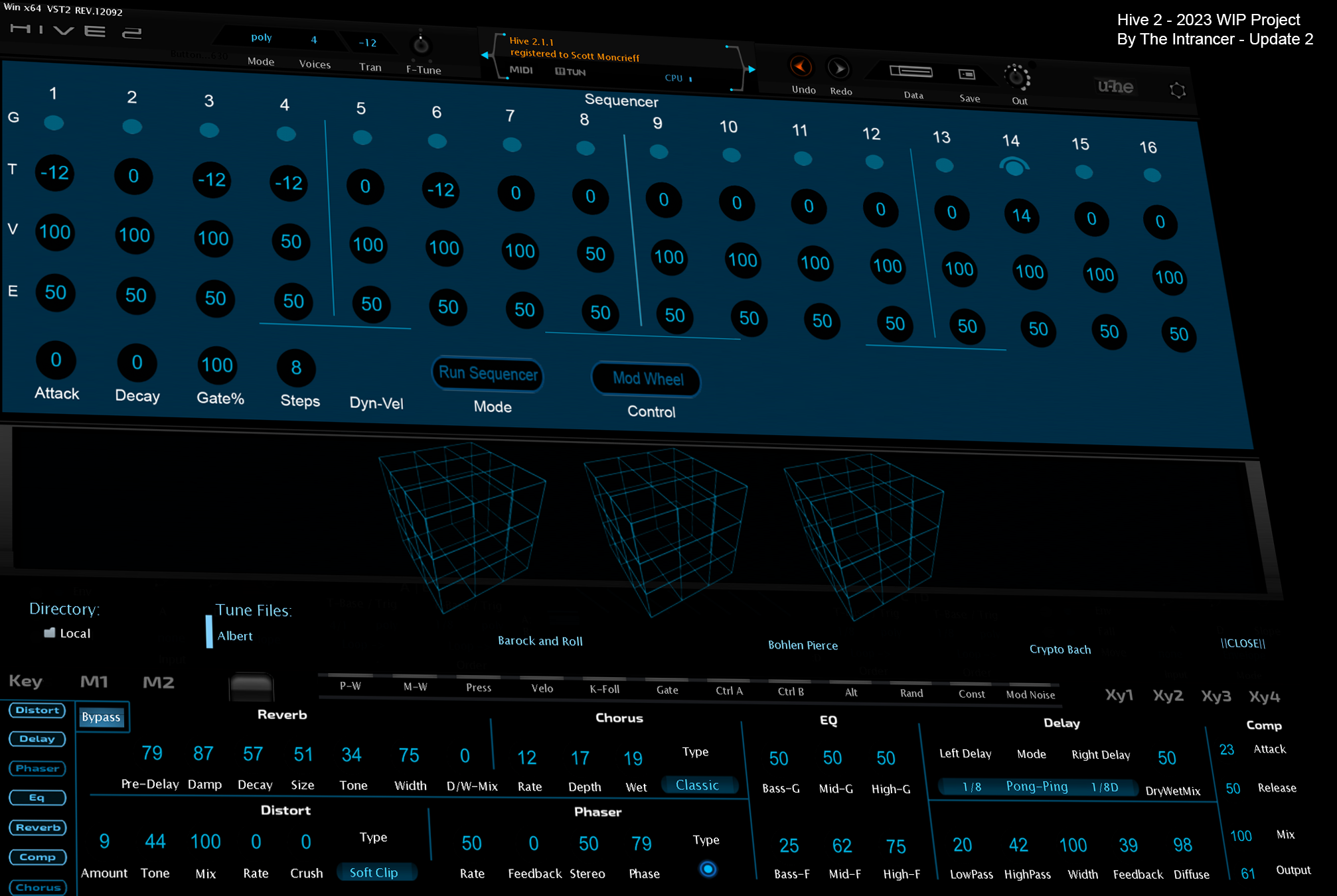
Update 1 - 26th Jan 2023.

Image


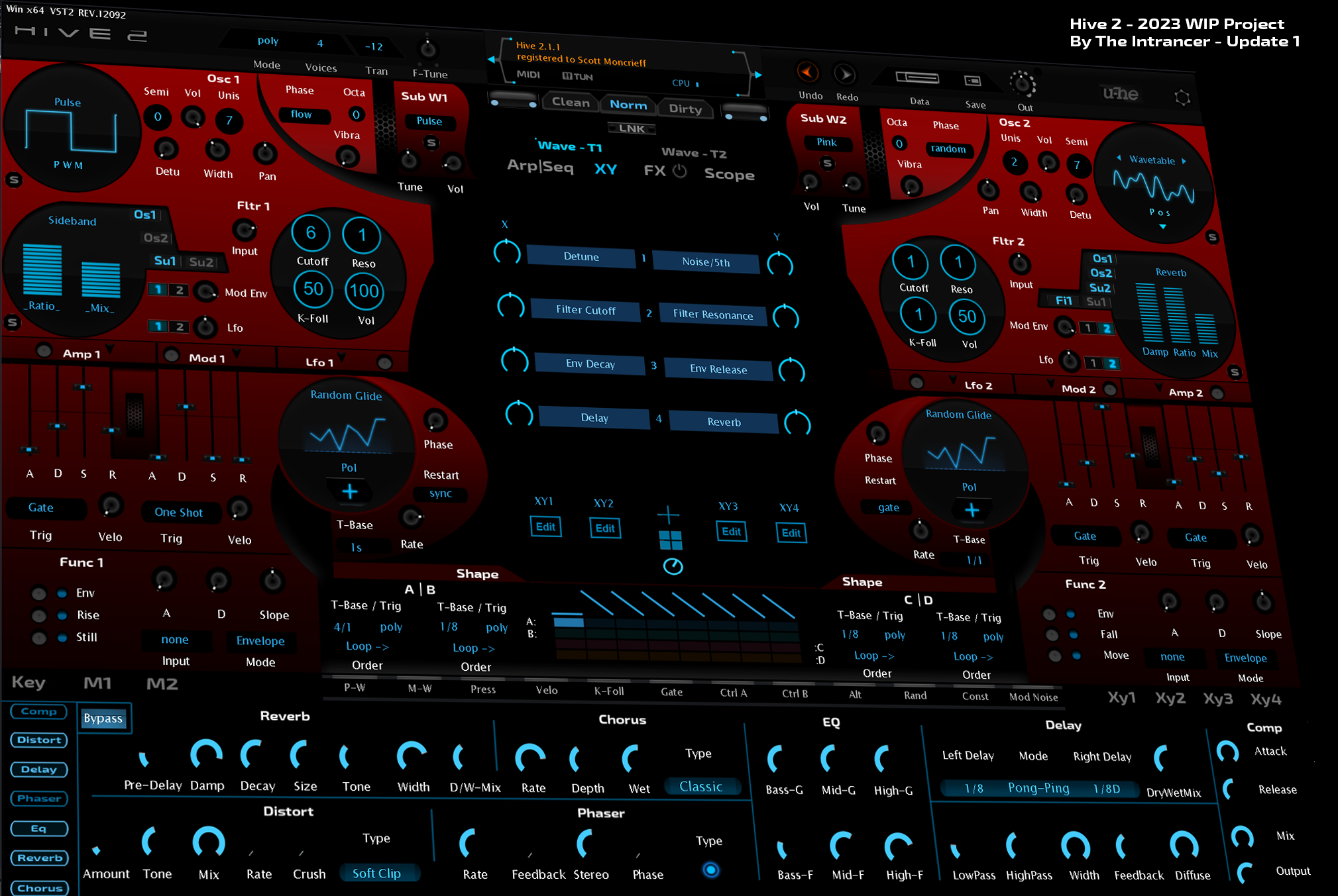
For the past week, I've been working intensely on a new Hive 2 project which is still currently in the midst of development, however significant progress has been made to give you an idea of how things have changed in the design. The top section is for the first time, now actually mirrored rather than just cloned and shifted. A new remote navigation system vie single buttons has been introduced which switches all panels. A new sequencer design has been created and a new effects panel has been integrated. This new version also integrates some basic dual-screen GUI switching for different operation modes, nothing too fancy atm. Besides the new organic look of the interface that moves away from a hexagonal feel, the GUI design is planned to include new animated features. Coming up with new ideas is fun, but it's quite a challenge to put some ideas into practice, whilst some things take you longer than you imagine. I'm a fan of HR Giger works, so the design sorta reflects that.
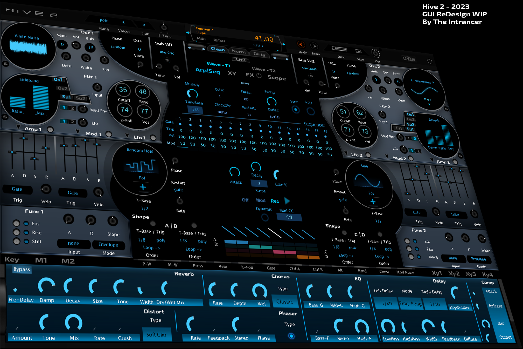
Start of project.
Image
Last edited by THE INTRANCER on Tue Jan 31, 2023 5:05 am, edited 4 times in total.
KVR S1-Thread | The Intrancersonic-Design Source > Program Resource | Studio One Resource | Music Gallery | 2D / 3D Sci-fi Art | GUI Projects | Animations | Photography | Film Docs | 80's Cartoons | Games | Music Hardware |

Post

Fantastic skin ;-)

Post

Looks nice!

Post

Sorry, it doesn't look good. Too much contrast in some parts and too low contrast in others, shapes with non-intuitive logic, and dirty redundant gradients. I have the feeling that the original skin was intentionally degraded in almost all characteristics. That's my impression. Of course, if you are interested in reasonable criticism.

Post

Looks nice to me. But I would also focus on usability. Like making the value of a knob obviously visible, but at the same time, the available range of it, too. I like the numbers in the middle, those could be maybe also printed in an inverted way, so you can use the middle of the knob for also pgraphically visualizing the value. Then you have lot of variations of knobs, maybe unify it? The vendors' skin knob value indicator is too thin IMO, and still not very clearly visible at a glance.
Last edited by Hanz Meyzer on Sat Jan 21, 2023 11:47 am, edited 1 time in total.

Post

Suddenly this thread:
viewtopic.php?t=591524
makes a lot more sense.

Post

Dombaeb wrote: Sat Jan 21, 2023 10:02 am Of course, if you are interested in reasonable criticism.
You don't know intrancer do you ? :hihi:
Eyeball exchanging
Soul calibrating ..frequencies

Post

Looks like the old freeware synth Oatmeal, because, electrolytes

Post

Still think that Plugmons' Eclipse is the best skin for Hive 2, layout wise anyway.

It's a pity he didn't do different colour variations, as not everyone likes purple.

Post

Yuk. Too busy. Sorry 🤷‍♂️
I wonder what happens if I press this button...

Post

Not my cup of tea either. Those big fake beveled edges combined with almost completely flat controls are already no-go for me. The big circles are a waste of space and clash with the artificial "circle/box" shapes. They also seem to destroy/split related sections (like part if the LFO is in the circle, other controls of it are outside but somehow also not separated from the shape section). The contrast is so tiring. IMO this looks way way more amateur-ish than the original or even the Hive1 skin (which seemed to be hated by a big audience already).

Post

You can't animate much with current u-he scripting implementation, so don't try to design your skin around that :)
Image

Post

It's a good thing that I have a good filter for any negative comments with work-in-progress projects, so I can confirm and dismiss any negative feedback as well as from certain individuals I recognise on KVR. No different from Propellerheads forum of 10 years ago really, so I pretty much half expect it, or perhaps even more so on KVR. It doesn't phase me or de-motivate me though, it's quite the opposite in effect. :-D I'm not scared to design outside the box and make it public.

With all that said, in regard to the UI, some aspects I'm aware of such as the colour/contrast and brightness, this isn't important at this stage as I'm still developing the functional aspects of the new screens at this stage. This is also related to the skin design as well because I don't know completely how the new functional design of elements will form the actual design of the skin.

Doing things differently and breaking normal conventions is that one can always question, so for example in the image above, I have split some of the oscillator knobs apart from each other from grey panel space and black space. So there is no ambiguity, I would place a OSC1 and OSC2 label there in addition to any other elements related to the systematic connectivity in the way the audio engine is routed internally.

Not all details are finalised at this point, including the termination points of the knobs and such like. Knobs are regularly moved around, so re-doing graphics and such isn't a good use of time, and get in the way. The LFO's with the black knobs that lay aside the round displays are like this presently to provide a rectangle boundary space, so I can judge the proximity of the other features that are designed within that area. The interconnection in which they are associated to the LFOs will be established by graphical inclusion of the background and perhaps labelling. A circular perimeter around the LFO's was initially set in the graphical files, but removed from view for practical purposes.

The section with modulation points and faders, has been moved but still retains the same layout and isn't mirrored as it is at the top at this stage, still deciding whether to make it so at this point.

The new FX button section at the bottom doesn't replace the original design of my previous reskinned version of Hive in which this skin is based, it actually adds a new and different feel of interactivity in enabling the simultaneous view of the sequencer and the effects section at the same time. The bottom effects section still has features to be added to it, requiring more manual scripting. It may be that I find that I need to rescale elements of this part to include what I want, such as the activation menu to click on. I've rescripted one so, so it's there, but it's invisible. It's interesting to use as it's much smaller and adds a random sound generation system feel to Hive.

The learning process in developing Hive interface-wise is very much an iterative one when it comes to the scripting side and working with new functions you've not used before. Back in the 1980s I used to construct levels for an Atari 800 XL platformer game called Mr Robot (and his robot factory). Back then, I used to code in BASIC and had a love for art and design besides music and in 2008 I graduated in Interactive Multimedia / GUI Development. I only add that for those who might be interested in my background and enjoy using the GUIs I provide and design for them.

I'm not sure how long this Hive GUI will take in its final completion, but the previous black Hive 2 GUI took several weeks, not counting the additional updates for version 2.1 I did.
KVR S1-Thread | The Intrancersonic-Design Source > Program Resource | Studio One Resource | Music Gallery | 2D / 3D Sci-fi Art | GUI Projects | Animations | Photography | Film Docs | 80's Cartoons | Games | Music Hardware |

Post

"It's a good thing that I have a good filter for any negative comments with work-in-progress projects, so I can confirm and dismiss any negative feedback as well as from certain individuals I recognise on KVR. No different from Propellerheads forum of 10 years ago really, so I pretty much half expect it, or perhaps even more so on KVR. It doesn't phase me or de-motivate me though, it's quite the opposite in effect."

The prop forum, here, the presonus forum and Gearspace.

Post

My two cents:

I think the factory style/look is fine as is. The issue is the symmetric/mirrored layout IMO. It just doesn't work that good. There is a reason why you don't find such layouts very often. Although i don't think it's a showstopper.

So if it were my job i would concentrate on the layout/placement.

Post Reply

Return to “Instruments”