Simple mock-up GUI for a reverb

DSP, Plugin and Host development discussion.
Post Reply New Topic
RELATED
PRODUCTS

Post

Out of boredom, I spent some time this evening creating a simple GUI. :)
It's my very first try, so actual usability is probably null.

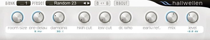
I used Kjaerhus Classic Reverb as a template for the controls.

Let me know what you think!


Image

(The name of this mock-plug-in is a pun on German words:
Schallwellen = soundwaves,
Hall = reverb,

so it would become 'Reverb-waves'. :wink:)

Post

What does the dr.who control do?

Post

Looks pretty good, especially the knobs. I'm not crazy about the black selection boxes, though. Kind of makes it look like a Synth Maker GUI. MMM... I'm not too fond of the font either. A little too "bubbly"--I think I would get irritated looking at the GUI as it is. Maybe just a couple small changes for my personal taste.

Post

I liked the general appearance and the knobs. However, the expression of the knob's value is too close to the label itself, imo. I think a pixel font would make a difference there; it would be smaller and probably more differentiated.

edit: example

Image

Now the values have a color which intuitively connects with the color of the knob visuals.
Image

Post

Shane Sanders wrote:
edit: example
Congratulations. You've managed to not only lose most of the contrast on the important text, but also make it so small I for one cannot even read it easily from my normal working distance (especially with that contrast).

The proper fix for moving the text further away is NOT making it smaller: instead make the box it's within taller. That said, since it was clearly more important on the original (with more contrast and all) it didn't bother me too much that it was close. Actually I liked how it worked, as it defied the normal layout rules, but managed to do it in a way that still kept it easy to look at.

Which brings me to a bigger problem: the light gray background could be made darker, while still keeping it light gray, such that the contrast between the knobs (and label background) and the light gray background would be more, and eyes would concentrate more easily on the actual controls (now my eyes tend to wander around). I tried a quickly photoshopping it, and wasn't too happy with the gray made darker though, so I suggest you also tint it with the cyan color used in other elements.

Other than that I liked the original. :)

Post

Oh, additional comment: I agree that the text on the original looks fuzzy, but a pixel-font isn't necessary (and they look crap anyway); instead just use a properly hinted anti-aliased font and it'll be fine. For a live GUI you'd obviously want to draw the text on the fly though, so you can have sub-pixel anti-aliasing on TFTs.

Post

Hi John Light and all others,

For my open source project I used your basic layout to update the GUI for the reverb example inside the project. The plugin itself doesn't contain a rocket science reverb algorithm, but the "Jezar at Dreampoint" one. It's only to demonstrate how to code some VST stuff in Delphi. I recently did some GUI components, that's why I decided to demonstrate those as well. However, I found your mock-up attractive and shamelessly stole the knob design (with some modifications though)
Image
The open source project doesn't feature many GUI widgets, so I can't do the rest, but it's only a plugin to show how it works. If you don't like me to use a similar design, then I'll modify it further.

Christian

Post

Thanks to everyone who posted!

mystran: Having the labels and readout text close together was a design choice, I guess my personal preferences came in the way of practicability! :wink: It's the same with the altogether very light colored surface.

About the main font... it should be anti-aliased and hinted, but I see what you mean.
Anyway, I'm interested in how you would go about this problem. I'm using the GIMP, btw, which has rather few controls for text. :(
And you're right, the readout would of course be drawn live, in a system font, probably.

The 'Dr. Who' control was taken from AriesVerb. I don't think it does anything... :wink:

sockofgold: I took inspiration for the black boxes from Eliosis' AirEQ GUI, where they're much smaller than mine, maybe that works better?

Shane Sanders: Coloring the readout text aswell is a great idea, though I have to agree with mystran that the font is a little small.

Christian Budde: Looking good! I have no problem with this at all... your own Noname EQ was one of my inspirations, too.
(But it scares me that you can read backwards! :-o :))

Post

i love the FONT myself.. please, keep it!!!
[Insert Signature Here]

Post

thcilnnahoj wrote: Anyway, I'm interested in how you would go about this problem. I'm using the GIMP, btw, which has rather few controls for text. :(
And you're right, the readout would of course be drawn live, in a system font, probably.
I'm not sure what GIMP does on platforms other than Linux, but on Linux at least it uses Freetype like everything else, and by default Freetype is built with auto-hinting code that generally speaking sucks (only fonts it works well with are those Bitvera fonts specifically designed for it, and even then some glyphs can almost vanish at times depending on settings), and now that I think of it, the text kinda looks like the sucky Freetype antialiasing that forces everything to touch at least two pixels making the text bleed in a really fuzzy way in the pixel grid, making it essentially impossible to read, unless the font is large enough compared to the stroke-width that you get above 50% or so opacity for both pixels.

That said, even with proper font renderer, unless you are using a TrueType font that actually has bytecode for hinting, you probably won't get that great results in either case. Drawing nice looking glyphs in small sizes is generally just damn hard, which I guess is why some people just prefer to forget about scalable fonts and go with straight bitmaps instead; at least you can design straight for the specific size and pixel grid.

That said, the font you use is nice looking; the font renderer used to draw it seems to fail miserably.

Post

Speaking about the freetype library, AFAIR it is possible to use proper hinting, the problem is only that it infringe either patents from microsoft, adobe or apple. For that reason it has to be deactivated by default. Especially for applications build with it, unless of cause you paid the license fee. Correct me if I'm wrong here. Btw. the font renderer I used in my above example is even worse, I used the default microsoft one (without cleartype) and just linearly oversampled 4 times...

Post

Christian Budde wrote:Speaking about the freetype library, AFAIR it is possible to use proper hinting, the problem is only that it infringe either patents from microsoft, adobe or apple. For that reason it has to be deactivated by default. Especially for applications build with it, unless of cause you paid the license fee. Correct me if I'm wrong here. Btw. the font renderer I used in my above example is even worse, I used the default microsoft one (without cleartype) and just linearly oversampled 4 times...
No idea about Microsoft. Adobe and/or Apple is the the relevant patent owner as far as I know. And Microsoft renderer, with or without ClearType (which only makes sense on TFTs anyway) is much better than default build Freetype, because many properly hinted fonts generally draw quite fine even with anti-aliasing totally disabled (so I'd say the 4 point average is generally enough). Enable the FreeType compile time flag that switches it to use a proper bytecode interpreter, and you'll have wonderful renderer. Oh well..

That said, graphics people generally like Apple renderer, 'cos it can draw smoother text. I'd say anyone that actually reads a lot of text probably likes Microsoft renderer better 'cos it produces better contrast. Yes, it looks worse if you consider the aesthetic quality of the individual glyphs, but the result still tends to be damn easy to read (except ofcourse for fonts that simply won't work with small pixel sizes, in which case you have the MS version of ugly and unreadable vs. Apple version of big blur and unreadable).

As for your version, it looks like the font-size didn't match the exact point sizes the font is hinted for (and possibly forced anti-aliasing for a size that would look better without). I still find the result less ugly than what default build Freetype tends to produce though. Actually I find it quite fine, though I wouldn't want to read a lot of text drawn like that.

edit: to get good text after enabling the full hinting with freetype, you also have to tell it not to anti-alias pixel sizes between 8 and 12 pixels or so, because those sizes produce better results without anti-aliasing (unless you've got sub-pixel rendering on TFTs) if the font was designed for small-size screen font use in the first place. Anything smaller than that and it has to be anti-aliased to read (even if it still will be hard to read) and anything larger and it just looks much better anti-aliased.. but for the base text size anti-aliasing just blurs the thing slowing down reading speed. :P

Post

mystran wrote:
Shane Sanders wrote:
edit: example
Congratulations. You've managed to not only lose most of the contrast on the important text, but also make it so small I for one cannot even read it easily from my normal working distance (especially with that contrast).

The proper fix for moving the text further away is NOT making it smaller: instead make the box it's within taller. That said, since it was clearly more important on the original (with more contrast and all) it didn't bother me too much that it was close. Actually I liked how it worked, as it defied the normal layout rules, but managed to do it in a way that still kept it easy to look at.
Thanks for schooling me in the ways of the force! :hihi:
Image

Post Reply

Return to “DSP and Plugin Development”