Yes. The problem is all the buttons in the group except WT work as expected — you click a button and it becomes active, and you can always choose another one…unless you click WT, at which point the button group is gone and you're left to guess how to get it back. If that button group is not always visible, it should simply be removed.Teksonik wrote: Thu Mar 11, 2021 3:32 am You can click on the Osc number and select "--Init--" and it will take you back to the basic wave forms or is that what you meant by reinitialize?
Hive 2.1 Izmo skin by Plugmon
-

- KVRian
- 732 posts since 9 Apr, 2005 from Japan
Stormchild
-
- KVRian
- 732 posts since 9 Apr, 2005 from Japan
I think this makes the most sense, because there's a clear hierarchy:
Type
[Wavetable Group]
[Wavetable]
The other option is to have the button group in a single row at the top, which would always be visible. I know it looks a little empty when it's not in wavetable mode, but the hierarchy and intuitive navigation are more important.
You do not have the required permissions to view the files attached to this post.
Stormchild
-
- KVRist
- 283 posts since 9 Dec, 2018
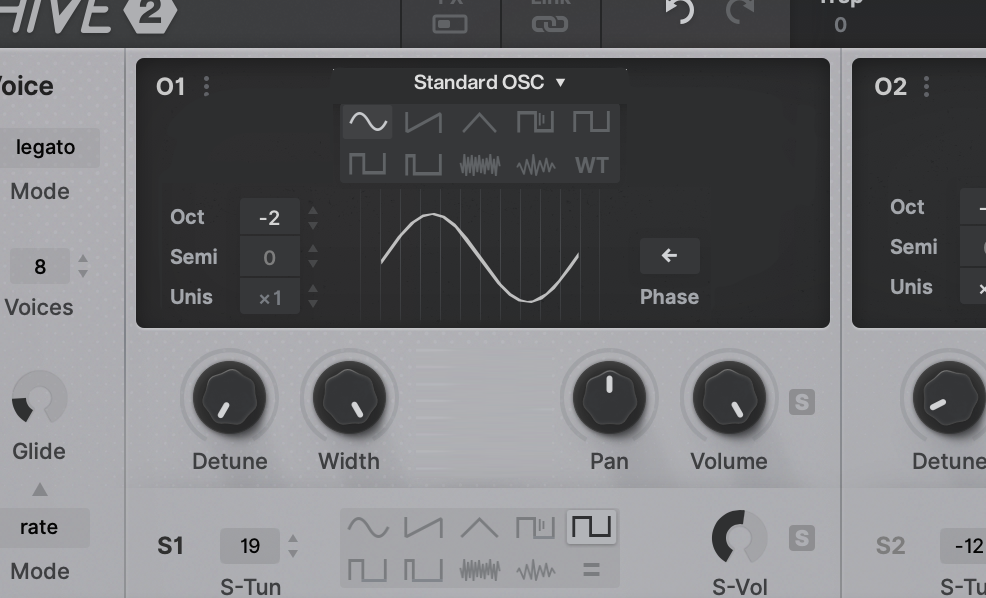
May be a small thing but it would be nice to be able to turn on the sub oscillators by clicking the S1 and S2 within the oscillator window.
-
- KVRist
- 194 posts since 25 Mar, 2004 from Strasbourg, Saskatchewan, Canada
Thanks... Even after searching and finding this post I had to look twice to see it that the new section was there... Didn't seem intuitive to me, but otherwise I like the Izmo... I've bought quite a few of Plugmon's skins and they are usually my go to GUIs...zvenx wrote: Sat Mar 06, 2021 4:49 pmAhh I missed it.
Thanks
Cause it is in a completely different colour. I didn't even consider that was a new section only available with the rest of the lighter pop up.
rsp
-
- KVRian
- 732 posts since 9 Apr, 2005 from Japan
Plugmon does very nice graphic work, puts a lot of care and attention into details, and even comes up with clever new/improved functionality, but often tips a bit too far into form over function and tends to make a few usability errors in each design. Things like buttons that look the same but behave differently (maybe it opens a menu, toggles between two values, pops up a browser, or is just a label that does nothing — you don't know until you try clicking it), too much subtlety/not enough contrast, and functionality that is effectively hidden until you guess the right place to click.srcodling wrote: Thu Mar 11, 2021 7:30 am Thanks... Even after searching and finding this post I had to look twice to see it that the new section was there... Didn't seem intuitive to me, but otherwise I like the Izmo... I've bought quite a few of Plugmon's skins and they are usually my go to GUIs...
This latest design suffers from some of the usual problems with overly flat design, where it's unclear which elements are interactive. I wouldn't think to click a magnifying glass unless I want to actually search for something, but Izmo uses that for toggling the entire preset browser. The clock and arpeggiator sections are hidden until you realize you can click the 'expand' icons to open the sequencer or shape sequencer, and even then, they appear outside of the expanded editing area, which you are not likely to notice. It's very pretty, but the details haven't been thought through, and as a result it's a bit frustrating and unintuitive.
Still, I'm a fan, and have bought the Plugmon skins for all the u-he synths I use. I really like the stylized modules in AIKO (for Diva) that hint at which hardware they're based on. Neumann (for Zebra) is much cleaner and easier to use than the default skin.
I think part of the problem is Hive itself is just complex in nature and very challenging to design a UI for. I'll give the benefit of the doubt there, but there are still a few areas where Izmo could be improved.
Stormchild
-
- KVRAF
- 2685 posts since 14 Jul, 2005 from Australia
I said something similar a few pages ago, must agree with this. It threw me off the first time I used it too.Arashi wrote: Thu Mar 11, 2021 4:27 amThanks. I didn't notice the smaller menu. It's not clear that it's a dropdown — it just looks like a label. I suggest adding pop-up menu arrows to make it obvious there's a menu. I also think if the button group is not always visible, it should just be removed, because it's not really intuitive that there would be two different ways to switch waveform modes (and one of them sometimes disappears).plugmon wrote: Thu Mar 11, 2021 4:04 am There're 2 Waveform selectors, one in the upper display (which disappear when in WT mode), the other in the lower which is kept visible across in all modes.
Izmo Waveform Menu.png
-
- KVRian
- 1120 posts since 4 Jan, 2007
Is this a bug?
VST2.4. Reaper 6.25. Win 10.
-Load hive.
-Right click on the pacth name and press the "init" patch.
-Go to the modulation matrix and select e.g. "Key Follow".
-Drag the first mod slot to e.g. oscillator detune (either from the matrix or from the bottom of the GUI).
-The orange dot doesn't appear.
-Drag the second mod slot to the neighboring knob (either from the matrix or from the bottom of the GUI).
-The orange dot doesn't appear.
-Move the modulation amount on the matrix.
-Both orange dots appear.
On the original skin the orange dot appears from the start.
Selecting the modulation from the center source shows the orange dot correctly.
-
- KVRian
- 798 posts since 17 Nov, 2015 from Yuma
the skin is damn nice here in the kvr-forum previews. when i start hive 2 on my system it looks way more grey in grey and less contrasty. is there a chance to get a version with more contrast?
[aˈtoːm] [aːl] [ˈa(ː)tonaːl] IV
https://soundcloud.com/atomaalatonal4
https://soundcloud.com/atomaalatonal4
-
- KVRian
- 732 posts since 9 Apr, 2005 from Japan
Another bug (or perhaps incorrect design choice): when you click the FX button in the header, it's illuminated when the effects are off, which seems backwards to me. Should be lit when effects are on.
Stormchild
-

- KVRAF
- 14501 posts since 16 Feb, 2005 from Planet Earth, Somewhere
Indeed.anttimaatteri wrote: Thu Mar 11, 2021 11:07 pm the skin is damn nice here in the kvr-forum previews. when i start hive 2 on my system it looks way more grey in grey and less contrasty. is there a chance to get a version with more contrast?
He was convinced here to take away some of the contrast from his earlier versions.
rsp
sound sculptist
-

- KVRist
- 396 posts since 3 Mar, 2015 from Japan
"the center source" is technically called "Mod Assigner" and modulation dots are shown only when the corresponding Mod Assigner is active (=clicked). In Izmo, an active Mod Assigner is highlighted by underline.rafa1981 wrote: Thu Mar 11, 2021 8:14 pm Is this a bug?
VST2.4. Reaper 6.25. Win 10.
-Load hive.
-Right click on the pacth name and press the "init" patch.
-Go to the modulation matrix and select e.g. "Key Follow".
-Drag the first mod slot to e.g. oscillator detune (either from the matrix or from the bottom of the GUI).
-The orange dot doesn't appear.
-Drag the second mod slot to the neighboring knob (either from the matrix or from the bottom of the GUI).
-The orange dot doesn't appear.
-Move the modulation amount on the matrix.
-Both orange dots appear.
On the original skin the orange dot appears from the start.
Selecting the modulation from the center source shows the orange dot correctly.
Currently the communication between the traditional Mod Matrix and the v2 Mod Assigner is not perfect.
-Clicking a mod depth knob automatically activates the mod assigner (smart!!)
-Clicking (or dragging) a mod target area doesn't activates the mod assigner
But note that there's no difference between the default and Izmo on this point. If you think that in the default skin the dot appears, it must be because the Mod Assigner is already activated before D&D.

-
- KVRist
- 396 posts since 3 Mar, 2015 from Japan
The first time you got perplexed, and how about now? That is what I care.fgimian wrote: Thu Mar 11, 2021 8:54 amI said something similar a few pages ago, must agree with this. It threw me off the first time I used it too.Arashi wrote: Thu Mar 11, 2021 4:27 amThanks. I didn't notice the smaller menu. It's not clear that it's a dropdown — it just looks like a label. I suggest adding pop-up menu arrows to make it obvious there's a menu. I also think if the button group is not always visible, it should just be removed, because it's not really intuitive that there would be two different ways to switch waveform modes (and one of them sometimes disappears).plugmon wrote: Thu Mar 11, 2021 4:04 am There're 2 Waveform selectors, one in the upper display (which disappear when in WT mode), the other in the lower which is kept visible across in all modes.
Izmo Waveform Menu.png
Whether you've got used to it and benefit from the ability of 1-click waveform select, or seems like there's little hope of feeling familiar to it?
Imagine if there's no waveform selector, do you miss it or feel relaxed by a clear structure?
I couldn't stand the sense of guilt that I burnt so many people's eyes... some might have gone to hospital.....zvenx wrote: Thu Mar 11, 2021 11:36 pm Indeed.
He was convinced here to take away some of the contrast from his earlier versions.
rsp
-
- KVRAF
- 14501 posts since 16 Feb, 2005 from Planet Earth, Somewhere
lol.
rsp
sound sculptist
-
- KVRist
- 75 posts since 2 Jan, 2021
plugmon wrote: Fri Mar 12, 2021 2:57 am I couldn't stand the sense of guilt that I burnt so many people's eyes... some might have gone to hospital.....
Instead, the sadness of a less-contrasty version means I need therapy
-
- KVRist
- 283 posts since 4 Feb, 2015
Really?zvenx wrote: Thu Mar 11, 2021 11:36 pm Indeed.
He was convinced here to take away some of the contrast from his earlier versions.
rsp
I thought people here were complaining about Izmo being too blurry and were asking for a version with higher contrast instead - especially, as regards the contrast of the grey display areas (e.g. "Glide") against that white paper background.
As for me, the latest reincarnation is too blurry (but I already stated that here); even the very first version was better in that respect.